21 Board and Batten Accent Wall Ideas That Look Luxe

A plain wall can completely change the feel of a room when the right architectural detail is added. Board and batten accent wall ideas offer an easy way to bring depth, character, and a custom-designed look into your home.
From soft cream panels and warm wood battens to dramatic navy and charcoal designs, there are so many ways to make this feature work with your style. Whether you want a cozy bedroom, polished living room, welcoming entryway, or elegant dining space, the right panel layout can instantly create a stronger focal point. Simple paint colors paired with thoughtful proportions often create the most beautiful results without overwhelming the room.
1. Classic White Paneling

- Crisp white paint makes the wall feel taller and brighter.
- Vertical battens add architectural detail without overwhelming the room.
- Warm wood furniture keeps the white wall from feeling too stark.
- This is an easy foundation for changing decor later.
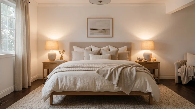
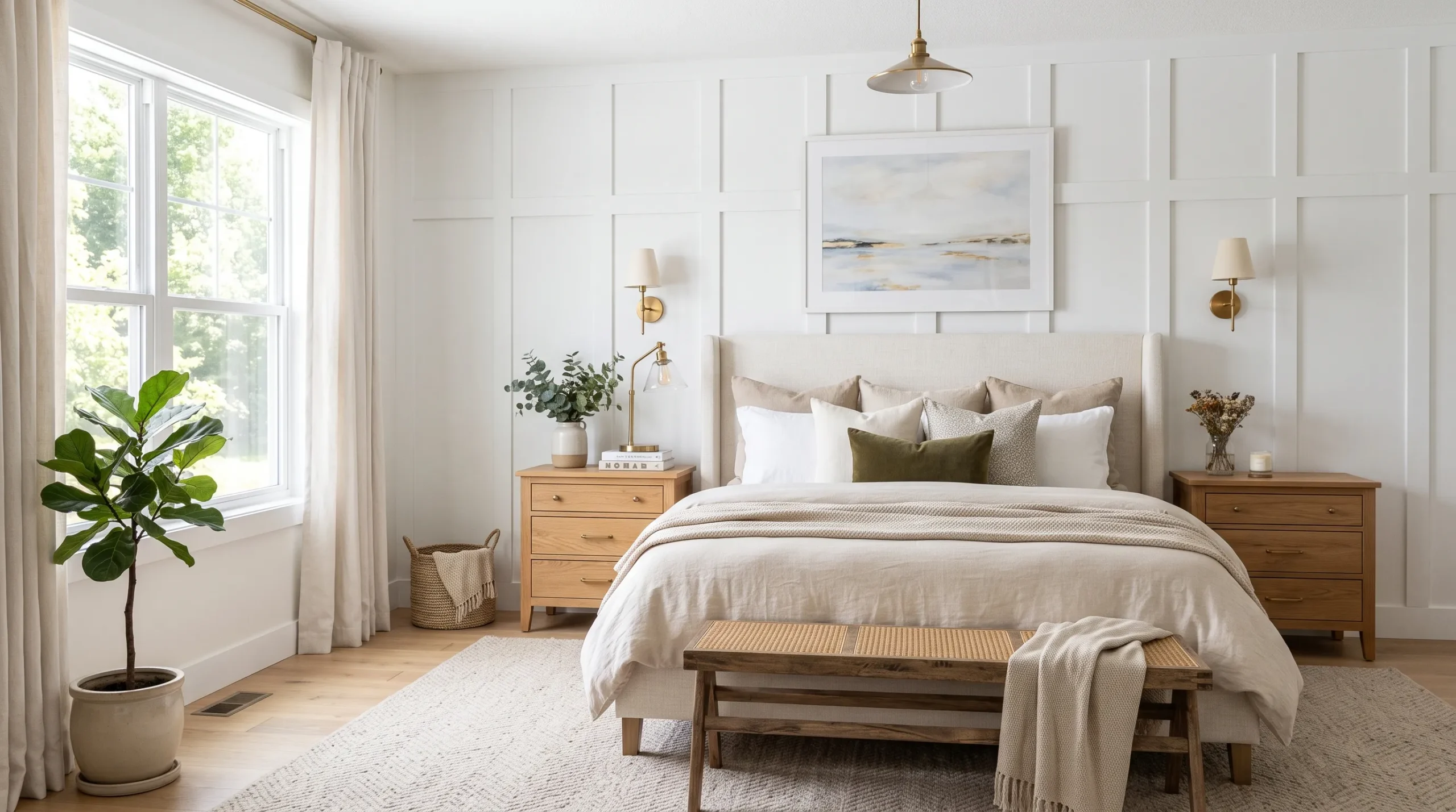
A white paneled wall can instantly make a bedroom feel more finished without adding visual clutter. This classic treatment works especially well behind a bed because the vertical lines naturally draw the eye upward and create a strong focal point. Keep the battens and wall in the same soft white shade for a seamless, upscale appearance. Layer in cream bedding, warm wood nightstands, and simple brass lighting to add depth. This combination feels polished while remaining flexible enough to work with seasonal pillows, artwork, or bedding changes.
For a timeless result, choose trim proportions that suit the room rather than making every panel identical. Taller battens can emphasize ceiling height, while slightly wider sections create a calmer appearance on larger walls. If your bedroom receives plenty of daylight, a warm white can soften the overall look beautifully. For darker rooms, choose a lighter neutral with a subtle warm undertone. This approach is one of the most versatile board and batten accent wall ideas because the wall itself becomes the decorative feature without competing with furniture or accessories.
2. Moody Charcoal Panels

- Charcoal creates instant depth and a dramatic focal point.
- Soft neutral bedding balances the darker wall beautifully.
- Warm lighting prevents the room from feeling cold or heavy.
- Matte finishes give the paneling a sophisticated, modern look.
Want a bedroom that feels instantly deeper and more luxurious? A charcoal board and batten wall creates that effect by giving the room a rich architectural backdrop. The dark color makes lighter furniture and bedding stand out, especially when paired with cream, oatmeal, or warm taupe textiles. Keep the surrounding decor relatively simple so the wall remains the star. Charcoal works particularly well in bedrooms because it absorbs harsh reflections and creates a softer, cocoon-like atmosphere once warm lamps are switched on.
The key is balancing the darkness with enough contrast and texture. Choose light bedding, pale curtains, or a soft rug to keep the room visually comfortable. Natural wood can also add warmth without making the space feel overly rustic. For a more contemporary finish, use black or aged-brass sconces and streamlined furniture. If the room is small, extending the same charcoal color across the trim can create a more cohesive appearance instead of making the accent wall feel like a separate block.
3. Soft Greige Grid
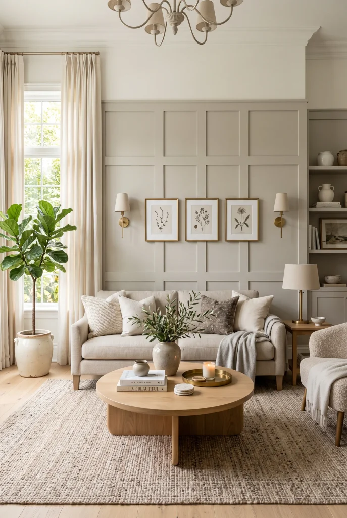
- Greige gives the wall warmth without looking too beige.
- A balanced grid pattern adds structure and visual rhythm.
- Natural textures make the neutral palette feel inviting.
- The design works beautifully with both modern and traditional furniture.
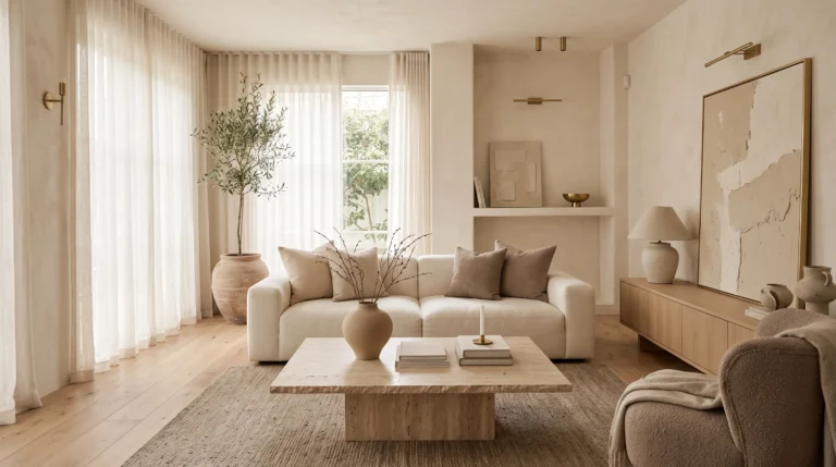
A soft greige wall brings subtle color and architectural character together in one easy update. Instead of relying on bright paint or bold wallpaper, the panel pattern creates interest through shadow, proportion, and texture. This makes it especially useful in living rooms where you want the backdrop to feel sophisticated but still relaxing. Pair the wall with a cream sofa, natural oak furniture, and woven accents for a layered look. The result feels intentional without looking overly decorated, which is often what makes neutral spaces feel expensive.
For the most polished effect, keep the panel spacing consistent and choose a greige shade that works with your existing flooring and upholstery. A slightly warm undertone usually pairs naturally with oak, linen, rattan, and other organic materials. You can also repeat the wall color in small accessories to connect the entire room. This approach works particularly well when a plain living room wall feels unfinished but you want something more substantial than artwork alone.
4. Natural Wood Battens

- Natural oak brings warmth and texture to a plain wall.
- Vertical battens make the ceiling feel visually taller.
- Light wood pairs beautifully with cream and beige furnishings.
- The organic finish adds character without feeling overly rustic.
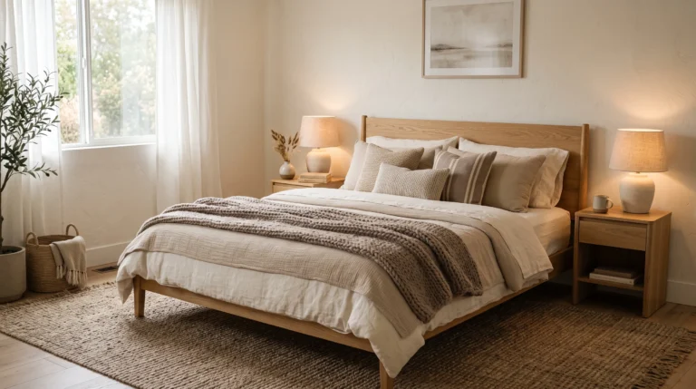
If your room feels a little flat, natural wood battens can bring warmth and dimension without relying on bold color. The combination of vertical timber and a soft neutral backdrop creates a relaxed architectural feature that feels especially welcoming in living rooms and bedrooms. Choose a light or medium oak tone and pair it with linen, boucle, woven baskets, and simple ceramics. This layered approach keeps the wall looking refined rather than busy. Natural wood works particularly well when the rest of the room already includes several warm, earthy materials.
For a cohesive result, repeat the wood tone in one or two nearby pieces, such as a coffee table, bench, or picture frame. Avoid matching every wooden element exactly; slight variations make the room feel more natural. If you are working with a narrow wall, slimmer battens can maintain visual openness while still creating texture. The vertical direction also helps emphasize height, making the feature especially useful in rooms with lower ceilings or compact proportions.
5. Black Framed Panels

- Black trim gives traditional paneling a sharper modern edge.
- The high-contrast design creates an instant focal point.
- Warm neutrals soften the stronger black details.
- Repeating black accents elsewhere makes the room feel cohesive.
A simple paneled wall can feel completely different when slim black accents are introduced. Framing the outer edges or painting the battens black against a warm white background creates crisp contrast and gives the architecture a more contemporary character. This treatment works beautifully behind a dining table, sofa, or console where the wall naturally becomes a focal point. Keep the surrounding furniture fairly simple so the strong lines have room to breathe. The result is polished, graphic, and surprisingly easy to style with neutral furnishings.
Balance is important when using dark trim. Repeat small touches of black through lighting, picture frames, hardware, or decorative objects so the wall feels connected to the rest of the space. Meanwhile, softer materials such as linen curtains, upholstered seating, and a textured rug can prevent the contrast from becoming too harsh. If you prefer a softer look, use charcoal rather than true black. This is one of those board and batten accent wall ideas that can give a basic room a custom-built appearance without requiring an elaborate renovation.
6. Arched Panel Details
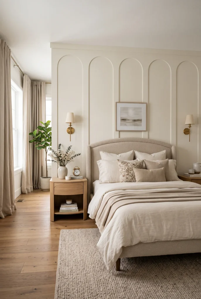
- Arched details soften the straight lines of traditional battens.
- Tall shapes create an elegant sense of height.
- Curved furniture reinforces the gentle architectural theme.
- Neutral colors keep the design sophisticated and calming.
Straight lines feel more graceful when they are paired with gentle curves. Arched panel details introduce that softness while keeping the structured character of board and batten design. Behind a bed, the arches can frame the sleeping area and create a sophisticated focal point without requiring a large headboard. Use warm white, cream, or muted greige for the wall, then repeat curved shapes through mirrors, lamps, or bedside furniture. Combining one strong architectural detail with quieter furnishings often makes a bedroom feel thoughtfully designed rather than overly styled.
The proportions of the arches matter more than adding lots of decoration. Taller, narrower arches can emphasize ceiling height, while wider arches create a softer and more relaxed appearance. Keep the surrounding palette restrained with linen, boucle, oak, or brushed brass details. For a modern finish, use clean edges and minimal accessories. For a more traditional room, pair the paneling with vintage-inspired lighting and classic furniture. Either way, the architectural pattern provides enough visual interest that the rest of the room can remain comfortably simple.
View: 15 Boho Style Bathroom Ideas That Look So Expensive
7. Sage Green Panels
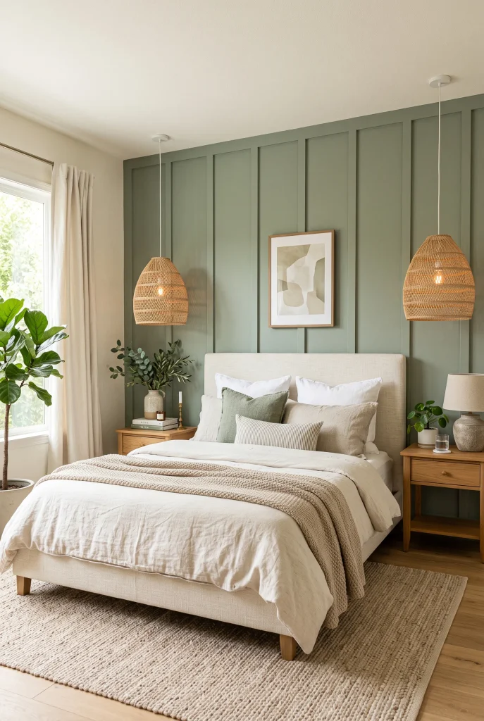
- Sage green adds color while keeping the room calm and sophisticated.
- The vertical panels create subtle architectural depth.
- Cream and oak accents keep the palette warm and balanced.
- Natural greenery reinforces the relaxed, organic feeling.
A muted sage green can turn a simple paneled wall into a calming focal point without making the room feel overly colorful. The soft green works beautifully with cream, beige, natural wood, and woven textures, making it especially appealing for bedrooms, entryways, and cozy living spaces. Painting both the wall and battens in the same shade creates a smooth, built-in appearance. The vertical detailing then catches the light and creates gentle shadows throughout the day, giving the wall dimension without needing additional artwork or decoration.
For a sophisticated result, choose a dusty or muted sage rather than a bright green. Pair it with warm white textiles, oak furniture, and subtle brass or black accents. Repeating the green in just one or two small accessories is enough to connect the space without making the color feel excessive. If the room receives limited natural light, test a sample first because green undertones can shift noticeably under artificial lighting. A balanced shade can make the entire space feel fresher, warmer, and more intentionally designed.
8. Floor-to-Ceiling Battens
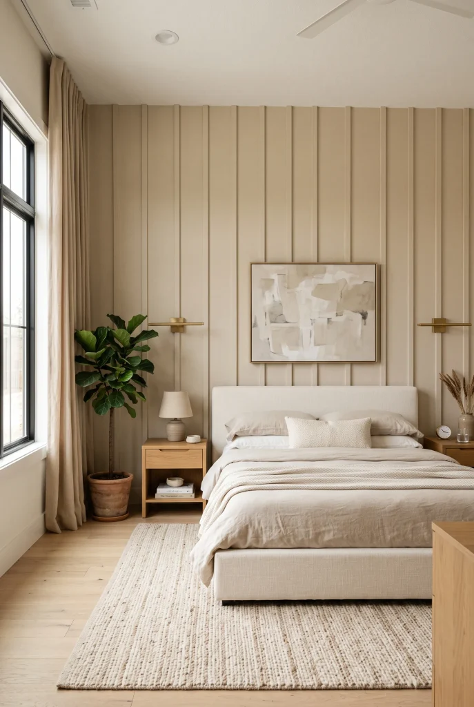
- Full-height battens emphasize the room’s vertical proportions.
- The uninterrupted design creates a strong architectural backdrop.
- Narrow spacing keeps the wall refined instead of bulky.
- Minimal furniture lets the dramatic wall detail stand out.
When you want maximum impact from a relatively simple treatment, take the battens all the way from floor to ceiling. Full-height detailing draws the eye upward and can make the entire room feel taller and more architectural. Behind a bed or sofa, it creates a natural focal point while adding texture across a large blank surface. Keep the color consistent from top to bottom for a seamless effect. This approach works especially well in modern interiors where clean lines and strong proportions are more important than lots of decorative accessories.
The spacing of the battens becomes especially noticeable on a floor-to-ceiling wall, so plan the layout before installation. Narrower strips can create a refined, tailored appearance, while wider spacing gives the design a more relaxed feel. Consider the location of windows, doors, outlets, and furniture before deciding where each vertical line should fall. This technique can make ordinary walls feel surprisingly custom because the architectural detail becomes part of the room rather than simply an added decoration.
9. Two-Tone Paneling

- Two paint colors make simple paneling feel more customized.
- A darker lower section adds grounding and visual weight.
- The lighter upper area keeps the room feeling open.
- Coordinating furniture ties both shades together naturally.
Two-tone paneling adds another layer of visual interest without requiring a complicated pattern. A warm taupe or muted beige on the lower portion paired with creamy white above can make a plain wall feel more thoughtfully designed. The darker section visually anchors furniture while the lighter upper portion keeps the room airy. This combination works particularly well in dining rooms, hallways, home offices, and bedrooms where you want architectural character without a dramatic color takeover.
The transition between the two shades should feel intentional, so align it with the height of your furniture or another architectural feature when possible. Use a darker tone that connects with your flooring, upholstery, or cabinetry, then choose a lighter coordinating shade rather than a stark white. Small details can make the whole treatment feel cohesive. Repeat the lower wall color through a cushion, vase, frame, or lamp base. The result is a layered accent wall that feels polished while remaining easy to live with.
10. Coastal Blue Panels
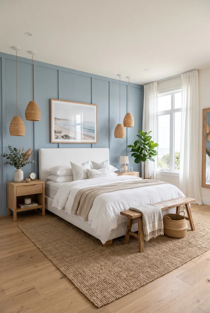
- Dusty blue brings a fresh, calming tone to the room.
- White bedding keeps the palette light and airy.
- Natural wood adds warmth to the cool wall color.
- Woven textures reinforce the relaxed coastal feeling.
A soft blue paneled wall can make a room feel instantly fresher while still maintaining a sophisticated look. Dusty blue, muted denim, and blue-gray shades work particularly well because they add color without becoming visually overwhelming. Behind a bed or sofa, the vertical detailing gives the wall extra dimension while the cool tone creates a calm backdrop. Pair it with white linen, light oak, woven textures, and simple ceramics for a relaxed coastal-inspired space that still feels polished rather than themed.
For a more elevated result, avoid overly bright or saturated blue. Muted shades tend to work better with natural materials and changing daylight. You can also introduce tiny amounts of navy through pillows, artwork, or a rug to create contrast. If your room already has cool flooring, choose a blue with a slightly gray or warm undertone so the space does not feel icy. This combination proves that an accent wall can feel colorful and distinctive while still remaining versatile enough for everyday living.
11. Bedroom Headboard Wall

- Paneling can visually frame the bed without needing an oversized headboard.
- Symmetry makes the entire wall feel intentional and balanced.
- Soft neutral colors create a relaxing bedroom atmosphere.
- Built-in-looking details can make the room feel more expensive.
Turn the wall behind your bed into the room’s main architectural feature by using board and batten detailing as a visual headboard. The panels naturally frame the sleeping area and give the bed a stronger presence, especially when the furniture itself is simple. Choose a soft neutral such as warm white, greige, or muted beige, then layer the bed with textured linens and a few comfortable pillows. This approach is particularly useful when you want a luxurious bedroom look without spending heavily on a large decorative headboard.
The panel layout should relate to the width and height of the bed for the most balanced result. Centering the pattern around the mattress creates symmetry, while extending the treatment beyond the bed gives the room a more dramatic architectural feel. Add matching sconces or bedside lamps to reinforce the symmetry. Keeping the wall color close to the bedding creates the calmest appearance, while contrasting trim or darker paint can make the feature feel bolder and more contemporary.
12. Warm Beige Molding

- Warm beige creates a softer alternative to bright white paneling.
- Matching molding and wall color give the design a custom look.
- Neutral furniture allows the architectural detail to remain visible.
- Layered textures add depth without introducing strong colors.
Warm beige paneling brings architectural detail into a room while keeping the overall mood soft and inviting. Unlike stark white, a creamy beige can connect beautifully with wood floors, linen upholstery, woven rugs, and other warm materials. Painting the molding and wall in the same shade allows the shadows created by the battens to provide the visual contrast instead of relying on multiple colors. The result feels subtle during the day but becomes especially cozy when illuminated by warm lamps in the evening.
When choosing your paint, consider the existing undertones in the room. Beige with a warm undertone generally complements oak, brass, tan leather, and natural fibers, while a grayer beige creates a more contemporary appearance. Keep accessories restrained so the molding remains visible rather than getting lost behind too many objects. A simple sofa, textured rug, rounded coffee table, and a few ceramic pieces can be enough. This treatment is a practical way to make a plain wall feel more finished without making the room look overly formal.
13. Entryway Statement Wall
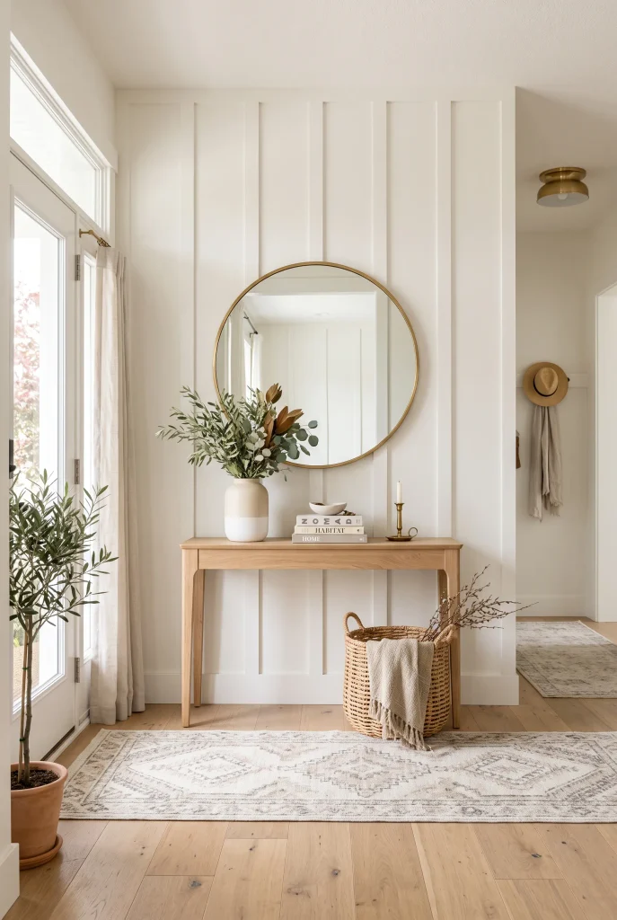
- Paneling gives an entryway instant architectural character.
- A slim console keeps the space functional without crowding it.
- A round mirror softens the strong vertical lines.
- Warm neutrals create a welcoming first impression.
Your entryway may be small, but it can still make a memorable first impression. A paneled statement wall adds architectural interest to an otherwise overlooked area and gives the space a finished, intentional appearance. Keep the design relatively simple, then place a slim console, round mirror, and a few useful accessories in front of it. The combination creates a beautiful focal point while still leaving enough room for everyday movement. Soft white, greige, or warm beige works especially well in narrow entryways.
Because entryways often receive less natural light than larger rooms, choose a wall color that keeps the area feeling open. A mirror can bounce available light around the space while also breaking up the repeated vertical lines. Add a small basket for practical storage, a runner for softness, and one natural element such as greenery or dried stems. Functional pieces look much more intentional when they are grouped against a strong architectural backdrop instead of scattered throughout the entry.
14. Deep Navy Panels
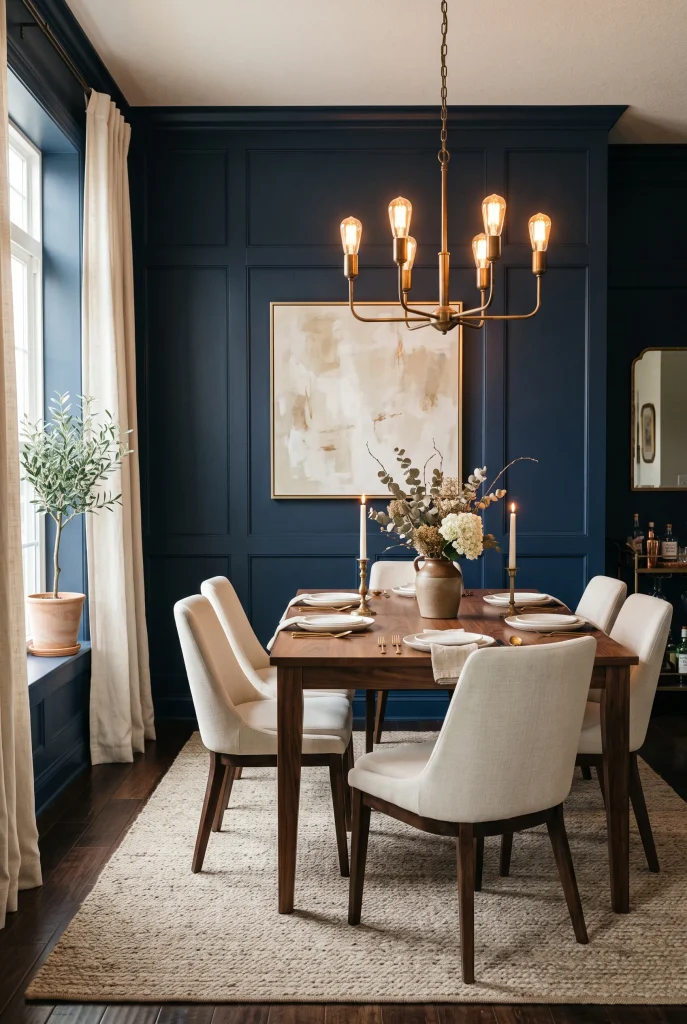
- Deep navy creates a dramatic but sophisticated backdrop.
- Warm wood prevents the darker color from feeling too cold.
- Brass lighting adds an elegant contrast against navy.
- Cream furnishings keep the overall composition balanced.
Deep navy paneling can give an ordinary room a dramatic sense of depth while still feeling timeless. The rich color looks especially striking in dining rooms, studies, bedrooms, and living spaces where you want a stronger focal point. Pair it with warm walnut or oak furniture, cream upholstery, and aged brass details to prevent the dark wall from feeling too heavy. The raised panels catch both natural and artificial light, creating subtle variation that makes the color feel more dimensional.
Dark paint works best when the surrounding palette provides enough contrast. Use lighter rugs, curtains, upholstery, or artwork to keep the room visually balanced. If the space has limited daylight, warm lamps can make the navy feel cozy rather than gloomy. A matte or eggshell finish is usually more forgiving for an architectural wall because it reduces harsh reflections. For a refined look, keep the accessories selective and let the paneling provide most of the room’s visual drama.
15. Minimalist Vertical Grid
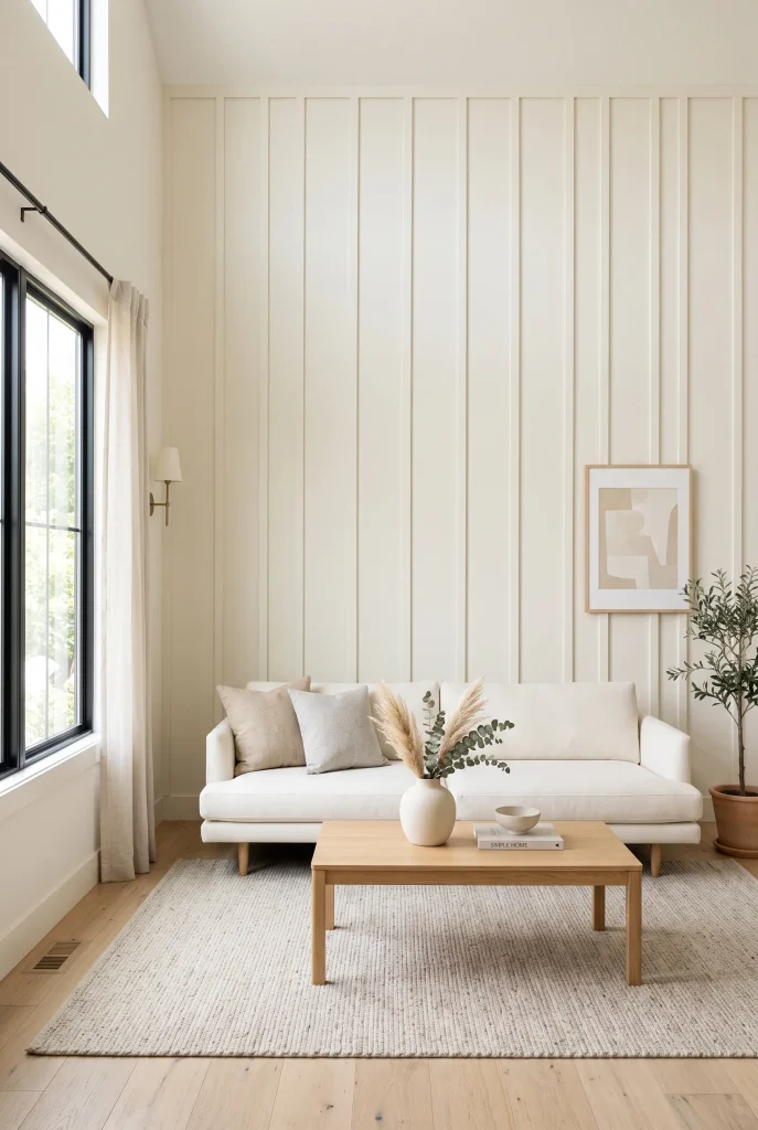
- Even spacing creates a calm and organized visual rhythm.
- Narrow battens keep the design sleek and contemporary.
- A monochromatic palette prevents the wall from feeling busy.
- Simple furniture lets the architecture become the focal point.
Sometimes the most luxurious wall treatments are also the simplest. A minimalist vertical grid uses evenly spaced battens to create rhythm without adding complicated shapes, contrasting colors, or heavy decoration. This makes it especially effective in modern homes where clean lines are important. Choose a soft ivory, warm white, or pale greige and keep the battens relatively narrow for a tailored appearance. The finished wall feels architectural while still blending naturally with understated furniture and neutral accessories.
Proportion is the secret to making this design look intentional rather than repetitive. Consider the wall width, ceiling height, and furniture placement before choosing the spacing. Too many battens can make a smaller room feel busy, while wider gaps can create a more relaxed appearance. Keep the rest of the styling restrained with simple artwork, a low-profile sofa, and natural materials. This is one of the easiest ways to create a sophisticated backdrop while maintaining the clean, uncluttered feeling that defines minimalist interiors.
16. Blush Pink Paneling
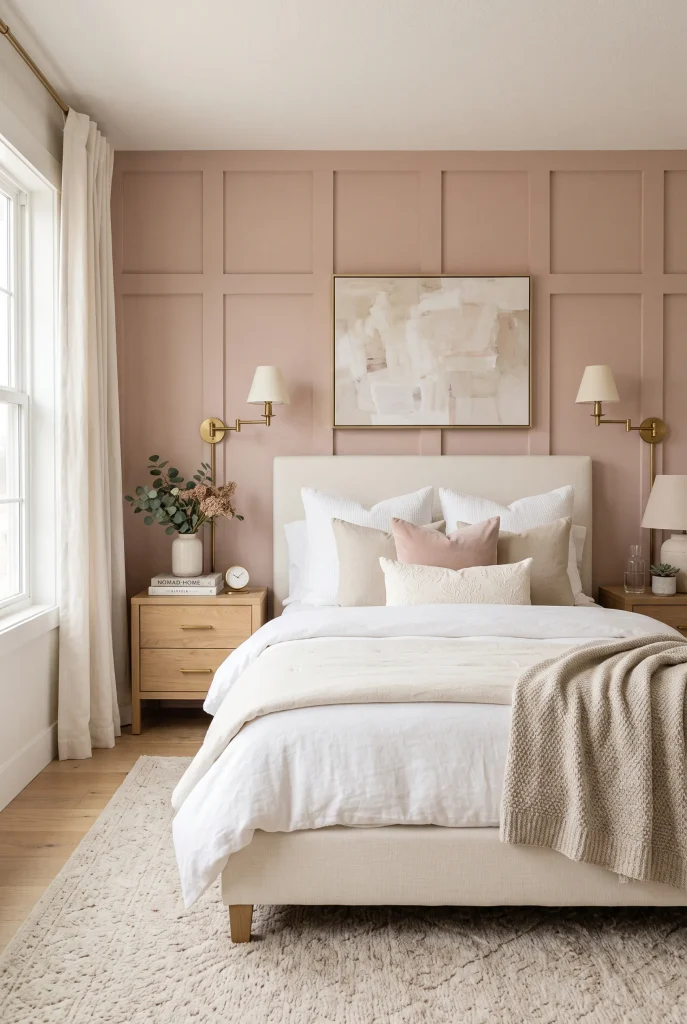
- Dusty blush adds warmth without feeling overly sweet.
- Cream and beige furnishings keep the color sophisticated.
- Brass details create a subtle luxe contrast.
- Soft textiles make the architectural wall feel inviting.
A muted blush wall can bring warmth and personality to a bedroom while still looking sophisticated. The key is choosing a dusty, slightly muted pink rather than a bright bubblegum shade. When combined with cream bedding, pale oak, linen curtains, and subtle brass accents, the color becomes an elegant backdrop instead of the main attraction. The board and batten structure adds another layer of refinement, giving the wall dimension that plain paint alone would not provide.
To keep the look timeless, repeat the blush tone sparingly throughout the room rather than matching everything to the wall. A small cushion, artwork detail, or ceramic accessory can create enough connection. If you are unsure about committing to pink, test the color on several areas because daylight can make blush shades appear warmer or cooler at different times. Soft pink works particularly well with warm neutrals because the combination feels cozy, layered, and welcoming without becoming visually overwhelming.
17. Rustic Farmhouse Battens
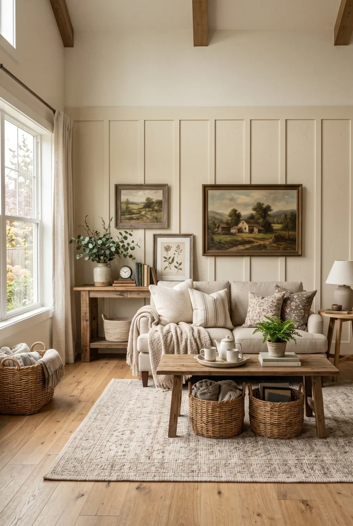
- Cream paint keeps farmhouse paneling bright and approachable.
- Natural wood adds authentic warmth and texture.
- Woven accessories reinforce the relaxed farmhouse character.
- Simple vintage accents keep the wall from feeling overly modern.
Board and batten detailing feels right at home in a farmhouse-inspired space because it combines practical simplicity with architectural character. A warm cream wall paired with natural wood furniture creates an inviting backdrop that feels established rather than overly decorated. Add woven baskets, linen upholstery, vintage-inspired artwork, and a few ceramic pieces to reinforce the relaxed atmosphere. The paneling provides structure while the organic materials keep the room comfortable and lived-in.
For a modern farmhouse result, avoid using too many rustic elements at once. One reclaimed wood piece or vintage accent is often enough to give the room character without making it feel themed. Choose a warm white or creamy neutral that works with your flooring, then let natural textures provide the contrast. Wider battens can create a traditional appearance, while slimmer ones feel more contemporary. This balance allows the wall to complement both classic farmhouse furniture and newer, cleaner-lined pieces.
18. Black-and-White Contrast
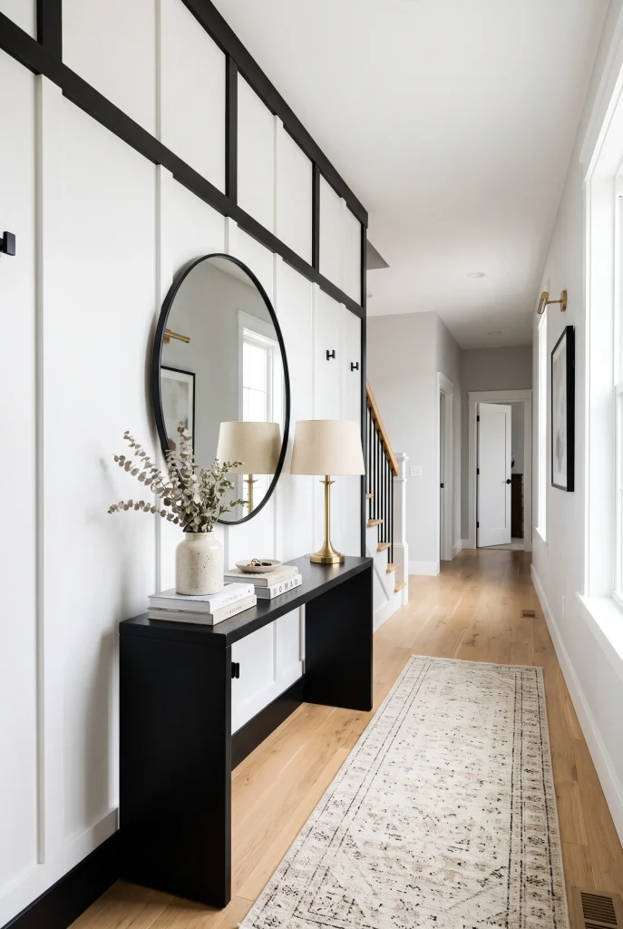
- Black and white create a crisp, instantly noticeable focal point.
- White keeps the wall bright while black adds definition.
- Small brass details soften the strong contrast.
- Minimal accessories allow the architectural pattern to stand out.
Black and white paneling creates a crisp architectural statement that can instantly sharpen an otherwise ordinary room. White panels keep the wall feeling bright and spacious, while black trim or battens add definition and visual contrast. This combination works particularly well in hallways, entryways, dining rooms, and modern living spaces. Add natural wood or brass accents to soften the graphic effect and introduce warmth. The result feels polished without requiring a complicated color palette or large collection of accessories.
The strongest version of this look usually comes from repeating the contrast in small, intentional ways. A black console, picture frame, lamp, or door handle can connect the wall to the rest of the room. Meanwhile, a beige rug or wooden accessory can prevent the palette from becoming too stark. Keep the panel spacing consistent and avoid placing too many competing patterns nearby. With thoughtful proportions, the wall becomes a clean architectural feature that looks custom and carefully planned.
19. Soft Taupe Panels

- Taupe adds depth while staying softer than darker accent colors.
- Cream textiles create a warm, layered contrast.
- Walnut and brass details make the palette feel richer.
- The neutral combination works across many decorating styles.
Soft taupe is an easy choice when you want an accent wall with depth but do not want the intensity of charcoal or navy. Its warm, understated character pairs naturally with cream, ivory, walnut, brass, and textured fabrics. When applied to board and batten detailing, the color becomes even more dimensional because light creates subtle shadows between each section. This makes the wall feel elegant and substantial while still maintaining the calm atmosphere that works so well in bedrooms and relaxed living spaces.
For the most cohesive result, compare your taupe paint sample with the room’s flooring and upholstery before committing. Some taupes lean gray, while others have stronger beige or brown undertones. Choose one that connects naturally with your existing materials. Keep accessories simple and let layered textiles provide softness. A cream rug, linen curtains, upholstered furniture, and warm wood accents can make the wall feel sophisticated without looking overly formal. The result is a neutral backdrop that can easily adapt as your decorating style changes.
20. Dining Room Paneling

- Paneling gives the dining area a defined architectural backdrop.
- A round table creates a softer contrast with straight lines.
- Warm wood furniture adds depth against neutral walls.
- Simple lighting completes the polished dining-room look.
A dining room is an ideal place for architectural paneling because the wall can become a beautiful backdrop without taking away valuable floor space. Use a warm neutral such as greige, cream, or soft beige, then position the dining table so the paneling naturally frames the eating area. A round wooden table creates a pleasing contrast with the straight vertical lines, while upholstered chairs add softness. Finish the room with a statement pendant or chandelier that draws attention toward the center.
Think about the wall from different seating positions before finalizing the layout. The panel spacing should feel balanced around windows, artwork, doors, and furniture rather than stopping awkwardly at one side. If the dining room is compact, lighter paint and slimmer battens can maintain an open feeling. For larger rooms, wider panels can create stronger visual impact. A few carefully chosen materials—wood, linen, brass, and ceramic—are usually enough to make the finished space feel layered and sophisticated.
21. Luxe Cream Panels

- Cream-on-cream paneling creates understated architectural luxury.
- Layered neutral textures prevent the palette from feeling flat.
- Curved furniture softens the structured wall treatment.
- Minimal decor keeps the finished look refined and expensive.
For an understated luxe finish, combine creamy paint with elegant paneling and equally soft furnishings. Instead of relying on strong contrast, let texture, proportion, and subtle shadows create the visual interest. A cream board and batten wall behind a plush sofa or upholstered bed can make the entire room feel more intentional. Add boucle, linen, light oak, ceramic, and brushed metal accents to create layers without introducing too many competing colors. The result is calm, sophisticated, and easy to live with.
The secret to making a monochromatic wall feel luxurious is variation. Mix several nearby shades of cream, ivory, beige, and warm white rather than trying to match everything perfectly. Different textures will catch the light differently, giving the room depth throughout the day. This approach works especially well when you want a high-end appearance without dramatic colors or elaborate decoration. Let the paneling provide the architecture, then use soft furnishings and carefully chosen materials to create the final polished effect.
Conclusion
A well-planned paneled wall can turn an ordinary room into a space that feels more finished, intentional, and stylish. From timeless white and warm beige to bold navy, charcoal, and natural wood, these board and batten accent wall ideas offer plenty of inspiration for different decorating styles and budgets.
Choose the color, spacing, and materials that work with your existing space rather than simply copying a look. Even one feature wall can make a noticeable difference. Save this post on Pinterest for your next home project, try your favorite idea, and share it with someone who is planning a room makeover.