
21 Jewel Tone Bedroom Ideas to Transform Your Space

Rich color can completely change the feel of a bedroom. A jewel tone bedroom adds depth, warmth, and personality with shades like emerald, sapphire, ruby, amethyst, and deep teal. But using bold colors does not mean every wall or piece of furniture has to be dramatic. The real trick is knowing where to use deeper shades and how to balance them with soft neutrals, natural wood, and warm lighting. Whether you want to refresh your bedding, add an accent wall, or simply bring in a few colorful details, these ideas make it easier to create a bedroom that feels cozy, stylish, and beautifully layered.
1. Emerald Green Accent Wall
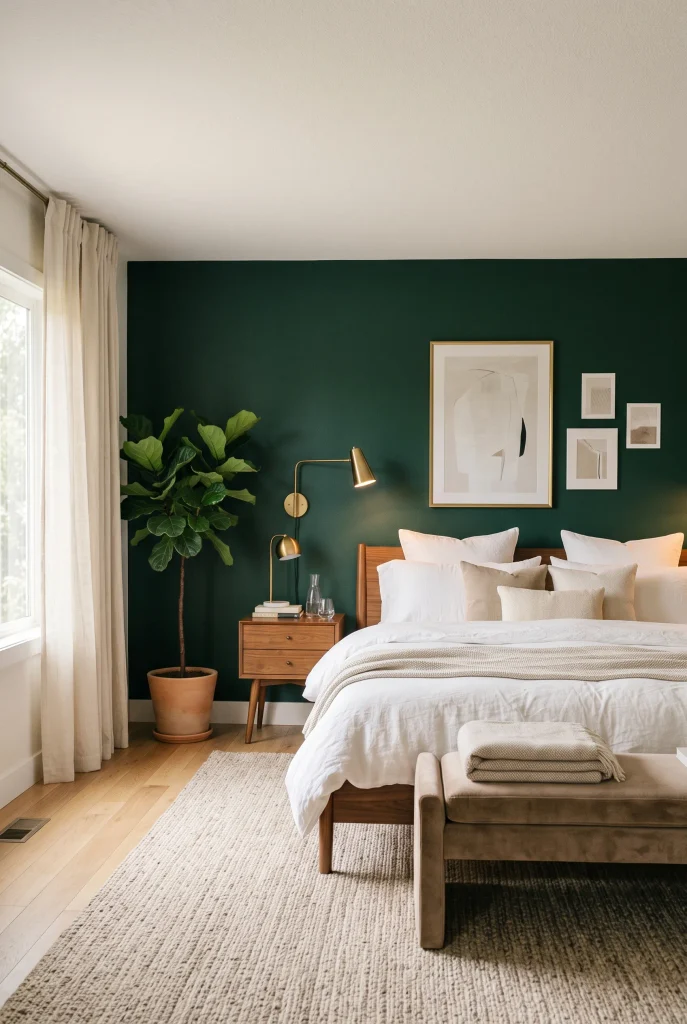
- Deep emerald creates an eye-catching focal point behind the bed.
- Warm white bedding keeps the darker wall from feeling too heavy.
- Brass lighting adds a subtle touch of elegance.
- Walnut furniture balances the strong green with natural warmth.
A deep emerald wall can make a bedroom feel instantly richer without requiring major furniture changes. The saturated green creates a beautiful backdrop for cream bedding, warm wood, and brass details. In a jewel tone bedroom, using one strong color on the wall is an easy way to create a clear focal point. Keep the surrounding pieces simple so the green has room to stand out. Textured pillows, a woven rug, and soft curtains can add comfort without competing with the wall. The result is bold enough to feel special but still comfortable for everyday living.
An emerald accent wall works especially well when the rest of the room stays warm and restrained. Choose warm white bedding instead of a very cool white, then add walnut or oak furniture to soften the intensity of the green. Brass sconces, picture frames, or small accessories can introduce another layer of warmth. If the room does not receive much natural light, warm bulbs can help the wall feel inviting in the evening. This combination gives even a simple bedroom a more finished appearance without making the decorating process complicated or expensive.
2. Sapphire Blue Bedding
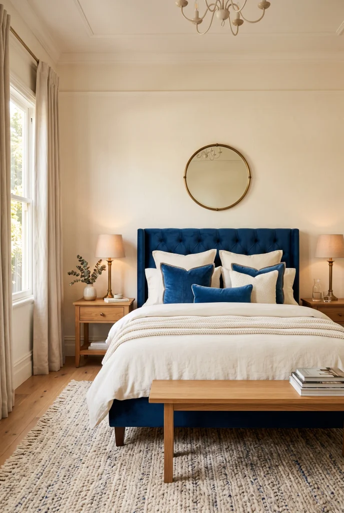
- Sapphire bedding creates a dramatic focal point without repainting the room.
- Ivory layers keep the rich blue feeling fresh and balanced.
- Velvet adds depth while keeping the bed soft and inviting.
- Warm wood furniture prevents the palette from feeling too cool.
Sapphire blue bedding can transform a simple bedroom into a space that feels rich and layered. The deep blue naturally becomes the focal point, while ivory sheets and warm neutral pillows keep the bed from looking too heavy. It is also an easy color to experiment with because bedding can be changed without making a permanent commitment. For a balanced look, mix different textures instead of matching every piece. Velvet, linen, cotton, and woven fabrics can give the bed more depth and make the overall arrangement feel thoughtfully styled rather than overly coordinated.
To keep sapphire blue from overpowering the room, surround it with warm neutrals and natural materials. A light oak nightstand, cream rug, or beige bench can soften the strong color beautifully. Brass lamps also work well because their warm finish creates a gentle contrast with deep blue. Smaller accessories do not all need to match the bedding. A blue throw at the foot of the bed or one patterned cushion can be enough to connect the color throughout the space. This keeps the bedroom interesting without making every surface feel overly decorated.
3. Ruby Red Velvet
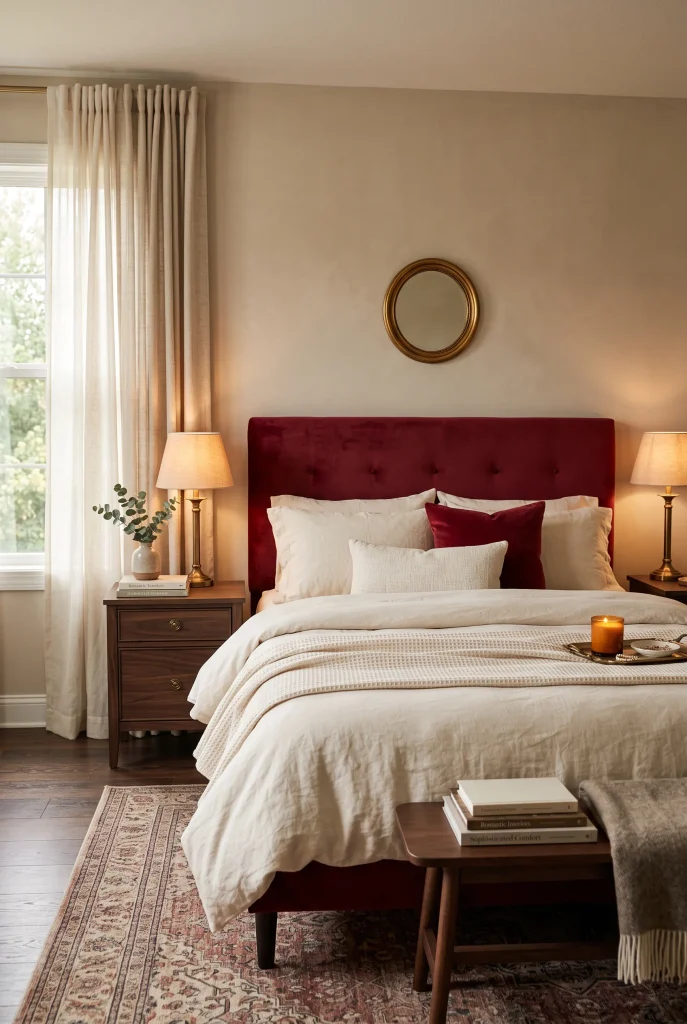
- Ruby red velvet brings warmth, drama, and texture to the bedroom.
- Cream bedding keeps the strong red from taking over.
- Dark walnut adds depth and works beautifully with the rich color.
- Antique brass details create a softer, classic finish.
Ruby red velvet can bring a dramatic touch to the bedroom while still keeping the space warm and inviting. A velvet headboard works particularly well because the fabric catches light differently across its surface, giving the red more depth. Pairing it with cream bedding creates enough contrast to keep the room balanced, while dark walnut furniture reinforces the rich palette. This combination is especially suitable for anyone who wants a bedroom with more personality without relying on bright colors everywhere. The mix of deep color and soft materials creates a comfortable and polished atmosphere.
The key to using ruby red is keeping it controlled. Instead of repeating the color across curtains, rugs, walls, and accessories, let one major element carry most of the visual weight. Smaller touches can come through a cushion, decorative object, or piece of artwork. Warm lighting also helps because cool white bulbs can make saturated red feel harsher at night. Aged brass or antique metal finishes provide a softer contrast, while neutral walls and larger textiles keep the room grounded. With this approach, the red feels intentional rather than overwhelming.
4. Amethyst Accent Chair
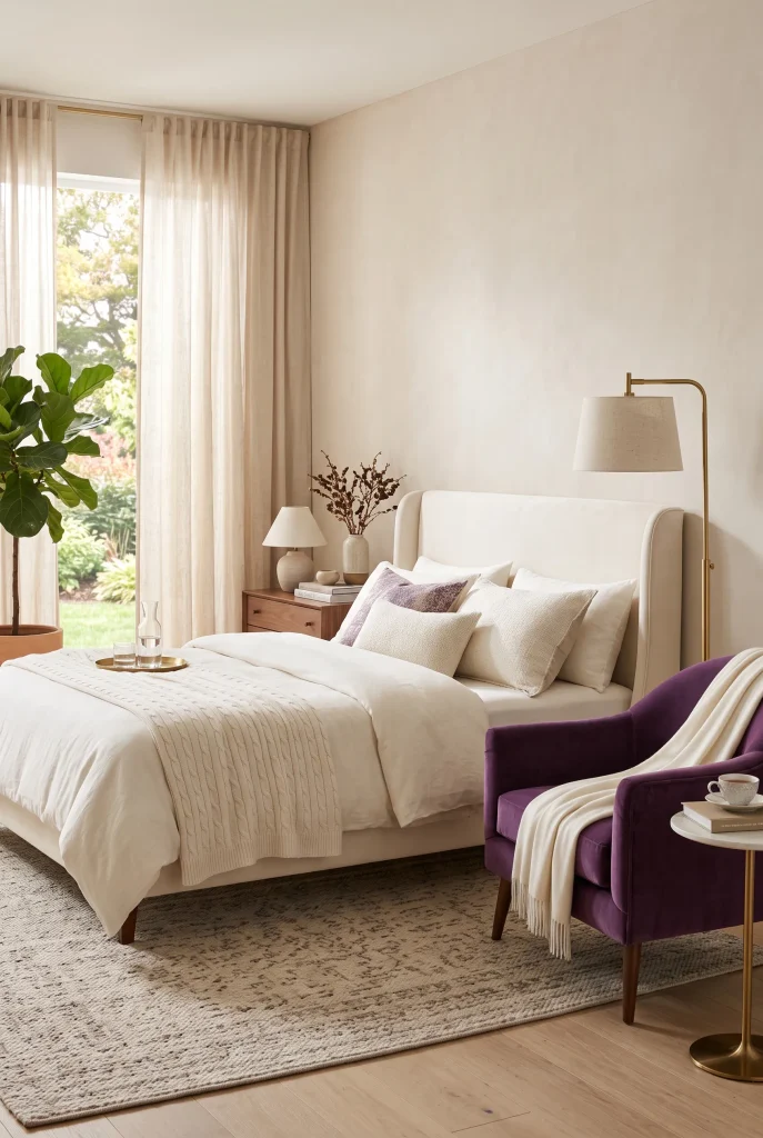
- An amethyst chair adds rich color without taking over the room.
- Velvet brings softness and visual depth to an empty corner.
- Neutral walls and bedding keep the purple accent refined.
- A small chair can turn an unused corner into a useful sitting area.
An amethyst accent chair can turn an unused bedroom corner into a beautiful feature without making the entire room purple. The rich violet shade looks especially good against cream, beige, or warm white because the contrast feels intentional without becoming too strong. Place the chair near a window, beside a dresser, or in another open corner where it does not interfere with movement. A small side table and soft throw can turn it into a practical reading spot. This simple addition gives the room another layer of color while also making the layout feel more complete.
For a polished look, choose an amethyst chair in velvet or another textured fabric and keep the nearby accessories simple. A brass floor lamp can add warmth, while a small walnut table introduces natural contrast. If the bedroom already contains several colors, a muted purple will usually feel easier to work with than an extremely bright shade. The goal is to make the chair feel connected to the room rather than like a random colorful piece. One carefully chosen accent can create plenty of visual impact without filling the bedroom with bold colors.
5. Teal Linen Layers

- Teal linen adds color while keeping the bedroom relaxed.
- Layered bedding creates depth without needing lots of accessories.
- Light oak furniture warms the cooler blue-green shade.
- Woven textures make the palette feel casual and welcoming.
Teal linen bedding gives a bedroom a fresh dose of color while keeping the overall look relaxed. Unlike heavier fabrics, linen has a naturally casual texture that prevents saturated teal from feeling too formal. Layer a teal duvet with lighter sheets, cream pillows, and one patterned cushion to create depth without making the bed look busy. This combination works especially well in bedrooms with plenty of natural light because the texture of the fabric changes subtly throughout the day. The result feels colorful and comfortable rather than overly styled, making it easy to live with throughout the year.
Balance teal with materials that bring warmth and softness into the room. Light oak nightstands, woven baskets, a textured rug, and natural linen curtains can keep the cooler shade from making the space feel cold. Brass or brushed gold lamps provide a gentle contrast without introducing another strong color. If the bedding is meant to remain the main feature, avoid covering nearby surfaces with matching teal accessories. A single throw or small decorative cushion is enough to connect the color around the room while keeping the overall look calm and uncluttered.
View: 21 Bed Without Headboard Ideas That Look Expensive
6. Plum Drapery
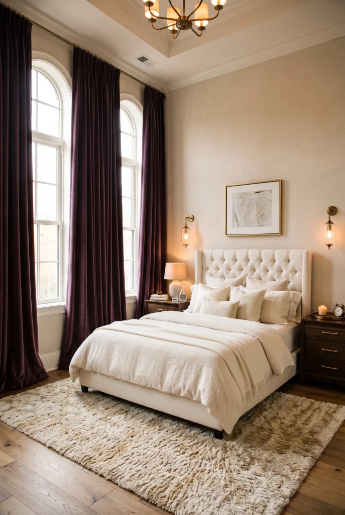
- Plum curtains create a dramatic frame around the bedroom windows.
- Floor-length fabric can make the ceiling appear taller.
- Ivory bedding softens the deep purple shade.
- Heavier drapery can also add privacy and warmth.
Deep plum curtains can completely change the mood of a bedroom by adding rich color around the windows. The shade creates a dramatic frame while drawing attention to the height of the room. Floor-length curtains usually look more polished than panels that stop at the window sill. Plum also pairs beautifully with ivory bedding, warm beige walls, and dark wood furniture. Together, these elements create depth without requiring lots of colorful decorations. The bedroom can feel layered and luxurious while still maintaining a calm and comfortable atmosphere.
Fabric choice makes a noticeable difference with deep plum. A heavier velvet or lined curtain can create a cozy, enclosed feeling, while a lighter woven fabric makes the color feel more relaxed. Mount the curtain rod slightly above the window frame and extend it beyond both sides when possible to make the window appear wider. Keep other textiles simple so the curtains remain the main color statement. Warm brass lighting, a neutral rug, and natural wood accents can then tie the entire palette together without competing with the rich purple.
7. Peacock Blue Headboard

- A tall blue headboard creates an immediate bedroom focal point.
- Ivory bedding keeps the saturated color feeling balanced.
- Walnut furniture adds warmth and natural contrast.
- Brass sconces provide a subtle polished detail.
A peacock blue headboard can give a bedroom an instant sense of character without changing every surface in the room. A tall design draws the eye upward and makes the bed feel more substantial. Pair the saturated blue with ivory bedding and warm beige walls for a softer contrast that still feels sophisticated. This approach works especially well when the rest of the furniture is simple. Instead of adding several competing colors, let the headboard provide the main statement and use different textures to make the surrounding layers more interesting.
For a balanced look, choose a fabric headboard in linen, boucle, or velvet rather than a glossy material. Texture softens the intensity of peacock blue and makes the bed feel more inviting. Walnut nightstands and brushed brass sconces can add warmth without distracting from the color. Keep decorative pillows within a restrained palette of cream, beige, and muted blue. If the bedroom is small, this strategy creates a strong focal point without filling the room with unnecessary furniture. The result feels intentional while still leaving enough open space for everyday use.
8. Garnet Throw Blanket

- A garnet throw adds rich color without requiring a major makeover.
- Draping it across the bed creates relaxed visual movement.
- Cream bedding provides a clean background for the deep red.
- Walnut and brass details reinforce the warm palette.
A garnet throw blanket is an easy way to bring a deep jewel tone into the bedroom without making permanent changes. Fold it across the lower part of the bed or drape it casually over one corner for a relaxed look. Because garnet is naturally rich, it can make simple cream bedding feel much more intentional. The color also works beautifully with walnut, beige, and warm white, so it can be introduced without replacing existing furniture. This makes the idea especially useful when you want a noticeable bedroom update without taking on a large decorating project.
The throw works best as a controlled accent rather than a color that appears everywhere. Add one or two cushions with a subtle red pattern if more connection is needed, then leave the rest of the room neutral. A textured rug and linen curtains can soften the contrast, while brass lamps add warmth beside the bed. The blanket does not need to be arranged perfectly. A slightly relaxed fold or casual drape can make the bedroom feel more lived-in while still keeping the bedding polished and layered.
9. Citrine Gold Accents
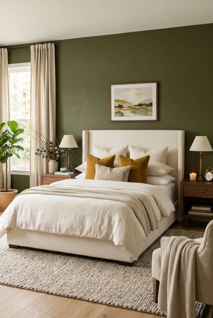
- Citrine accents add brightness without making the room overly colorful.
- Small golden-yellow pieces can lift deeper wall or bedding colors.
- Walnut furniture gives the warm palette more depth.
- Repeating the shade in subtle details creates visual connection.
Citrine gold accents can bring a fresh quality to a bedroom filled with deeper colors. Instead of using bright yellow across large surfaces, introduce the shade through pillows, a small throw, artwork, or a decorative object. Against deep green, navy, plum, or warm neutral backgrounds, the golden tone creates lively contrast while still feeling sophisticated. This approach works well when more color is wanted without making the room visually busy. Limiting the shade to a few carefully chosen pieces makes the entire palette feel deliberate and gives the bedroom a more collected appearance.
Warm materials make citrine especially easy to incorporate. Walnut furniture, antique brass lighting, cream upholstery, and natural woven textures all support the golden tone without competing with it. If the room already contains several strong colors, choose a muted citrine instead of a very bright yellow so the palette remains cohesive. Place the strongest accent where attention is most useful, such as on the bed or a reading chair. Then repeat a softer version elsewhere for balance. This creates a bedroom that feels colorful and layered while still remaining comfortable and restful.
10. Forest Green Bedding
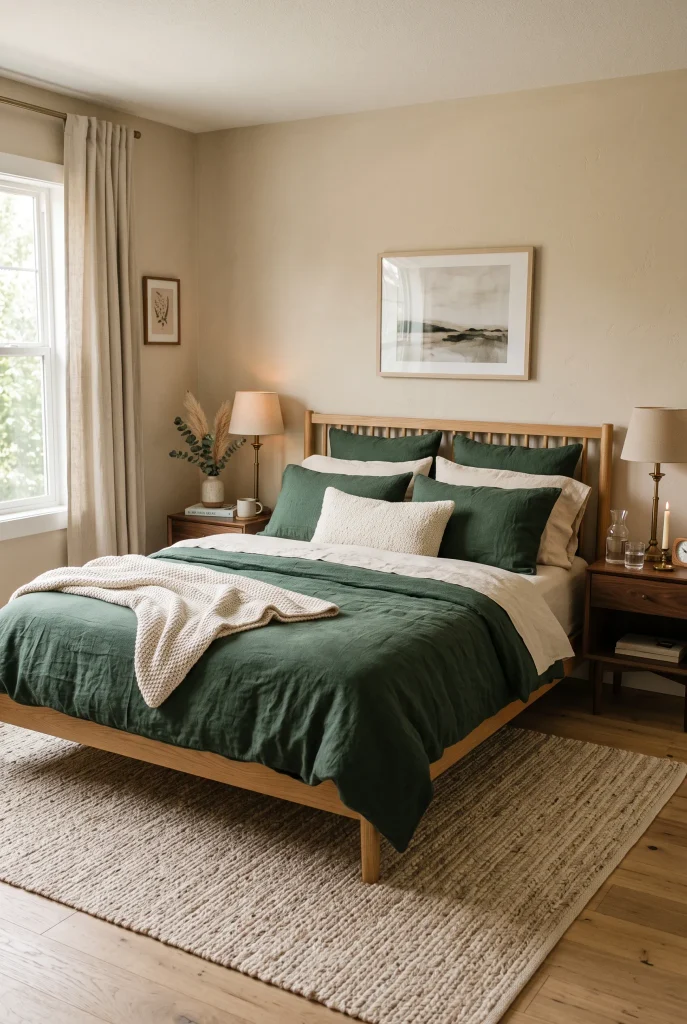
- Forest green bedding creates a grounded focal point.
- Cream sheets soften the depth of the darker shade.
- Natural wood keeps the palette warm and organic.
- Woven textures add softness without introducing more strong colors.
Forest green bedding can make a bedroom feel grounded, cozy, and connected to nature. The deep shade has enough richness to create a strong focal point, but it feels softer than many dramatic jewel colors. Pair a forest green duvet with cream sheets and neutral pillows so the bed looks layered rather than overly dark. This combination works especially well with natural wood because oak and walnut tones bring warmth against the cooler green. Simply changing the duvet and a few pillow covers can give an existing bedroom a completely different look without replacing major furniture.
To keep deep green bedding from making the room feel heavy, use lighter materials around it. Cream curtains, a beige rug, and warm white walls can reflect natural light and create breathing room. Add brass or aged-metal bedside lamps for a small touch of contrast, then introduce woven baskets or a jute bench for natural texture. In a smaller room, using the same dark green on the walls may feel more intense. A lighter background lets the bedding stand out while keeping the overall space comfortable and inviting.
11. Ruby and Blush Layers

- Ruby and blush create contrast while keeping the palette soft.
- Dusty pink tones prevent deep red from feeling too intense.
- Layered fabrics make the bed look plush and inviting.
- Warm wood and brass keep the combination sophisticated.
Ruby red and dusty blush can create a bedroom palette that feels rich without becoming overly dramatic. The key is to use the two shades at different intensities rather than giving them equal visual weight. Let a deeper ruby duvet or throw provide the strongest color, then soften it with blush pillows and cream sheets. The contrast adds dimension across the bed while keeping the atmosphere warm and inviting. This combination works particularly well with upholstered furniture and soft textiles because the colors naturally complement cozy materials and layered bedroom styling.
Keep the rest of the room relatively restrained so the bedding remains the main feature. Warm beige walls, walnut nightstands, and antique brass lamps create a sophisticated foundation around the red and pink tones. Choose dusty or muted blush instead of a very bright pink if you want a softer, more timeless appearance. A textured neutral rug can also help connect the different colors. When the palette is carefully controlled, ruby and blush can make even a basic bedroom feel thoughtfully decorated without requiring expensive furniture or a major renovation.
12. Cobalt Blue Nightstands
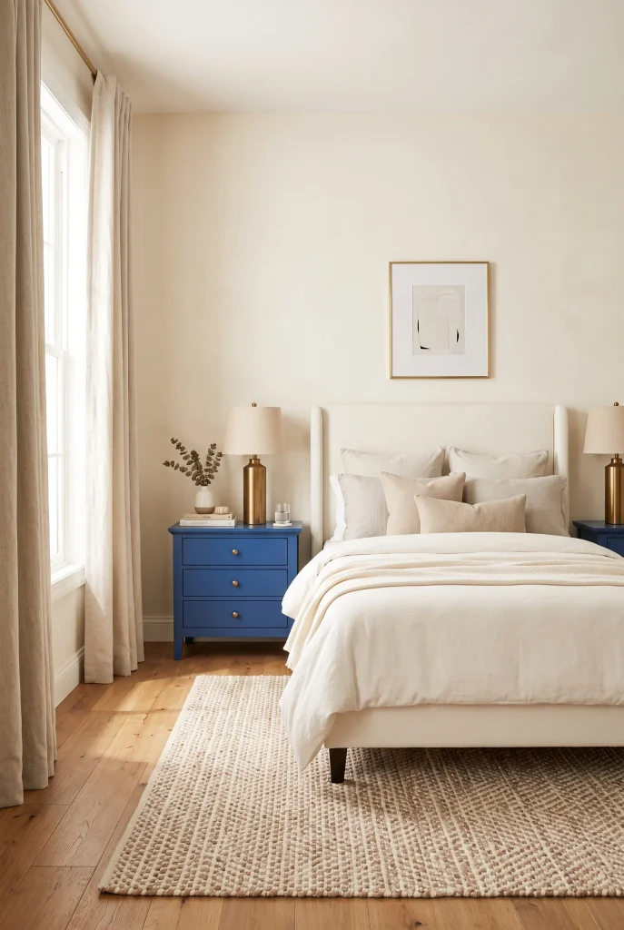
- Cobalt nightstands add concentrated color beside the bed.
- Matching pieces create symmetry and a polished appearance.
- Ivory bedding prevents the blue from feeling overpowering.
- Brass hardware adds warmth and visual contrast.
Cobalt blue nightstands can add a bold burst of color without taking over the entire bedroom. Because the pieces sit on either side of the bed, they naturally create symmetry and make the room feel organized. Pair them with an ivory or cream upholstered bed to give the saturated blue plenty of breathing room. This works especially well when colorful furniture is preferred but the walls need to remain neutral. The result feels energetic and polished while still leaving space for softer textures and practical pieces around the bed.
To make cobalt furniture feel connected to the rest of the room, repeat small hints of blue rather than matching every accessory. A patterned cushion, small artwork, or decorative vase can be enough. Brass lamps work beautifully against cobalt because the warm metal softens the cooler shade. Keep the flooring and larger textiles neutral, especially in a smaller bedroom. With this arrangement, the nightstands become memorable focal pieces while the surrounding cream, wood, and natural textures keep the space balanced and comfortable.
13. Aubergine Wall Panels

- Aubergine panels create architectural interest behind the bed.
- The deep purple shade gives the wall more visual depth.
- Cream upholstery keeps the dark backdrop from feeling overwhelming.
- Brass sconces add warmth and highlight the panel details.
Aubergine wall panels can turn the wall behind the bed into a dramatic architectural feature. The deep purple shade feels especially rich when paired with simple cream upholstery and warm neutral bedding. Rather than covering every wall, concentrate the color behind the bed so it creates a clear focal point. Vertical paneling can also emphasize ceiling height and give a plain room more structure. This approach works well when you want a colorful bedroom to feel sophisticated and layered without filling the space with numerous accessories.
For a balanced finish, combine the aubergine backdrop with materials that soften its intensity. A cream upholstered headboard, ivory bedding, and neutral rug provide enough contrast to keep the room comfortable. Dark walnut furniture reinforces the depth of the palette, while aged brass sconces add a warmer highlight against the purple. Keep artwork minimal so the paneling remains visible. If the room receives limited daylight, warm bulbs can help the deep purple feel softer and more inviting after sunset instead of making the wall appear too harsh.
14. Emerald Velvet Bench

- An emerald bench adds a concentrated jewel-tone accent.
- Placing it at the foot of the bed creates a strong visual anchor.
- Velvet introduces softness and light-catching texture.
- The bench also provides a practical place to sit or arrange blankets.
An emerald velvet bench can add a rich focal point to the bedroom without requiring a bold wall color or colorful bed frame. Positioned at the foot of the bed, it naturally draws attention toward the center of the room and helps complete the bed arrangement. The saturated green looks especially elegant against cream or ivory bedding, while velvet gives the color additional depth. It is also a practical choice for bedrooms that need more seating. The bench can hold folded blankets, provide a place to put on shoes, or simply make the room feel more finished.
Balance the strong green with warm materials throughout the rest of the space. Walnut nightstands, beige walls, and a textured neutral rug create a calm foundation around the colorful bench. Brass lamps or small metal accents add another warm layer without competing with the velvet. If the bedroom is narrow, choose a slim bench with clean lines so it does not interrupt the walking path. A few neutral cushions or a casually folded throw can soften the look while keeping the emerald piece clearly defined as the room’s main decorative accent.
15. Sapphire and Gold

- Sapphire and muted gold create a classic high-contrast combination.
- Cream bedding keeps the palette from becoming too heavy.
- Brass lighting naturally connects with the golden accents.
- Dark wood furniture adds depth and warmth to the room.
Sapphire blue and muted gold create a classic combination that can make a bedroom feel polished without relying on excessive decoration. Let sapphire carry the stronger visual weight through bedding, an upholstered chair, or a statement cushion, then use gold in smaller touches. A pair of muted gold pillows or a soft throw can add warmth without making the room look overly flashy. Cream upholstery and warm beige walls provide a neutral backdrop that allows both colors to stand out. The result feels layered and elegant while still being comfortable enough for everyday bedroom use.
The combination works best when the metallic accents are kept subtle. Instead of adding shiny gold accessories everywhere, choose aged brass or brushed metal finishes with a softer appearance. Dark walnut furniture can reinforce the richness of sapphire while adding natural texture to the room. Keep larger surfaces such as rugs and curtains neutral, then repeat small hints of blue and gold for continuity. If the bedding feels visually strong, balance it with simple pillows and uncluttered nightstands. This keeps the palette sophisticated without making the bedroom feel overly decorated.
16. Deep Teal Walls
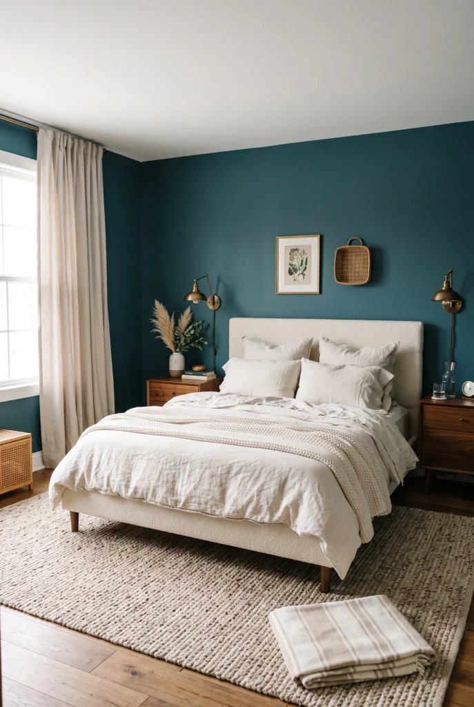
- Deep teal walls create a dramatic backdrop without feeling overly formal.
- Cream bedding provides soft contrast against the saturated color.
- Walnut furniture adds natural warmth and visual balance.
- Brass lighting brings a subtle glow to the darker palette.
Deep teal walls can give a bedroom an enveloping quality that feels cozy rather than overwhelming. The blue-green shade has enough depth to create drama, while its green undertones keep it connected to natural colors and materials. Pair the walls with an ivory upholstered bed and light bedding so the room does not become visually heavy. This approach works particularly well with warm wood flooring because the contrast between the saturated walls and natural timber creates a comfortable, grounded look. Even simple furniture can feel more intentional against such a strong backdrop.
Lighting becomes especially important when working with deep teal. During the day, natural light can bring out different blue and green tones in the walls, while warm bedside lamps create a softer atmosphere after sunset. Choose brass or aged-metal fixtures to add warmth without introducing another dominant color. Keep rugs, curtains, and bedding in cream, beige, or soft taupe to provide breathing room. If a calmer appearance is preferred, repeat teal through only one or two small accessories rather than covering every textile in the same shade.
17. Amethyst Bedding
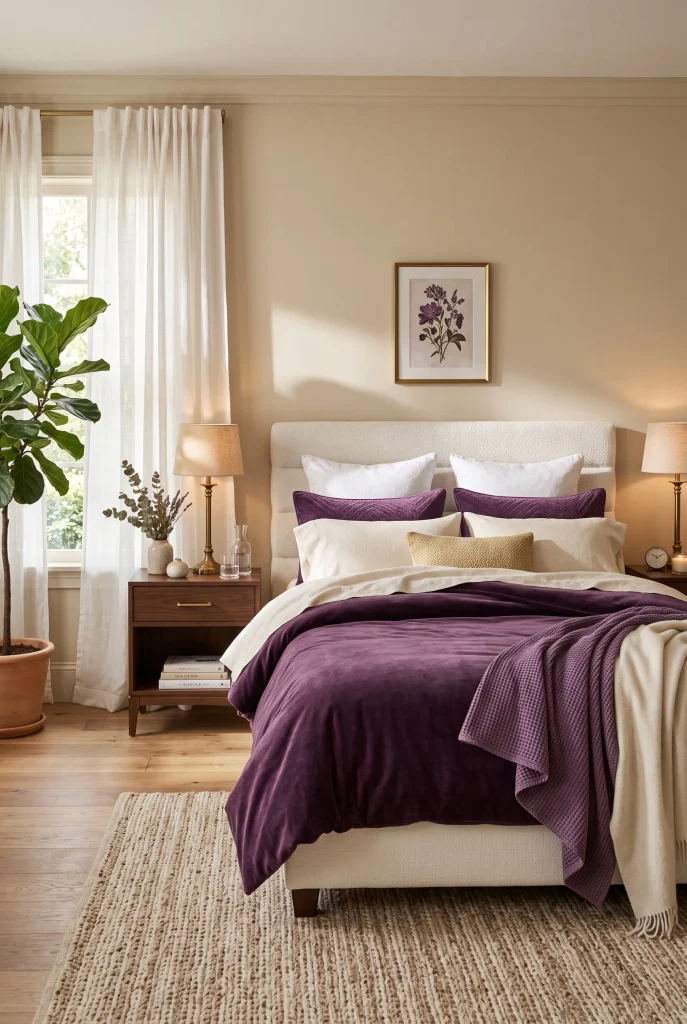
- Amethyst bedding creates a rich focal point without changing the walls.
- Cream layers make the purple feel softer and more approachable.
- Walnut furniture adds warmth and natural contrast.
- Subtle brass details enhance the luxurious color palette.
Amethyst bedding can give a bedroom an instantly richer appearance while keeping the walls and furniture simple. The deep purple becomes the main focal point, especially when layered over a warm white or cream bed frame. Use different fabrics to keep the arrangement from looking flat. Cotton sheets, a textured duvet, velvet cushions, and a soft woven throw can give the bed more dimension. In a jewel tone bedroom, these variations help the color feel rich without becoming overwhelming. The overall effect is cozy and sophisticated, especially when the surrounding room stays within warm neutral tones.
For a balanced palette, pair amethyst with walnut, beige, ivory, and aged brass rather than adding several other saturated colors. This allows the bedding to remain the star while natural materials keep the room from feeling overly styled. If the purple feels too intense in bright daylight, introduce a lighter lavender or dusty mauve cushion to soften the transition. Keep bedside surfaces simple and uncluttered, then use warm lamps to bring out the richness of the fabric at night. The result is colorful, comfortable, and easy to refresh when a seasonal change is wanted.
18. Burgundy Accent Wall
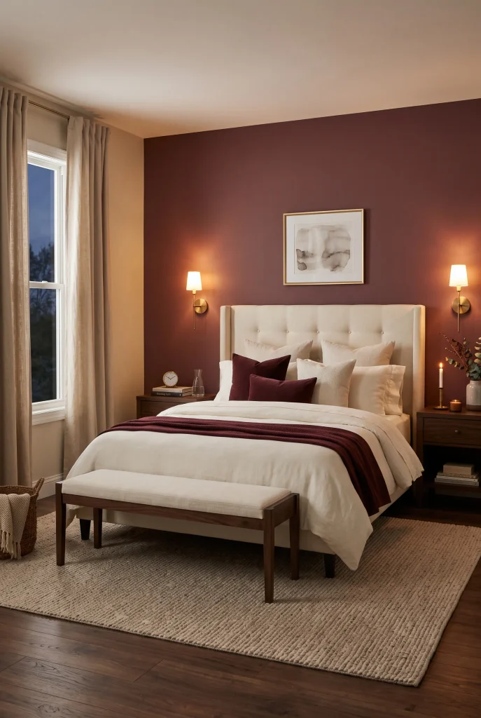
- Burgundy creates a warm and intimate focal wall.
- A muted finish keeps the red sophisticated instead of overly bright.
- Cream bedding creates clean contrast against the darker shade.
- Walnut and brass details reinforce the room’s warm character.
A burgundy accent wall can make a bedroom feel warm, intimate, and dramatically different without requiring a complete redesign. Use the color behind the bed so it naturally becomes the room’s focal point, then keep the remaining walls lighter for contrast. A muted burgundy works particularly well because it has enough depth to feel sophisticated without looking overly bright. Pair it with an upholstered cream headboard and ivory bedding to create a soft transition between the strong wall color and the rest of the room. This simple change can make basic bedroom furniture feel much more intentional.
Warm materials help burgundy feel comfortable rather than heavy. Dark walnut furniture complements the red undertones, while aged brass sconces provide a gentle contrast that looks especially attractive under warm evening light. Keep larger textiles neutral and add only small hints of burgundy through a cushion or folded throw if desired. If the room receives limited daylight, test paint samples at different times before committing because deep reds can change noticeably under artificial lighting. With thoughtful layering, the color can create a cozy retreat while keeping the overall design polished and practical.
19. Peacock Blue Curtains
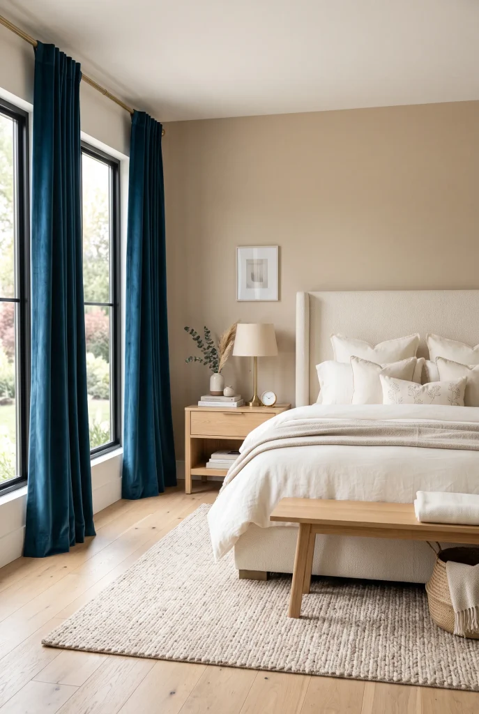
- Peacock blue curtains create a strong vertical color statement.
- Floor-length panels can make the windows and ceiling feel taller.
- Cream bedding balances the saturated blue beautifully.
- Light wood and brass details add warmth to the cooler shade.
Peacock blue curtains can bring rich color into a bedroom while keeping the walls completely neutral. The tall panels naturally draw the eye upward, making the windows feel larger and giving the room a more finished appearance. This is especially useful when a dramatic color change is wanted without painting or replacing major furniture. Pair the curtains with ivory bedding, beige walls, and natural wood so the saturated blue remains the main feature. The result feels polished but still relaxed, especially when the fabric has a soft linen or lightly textured finish.
Choose curtain panels that extend from near the ceiling to the floor whenever the room allows it. This creates a longer visual line and prevents the strong color from looking like a small isolated block. Brushed brass lamps or curtain hardware can introduce warmth, while a neutral rug keeps the lower part of the room visually calm. If the bedroom already contains several bold colors, choose a slightly muted peacock blue rather than a very bright version. One strong textile statement is often enough to transform the space while keeping the overall design balanced.
20. Emerald and Plum Accents

- Emerald and plum create rich contrast without relying on bright colors.
- Neutral bedding gives both jewel tones room to stand out.
- Walnut furniture connects the deeper colors with natural warmth.
- Small repeated accents keep the combination visually cohesive.
Emerald and plum can create a beautifully layered bedroom palette when both colors are used with intention. Instead of assigning one shade to every major surface, choose one as the dominant accent and use the other in smaller details. For example, emerald bedding can be paired with a plum cushion, artwork, or small upholstered piece. Cream walls and ivory textiles create breathing room between the saturated shades. This approach gives the room plenty of color while avoiding the busy feeling that can happen when multiple strong tones are spread across every surface.
Natural materials are particularly helpful when combining two rich colors. Walnut furniture, woven baskets, textured rugs, and linen curtains can soften the contrast and make the room feel more comfortable. Antique brass lighting adds another warm element that works naturally with both emerald and plum. Keep patterns simple and let texture provide most of the visual interest. If the room feels too dark, introduce more cream or warm white through bedding and curtains. A controlled palette like this can feel sophisticated while still remaining practical for an everyday bedroom.
21. Jewel Tone Gallery Wall
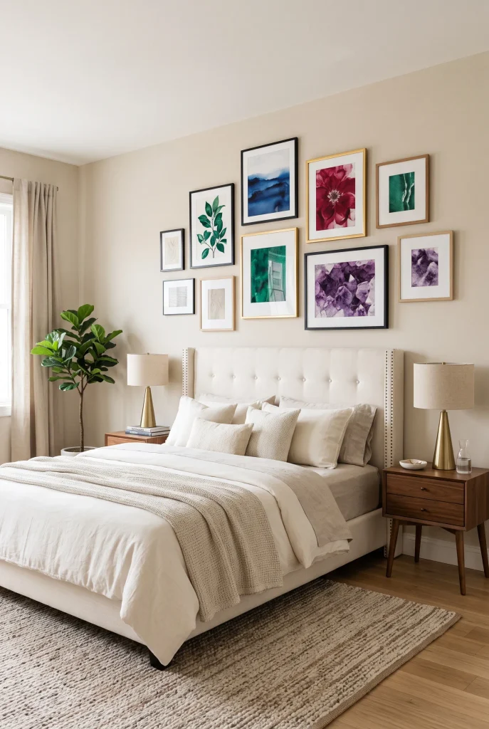
- A gallery wall lets you combine several jewel tones in a controlled way.
- Artwork adds personality without requiring colorful furniture.
- Neutral bedding keeps the collection from overwhelming the bedroom.
- Matching frame finishes can make different colors feel connected.
A jewel tone gallery wall is a flexible way to bring several rich colors into the bedroom without committing to colorful walls or large furniture pieces. Choose artwork featuring shades such as emerald, sapphire, ruby, and amethyst, then arrange the pieces above the bed or along a prominent wall. Keeping the background neutral allows the artwork to provide most of the color. This approach also makes it easier to change the look later because individual prints can be replaced without redesigning the entire room. The finished wall adds personality while giving the bedroom a thoughtfully collected appearance.
For a cohesive display, look for artwork that shares at least one common element, such as similar frame finishes, warm undertones, or repeating colors. Walnut or dark wood frames can complement the deeper palette, while simple brass frames create a slightly more refined effect. Leave consistent spacing between pieces so the arrangement feels intentional rather than crowded. Keep nearby bedding and furniture relatively simple to let the artwork remain visible. Whether you use photography, abstract prints, botanical artwork, or vintage-inspired pieces, the gallery wall can become the final layer that brings the entire colorful bedroom together.
Conclusion
Creating a colorful bedroom does not require a complete makeover. A rich headboard, velvet bench, colorful curtains, layered bedding, or carefully chosen artwork can completely change the atmosphere of a space. These jewel tone bedroom ideas show how deeper colors can work beautifully when balanced with cream, beige, natural wood, soft textiles, and warm lighting. Start with one shade that fits your style and build around it gradually. Save this post on Pinterest for your next bedroom refresh, try an idea that works for your space, and share it with someone looking for colorful bedroom inspiration.