21 Corner Wall Gallery Ideas to Transform Your Space
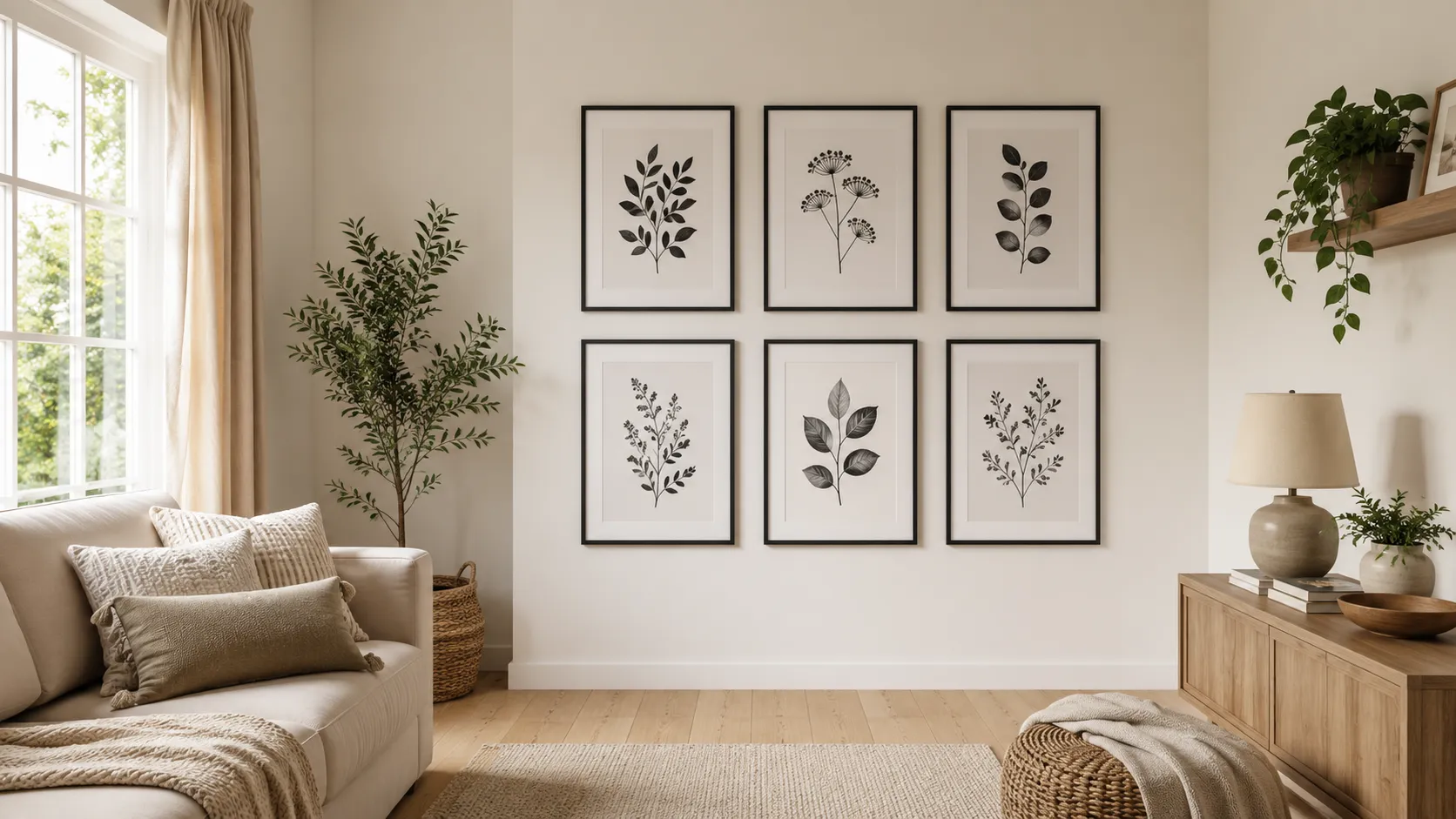
Empty corners can feel awkward, but they also offer a perfect chance to add personality. These Corner Wall Gallery Ideas turn overlooked walls into beautiful, intentional displays. From balanced frames to layered artwork, you’ll find simple ways to make a small or unused corner feel finished and inviting. Whether your style is cozy, modern, vintage, or eclectic, the right arrangement can add depth without overwhelming the room. I’ve noticed that starting with the wall’s size and nearby furniture makes gallery layouts much easier to plan and far more natural in real homes.
1. Corner Frame Grid
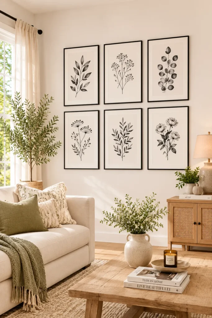
- Creates a clean, organized look without feeling overly busy.
- Even spacing makes the corner feel intentional and polished.
- Black-and-white artwork works beautifully with many color schemes.
- A grid is especially helpful when you prefer symmetry.
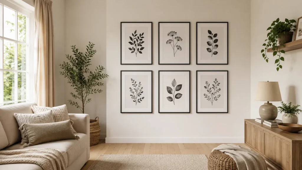
A neat frame grid can turn an awkward corner into a polished focal point almost instantly. Choose six or eight similarly sized frames and arrange them in straight rows with consistent spacing between each piece. Black-and-white photographs, botanical prints, or simple line drawings keep the display cohesive while allowing the surrounding furniture to remain visible. In my experience, measuring the wall before hanging anything makes this layout much easier to balance. Keep the outer edges aligned and leave enough breathing room around the collection so the corner feels decorated rather than crowded or visually heavy.
This arrangement works especially well beside sofas, reading chairs, consoles, or narrow entryway furniture because its structured shape adds definition without taking over the room. For a softer result, use light wood or white frames instead of black ones, then coordinate the artwork with nearby cushions, rugs, or curtains. If your corner receives strong daylight, matte prints can reduce distracting glare. You can also create a similar effect with inexpensive frames and printable artwork, making this one of the most approachable gallery wall solutions for renters or anyone decorating on a budget.
2. Layered Picture Ledge
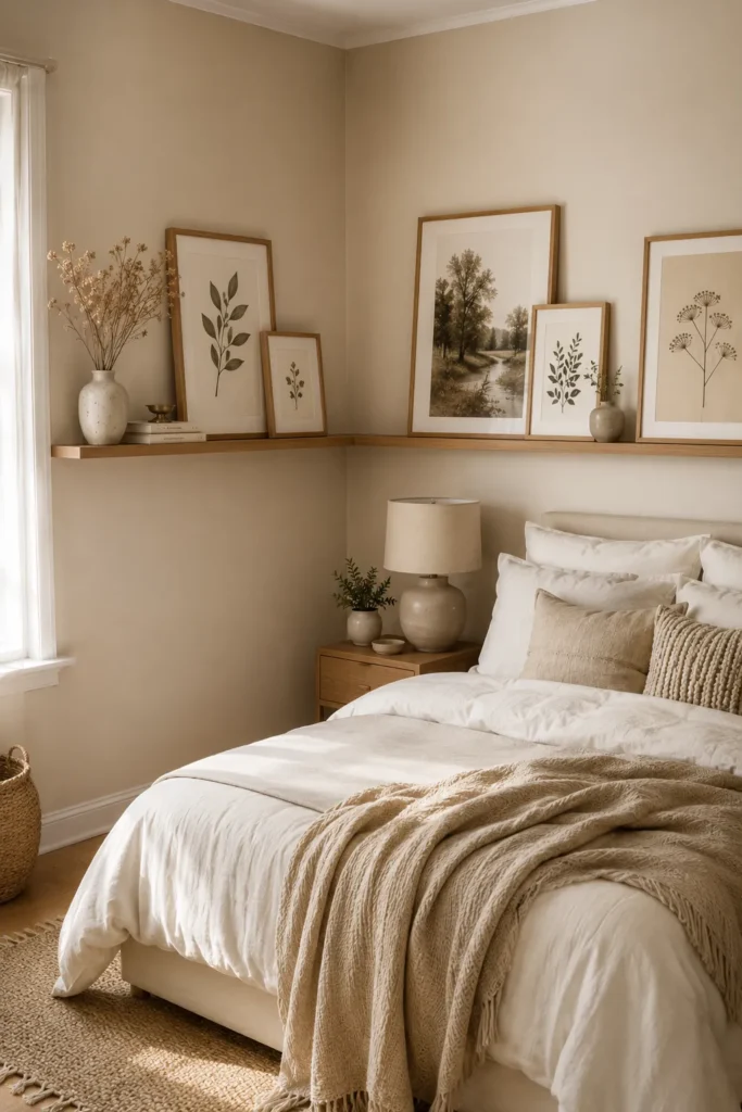
- Adds depth by combining artwork with small decorative objects.
- Picture ledges make changing seasonal displays simple.
- Layered frames create a relaxed look without strict symmetry.
- Natural wood can warm up plain or cool-toned walls.
A picture ledge brings an easygoing gallery feel to corners where a traditional frame arrangement might look too rigid. Instead of hanging every piece individually, place a narrow wooden shelf across the wall and lean several frames against it at different heights. Add a small vase, a few books, or a simple ceramic object to break up the artwork. This approach makes the display feel collected rather than perfectly planned. It is also practical because you can rearrange the pieces whenever your room changes, without creating a new set of holes in the wall.
For a cohesive result, repeat one or two colors from the room throughout the artwork and accessories. Warm oak looks especially inviting with cream, beige, terracotta, or muted green accents, while white shelves suit brighter contemporary spaces. Keep larger frames toward the back and smaller pieces toward the front so each layer remains visible. I’ve seen this technique work particularly well in bedrooms and living rooms because it adds personality while keeping the overall arrangement relaxed. If the corner is narrow, choose a shallow ledge so the display does not interfere with movement.
3. Eclectic Art Cluster
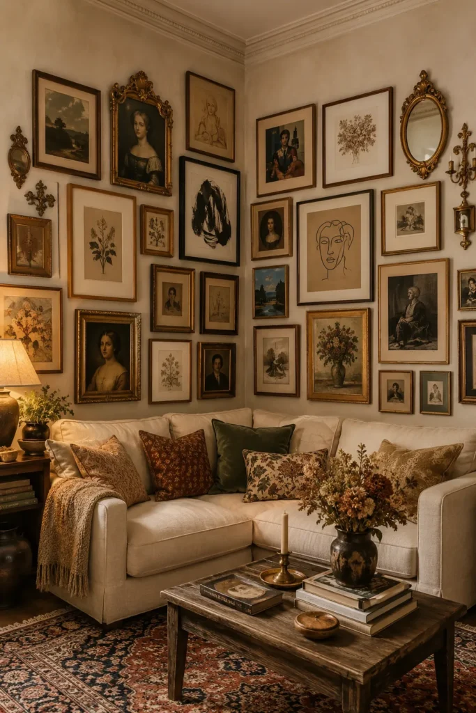
- Mixing frame styles gives the corner a collected personality.
- Different artwork sizes make the arrangement feel dynamic.
- Repeating colors keeps an eclectic display visually connected.
- Vintage pieces can add character to otherwise plain walls.
An eclectic art cluster is perfect when you want your corner to feel personal instead of perfectly coordinated. Mix different artwork sizes, frame materials, and visual styles, then connect everything with a small shared color palette. For example, vintage portraits, abstract sketches, botanical illustrations, and family photographs can work together when they include touches of cream, brown, black, or muted green. Start with your largest artwork and build outward from it, leaving irregular but intentional gaps. The result feels relaxed, layered, and collected, especially when the surrounding furniture has similarly warm or lived-in textures.
The secret is giving the arrangement enough visual connection to avoid looking random. Try repeating one frame material several times, or choose artwork that shares similar tones even when the subjects differ. You can also extend the cluster around the corner slightly so the two walls feel connected rather than separate. This technique is particularly useful for apartments, older homes, or rooms with plain walls that need more character. Instead of buying everything at once, collect pieces gradually from thrift stores, family collections, travel memories, or affordable art prints that genuinely reflect your taste.
4. Black Frame Gallery
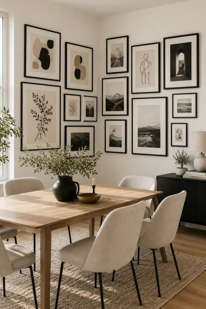
- Black frames create strong definition against light walls.
- Monochrome artwork keeps the arrangement sophisticated and cohesive.
- Matching frames make different artwork styles feel connected.
- This look works especially well in modern or transitional rooms.
Black frames can give a simple corner an instant sense of structure and contrast. Choose several frames in the same finish and fill them with monochrome photography, abstract line art, or simple botanical prints. The repeated dark border creates a visual thread between different images, helping the entire arrangement feel intentional. For lighter rooms, place the gallery against warm white, cream, or pale beige walls so the frames stand out clearly. I’ve noticed that keeping the artwork relatively simple prevents black frames from making a small corner feel too visually heavy.
This style works particularly well behind a dining table, beside a sofa, or above a compact console where you want the wall to become a defined focal point. Keep the spacing consistent if you prefer a polished appearance, or vary the frame sizes slightly for a softer arrangement. If your room already has black accents, repeat them through lighting, furniture legs, hardware, or small accessories to create balance. A few carefully chosen pieces usually look stronger than filling every available inch, so leave some breathing room around the outer edges of the display.
5. Botanical Print Mix
- Botanical artwork introduces a natural feeling without requiring live plants.
- Green and earthy tones create a calm visual connection.
- Mixing leaf shapes keeps the collection interesting.
- Natural frames complement wood, rattan, and woven textures beautifully.
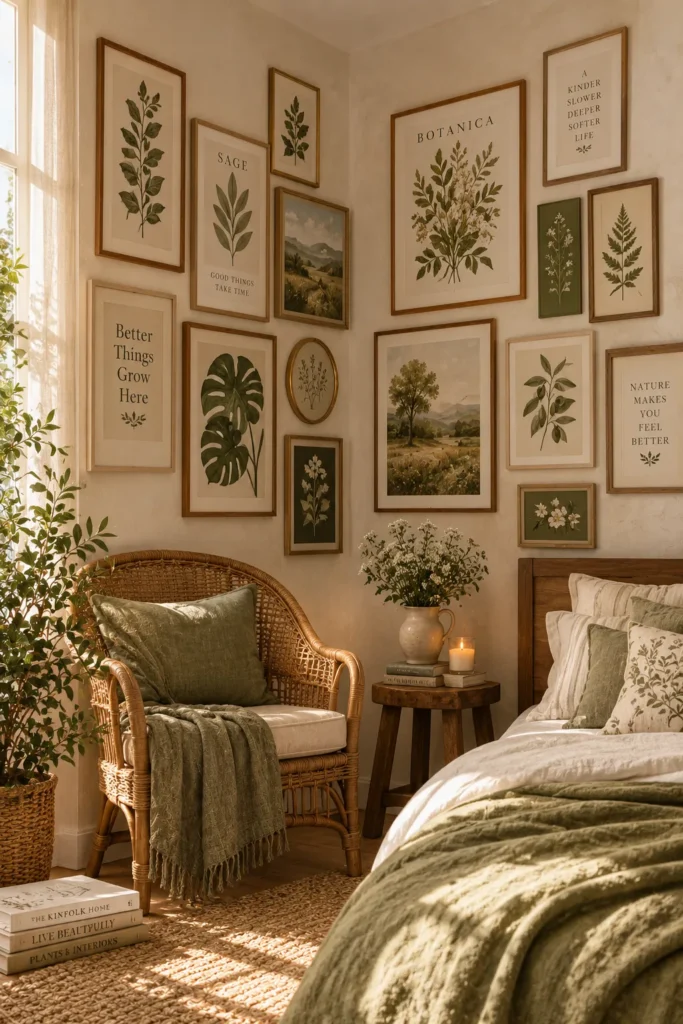
Bring a fresh, nature-inspired feeling to an empty corner with a collection of botanical prints. Choose leaves, herbs, flowers, or delicate branches in shades of sage, olive, cream, and muted brown. The artwork can be arranged symmetrically for a refined look or mixed in different sizes for a more relaxed display. This idea works especially well when a room already includes wood, rattan, linen, or woven textures because the natural imagery reinforces those materials. Even without many real plants, the wall can create a softer connection to nature and make the room feel more inviting.
For the most cohesive result, repeat colors from the botanical prints in nearby textiles or accessories. A sage cushion, beige rug, or wooden side table can quietly connect the artwork to the rest of the room. Natural wood frames are ideal for warm interiors, while white frames can make the display feel lighter and more contemporary. If the corner is small, choose delicate illustrations rather than dense, dark foliage. In my experience, botanical prints are particularly forgiving because their organic shapes remain visually interesting even when the spacing is not perfectly uniform.
View: 25 Cottagecore Bedroom Decorating Ideas to Try Today
6. Photo Memory Wall
- Personal photographs make the gallery feel meaningful and unique.
- Mixing family and travel photos creates visual variety.
- Warm frame tones make memories feel even more inviting.
- A consistent photo filter can make different images look cohesive.
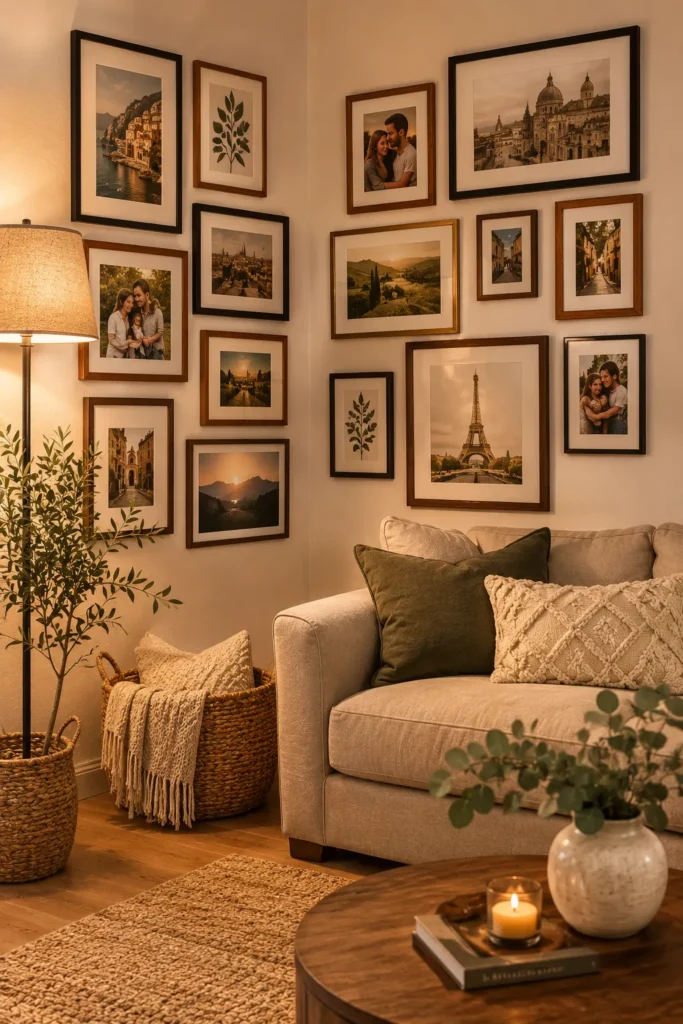
Turn an unused corner into a collection of moments with a personal photo memory wall. Combine family portraits, travel photographs, celebrations, pets, or everyday snapshots that carry genuine meaning. Rather than choosing only professionally photographed images, include candid moments because they often give the display more personality. Use similar editing tones or warm filters to make photographs from different years feel visually connected. Arrange larger portraits toward the center and smaller memories around them, creating a natural focal point. The finished display becomes more than decoration because it tells a story that belongs specifically to your home.
Frame colors can help determine whether the gallery feels modern, rustic, or traditional. Walnut and natural wood frames create warmth, while black frames give photographs a cleaner contemporary appearance. Leave enough space between each frame so individual images remain easy to appreciate. If you frequently update family photographs, consider using frames with simple front-opening designs that make swapping pictures convenient. This approach works beautifully in hallways, stair corners, bedrooms, and living areas because it transforms unused wall space into something personal. I’ve found that meaningful images also make these displays much more enjoyable to revisit over time.
7. Asymmetrical Frame Arrangement
- Uneven frame placement creates movement and visual interest.
- Different sizes make the corner feel collected rather than rigid.
- A shared color palette keeps the arrangement from looking chaotic.
- This layout works well around furniture with irregular proportions.
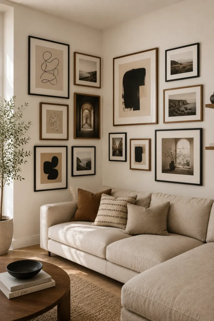
An asymmetrical arrangement can make a corner feel artistic without requiring perfectly matching frames or equal spacing. Start with one larger piece as the visual anchor, then place smaller artwork around it at different heights. The uneven edges create movement and naturally draw the eye across both walls. Choose artwork with related colors, subjects, or textures so the collection still feels connected. In my experience, laying every frame on the floor first makes it easier to adjust the balance before hanging anything. This simple step can prevent an arrangement from feeling accidentally lopsided.
This layout is especially useful when furniture already has an uneven shape, such as a corner sofa, tall plant, or floor lamp. Instead of forcing a rigid grid above it, let the artwork follow the room’s natural lines. Keep heavier-looking frames closer to the center and use smaller pieces toward the outer edges to maintain visual balance. You can also leave slightly larger gaps between certain pieces to create breathing room. The result feels relaxed and modern while giving you more freedom to add new artwork later without rebuilding the entire gallery.
8. Vintage Corner Collection
- Vintage frames instantly add character to plain walls.
- Antique artwork brings warmth and history into the room.
- Brass, wood, and distressed finishes create rich visual texture.
- Mixing old and new pieces keeps the corner from feeling dated.
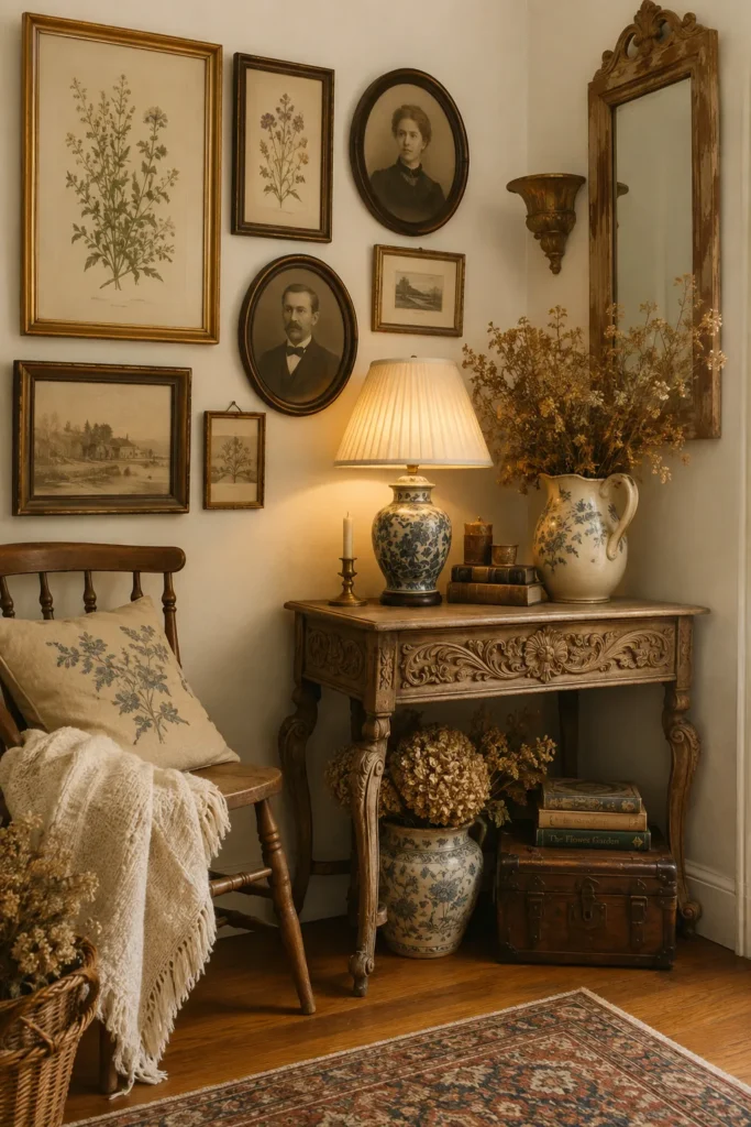
Give an overlooked corner a sense of history with a vintage-inspired collection of artwork and frames. Look for antique portraits, botanical illustrations, old maps, delicate sketches, or faded artwork in brass, walnut, and distressed wood frames. The slightly varied finishes make the display feel collected over time rather than purchased as one matching set. Keep the surrounding palette soft with cream, beige, muted green, or warm brown tones. This allows the aged artwork to become the focal point while maintaining a calm and welcoming atmosphere throughout the room.
A vintage gallery does not need to contain genuinely antique pieces to achieve the look. Reproduction prints, thrifted frames, and family photographs can create a similar layered effect when combined thoughtfully. Place the most detailed artwork near the center and use quieter prints around it to prevent visual competition. Nearby furniture can reinforce the style through materials such as oak, cane, linen, or aged metal. I’ve seen this approach work particularly well in bedrooms and entryways because the combination of soft colors and aged details makes otherwise forgotten corners feel warm, lived-in, and intentional.
9. Minimalist Line Art
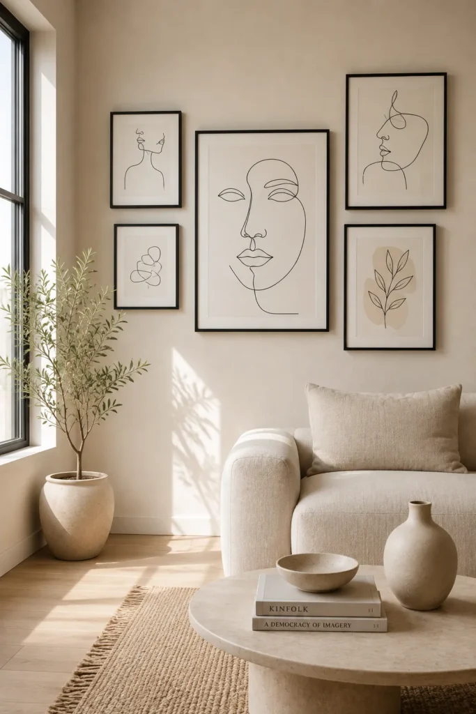
- Simple line drawings keep the corner visually light.
- Thin frames add definition without overwhelming a small space.
- Neutral artwork works with many existing decor styles.
- Fewer pieces can create a sophisticated finished look.
Minimalist line art is an easy way to decorate a corner without making it feel crowded. Choose simple drawings of faces, figures, leaves, arches, or abstract shapes and display them in thin black, white, or natural wood frames. The limited detail keeps the wall visually calm while still giving it personality. This approach is especially useful for small apartments, narrow corners, or rooms where furniture already provides plenty of visual interest. Use a restrained palette of black, cream, beige, and soft gray to create a clean connection between the artwork and surrounding decor.
Spacing becomes particularly important with minimalist displays because empty areas are part of the design. Keep generous gaps between frames so each drawing has room to breathe, and avoid adding too many decorative objects nearby. A simple ceramic vase, small plant, or sculptural lamp can complement the arrangement without competing with it. If the room has warm wood furniture, natural frames can soften the artwork, while black frames create sharper contrast. The finished corner feels intentional and sophisticated, proving that a gallery wall does not need dozens of pieces to make a noticeable impact.
10. Mixed Frame Gallery
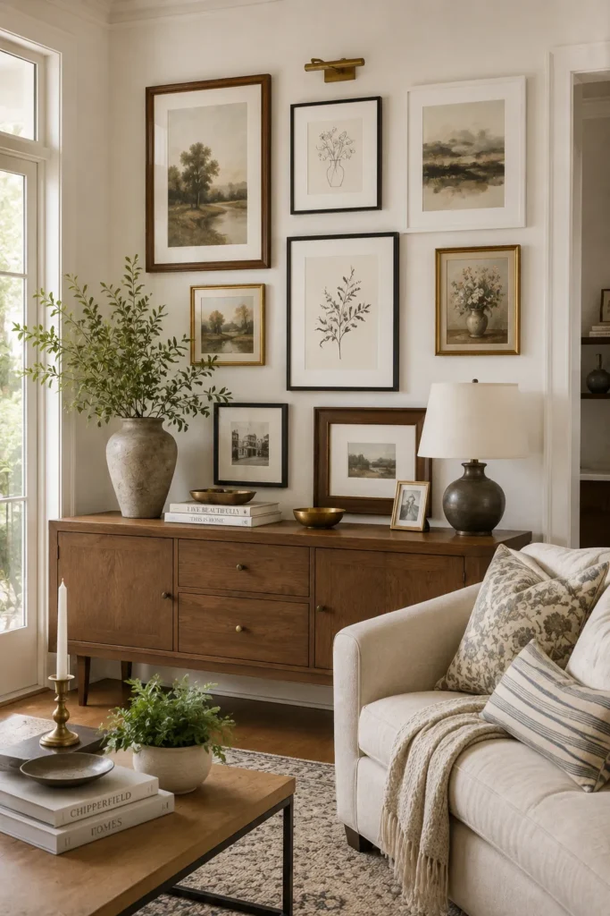
- Mixing frame finishes adds depth without changing the artwork.
- Repeating one or two colors keeps varied frames cohesive.
- Different frame widths create subtle visual texture.
- This approach is ideal for collected, lived-in interiors.
A mixed-frame gallery gives your corner a layered look while allowing you to use pieces you already own. Combine walnut, black, white, brass, or distressed frames, then connect them through the artwork’s colors. For example, neutral prints can easily bridge warm wood and dark metal frames. Start by choosing one dominant frame finish and use the others as accents rather than giving every material equal attention. This keeps the display visually balanced. I’ve noticed that repeating one frame color at least twice helps an eclectic collection feel intentional instead of accidentally mismatched.
The arrangement can be symmetrical or relaxed depending on your room and personal style. Place larger frames toward the middle, then use smaller pieces to fill the surrounding spaces without creating a perfectly even border. If your corner already contains mixed materials, such as wood furniture and metal lighting, echo those finishes in the gallery. This creates a subtle connection throughout the room. For renters or budget decorators, mixing existing frames can also reduce costs because you do not need to replace everything. The result feels personal, flexible, and naturally collected over time.
11. Neutral Art Display
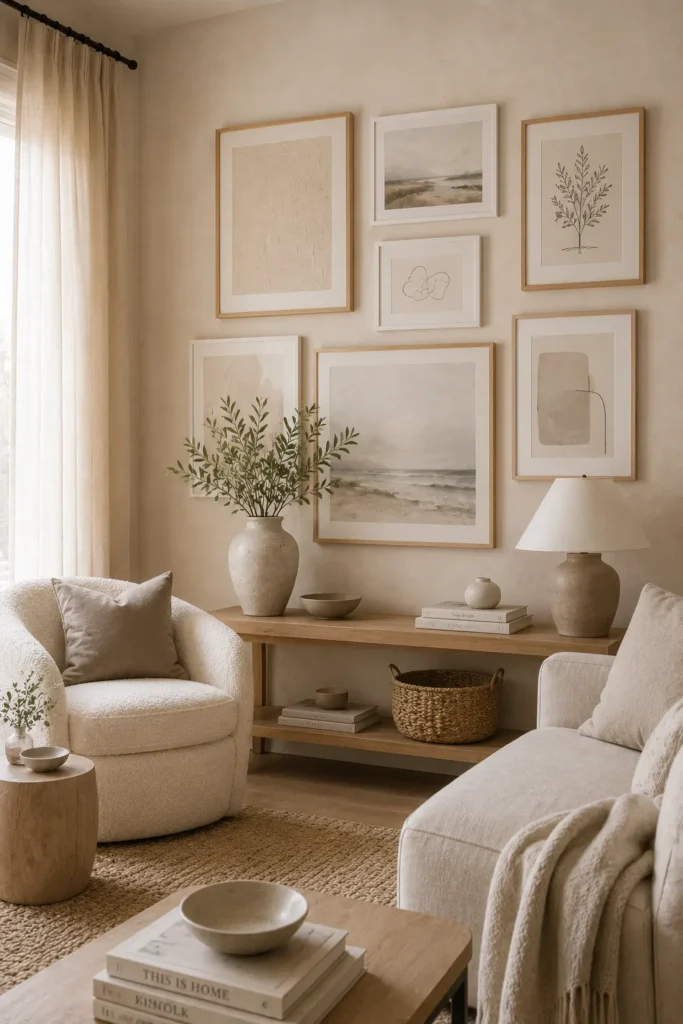
- Neutral artwork creates a peaceful, uncluttered atmosphere.
- Soft colors make small corners appear visually lighter.
- Textured prints prevent a neutral display from feeling flat.
- Light wood frames add warmth without strong contrast.
A neutral art display can make a corner feel finished while preserving a calm, airy atmosphere. Choose artwork in cream, beige, taupe, soft gray, warm white, or muted brown, then pair it with light wood or white frames. Abstract shapes, subtle landscapes, textured prints, and simple architectural drawings work particularly well. Because the palette is restrained, the display blends naturally with existing furniture instead of demanding attention. This makes it a strong choice for bedrooms, living rooms, and minimalist homes where you want decoration without introducing another strong color into the overall space.
To keep a neutral gallery from looking flat, combine different textures and levels of contrast. A linen-textured print can sit beside a soft abstract painting or a simple black-and-cream sketch. Repeat nearby materials through cushions, rugs, curtains, or ceramics to create a cohesive layered effect. Natural daylight will highlight subtle differences between the tones, while warm evening lighting can make the corner feel especially cozy. In my experience, neutral galleries are also easy to refresh because seasonal accessories can change around them without making the artwork feel out of place.
12. Corner Mirror Gallery
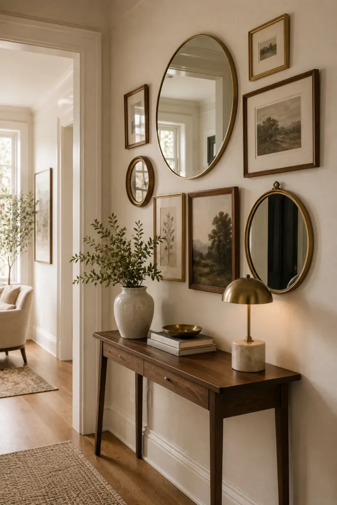
- Mirrors can make a tight corner feel brighter and more spacious.
- Mixing reflective pieces with artwork adds visual variety.
- Different mirror shapes create a playful layered composition.
- Warm frames help reflective surfaces feel softer and more inviting.
A mirror gallery can turn an overlooked corner into a brighter, more dimensional feature. Mix small round, oval, arched, or rectangular mirrors with a few framed artworks to create a display that feels decorative and functional. Position mirrors where they can reflect a window, lamp, or attractive part of the room rather than a cluttered area. This helps bounce light around the space while giving the wall greater depth. The combination of reflective surfaces and artwork also creates more visual movement than a standard collection of framed prints.
Choose mirror frames that coordinate with the room’s existing finishes, such as brass with warm lighting or walnut with wooden furniture. Keep the largest reflective piece near the center, then build outward with smaller mirrors and artwork. Avoid placing every mirror at exactly the same height because varied shapes make the arrangement feel more natural. This idea is particularly useful in hallways, entry corners, and compact apartments where light can be limited. A few strategically positioned mirrors can make the area feel more open while still functioning as an attractive decorative feature.
13. Floating Shelf Gallery
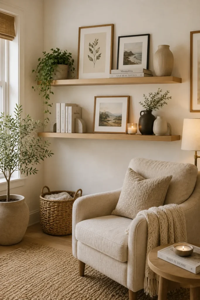
- Floating shelves add storage and artwork in one simple feature.
- Layered objects create more depth than flat frames alone.
- Shelves make it easy to refresh the display seasonally.
- Small corners benefit from their vertical, space-saving design.
A floating shelf gallery combines wall art with practical display space, making it especially useful in smaller rooms. Install one or two slim shelves vertically in the corner, then layer framed prints with small ceramics, books, candles, or a trailing plant. Keep the shelves relatively shallow so they do not interfere with movement around the room. Choose wood for warmth or white for a cleaner appearance. The layered arrangement gives the wall dimension while keeping your favorite decorative pieces visible. It is an easy way to make a plain corner feel designed without filling the entire wall.
For a balanced display, vary the heights and shapes of the objects rather than lining everything up evenly. Lean larger artwork toward the back and place smaller frames or accessories in front. Leave some open shelf space so the arrangement does not become visually crowded. If you enjoy changing your decor, this setup is particularly convenient because seasonal prints, flowers, books, and small accents can be swapped without rehanging anything. I’ve noticed that using fewer, larger objects often makes floating shelves look more polished than filling every available inch with small decorations.
14. Colorful Abstract Cluster
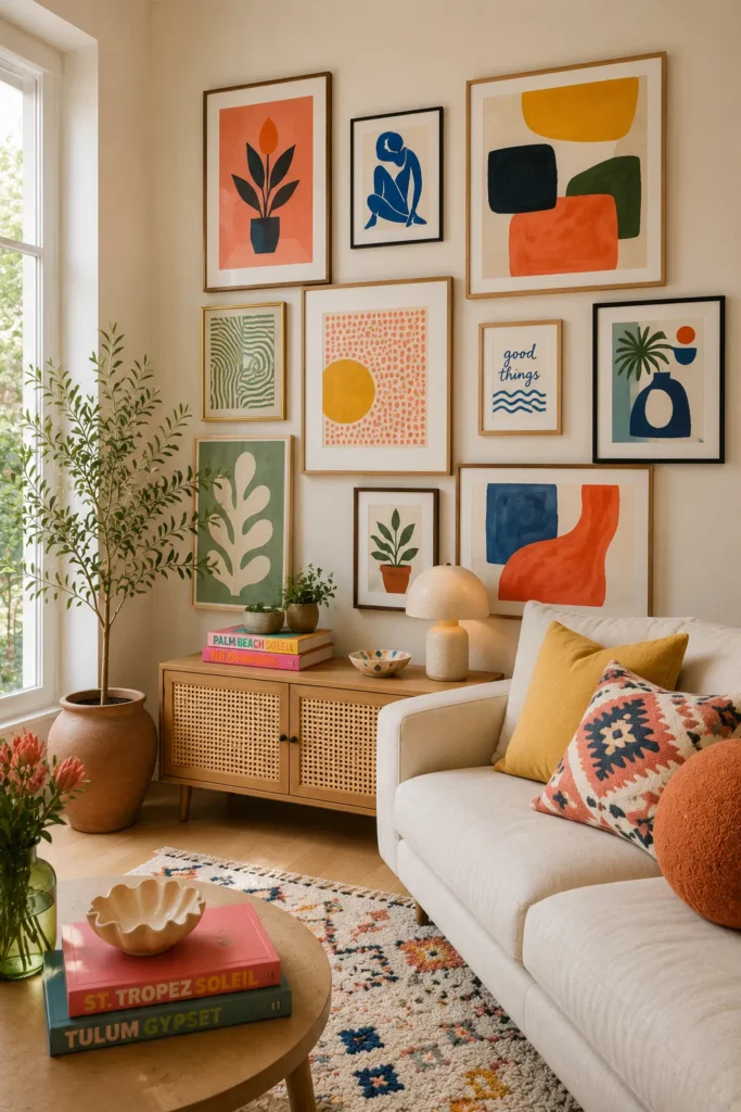
- Bold artwork can instantly energize a quiet corner.
- Repeating accent colors creates visual connection across different prints.
- Neutral furniture allows colorful pieces to stand out.
- Abstract shapes add movement without needing a specific theme.
Bring personality into a plain corner with a cluster of colorful abstract artwork. Look for prints or paintings featuring two to four repeating shades, such as terracotta, mustard, sage, blue, coral, or cream. The artwork does not need to match exactly; repeating a few colors is enough to make the collection feel connected. Start with the most prominent piece and arrange smaller works around it. Against a neutral wall and furniture, these stronger tones become an instant focal point without requiring additional bold accessories throughout the room.
The key is controlling the amount of color so the corner feels energetic rather than overwhelming. If the artwork contains several bright shades, keep the surrounding furniture and textiles relatively neutral. You can repeat one accent color in a cushion, vase, rug detail, or small decorative object to connect the display with the rest of the room. This idea works especially well in contemporary, bohemian, and eclectic interiors where personality matters more than perfect symmetry. A colorful gallery can also make a small corner feel intentional by giving the eye a clear area to explore.
15. Black-and-White Photos
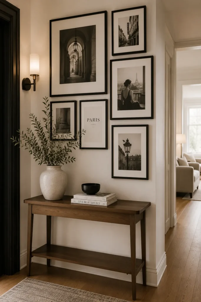
- Black-and-white photos create an instantly cohesive collection.
- Architectural images add structure to a simple corner.
- Matching black frames give the display a polished finish.
- Neutral photography works with both modern and classic interiors.
Black-and-white photography is one of the easiest ways to create a cohesive gallery without worrying about clashing colors. Choose photographs with different subjects, such as architecture, landscapes, portraits, streets, or everyday details, then use matching black frames to unify them. The absence of color allows differences in composition and subject matter to become the focus. Arrange the larger images near the center and smaller photographs around them for a relaxed cluster, or use equal-sized frames in rows for a more structured appearance.
This style is especially effective in hallways, dining areas, offices, and living rooms because it adds sophistication without competing with colorful furniture or textiles. If your room already contains several finishes, black-and-white photography can act as a visual reset. Use a white mat inside each frame when you want a lighter, gallery-like appearance. For a warmer result, choose slightly off-white mats and pair the display with walnut furniture. I’ve seen this approach work beautifully in homes where the owners want meaningful photographs on display but still prefer a clean, coordinated interior.
16. Oversized Statement Art
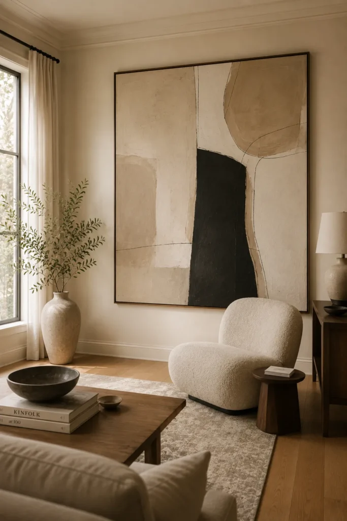
- One large artwork creates impact without needing many frames.
- Oversized pieces can visually anchor an empty corner.
- Neutral artwork keeps the statement sophisticated and versatile.
- A large frame works especially well above low furniture.
An oversized artwork can completely change the presence of an otherwise forgotten corner. Instead of filling the wall with many small frames, choose one large painting, photograph, or abstract print that becomes the main visual anchor. Look for artwork that complements the room’s existing palette rather than competing with it. A neutral abstract in cream, beige, charcoal, or muted earth tones can add sophistication while remaining easy to style. Position the piece above a console, chair, or low cabinet so the artwork feels connected to the furniture below.
Scale matters more than quantity with this approach. The artwork should feel substantial enough to balance the wall, but it should not extend so far that the corner feels cramped. Leave comfortable space around the frame and avoid placing too many accessories underneath it. If the room is small, a large piece with a simple design can actually feel cleaner than several tiny frames. In my experience, oversized art is particularly effective when the rest of the decor stays restrained, allowing one strong visual element to give the corner purpose and definition.
17. Arched Frame Collection
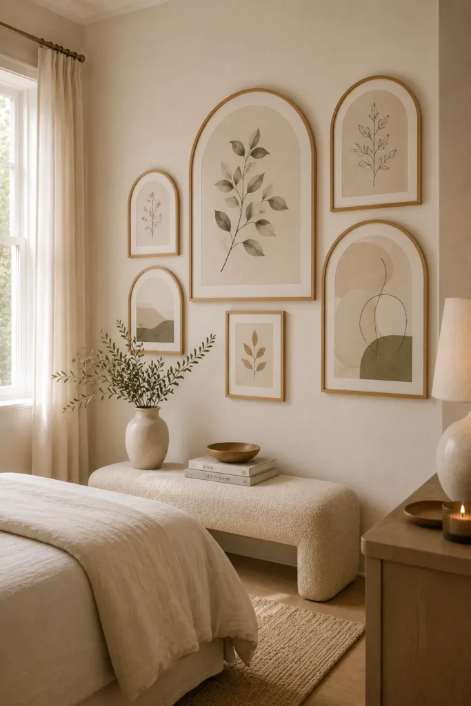
- Arched frames soften the hard lines of square furniture.
- Repeating curved shapes create a subtle design theme.
- Neutral artwork keeps the arrangement light and elegant.
- Rounded details can make compact corners feel more welcoming.
Arched frames introduce softer shapes into a room filled with straight lines. Combine several rounded frames containing botanical prints, abstract artwork, photographs, or simple illustrations to create a gentle gallery effect. The repeated curved silhouettes give the display a clear identity without requiring identical artwork. Light oak, cream, or white frames work beautifully with soft interiors, while darker frames can provide stronger contrast. Place the frames close enough to feel connected but leave consistent breathing room between them so the rounded shapes remain easy to appreciate.
This idea works particularly well near curved furniture, arched mirrors, rounded lamps, or other organic forms already present in the room. If your furniture is mostly rectangular, the gallery can provide a welcome visual contrast. Keep the artwork relatively simple because the unusual frame shapes already create interest. You can also combine one larger arch with two smaller pieces for a more relaxed arrangement. The finished display feels softer and more contemporary than a traditional rectangular gallery, making it a useful option for bedrooms, reading corners, entryways, and cozy sitting areas.
18. Layered Corner Frames
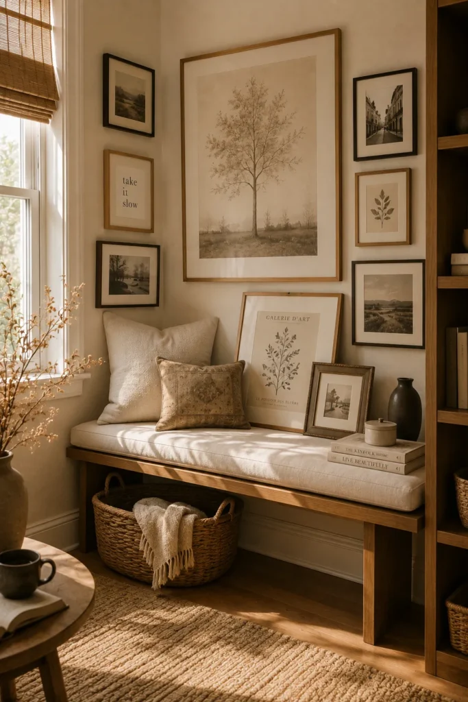
- Layering creates depth without requiring a perfectly flat arrangement.
- Leaning frames make artwork easy to change or rearrange.
- Different sizes give the corner a relaxed collected appearance.
- This method works well for renters avoiding multiple wall holes.
Layered frames create a relaxed gallery look by combining wall-mounted pieces with artwork that leans against shelves, consoles, or furniture. Start with one larger frame as your anchor, then overlap smaller pieces slightly in front of it. The controlled layering adds depth and makes the corner feel more casual than a traditional hanging arrangement. Choose artwork with related colors or subjects so the pieces still look connected. This setup is particularly useful when you want a decorative display that feels collected rather than perfectly measured and symmetrical.
You can adapt the idea to almost any room by changing the materials and artwork style. Natural wood frames suit cozy bedrooms and cottage-inspired spaces, while black or metal frames create a sharper contemporary effect. Keep heavier frames securely supported and avoid placing fragile pieces where they could easily be knocked over. A nearby shelf or console gives you a stable surface for leaning artwork and small decorative objects. I’ve noticed that layered displays are also easier to update because adding one new piece rarely requires completely rearranging the existing composition.
19. Gallery With Greenery
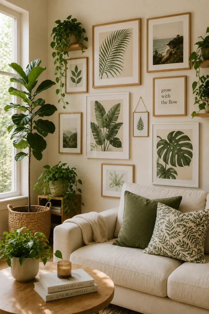
- Greenery softens the straight lines of framed artwork.
- Plants add natural color without requiring colorful prints.
- Varying plant heights create depth around the gallery.
- Natural materials make the entire corner feel warmer.
Pair framed artwork with greenery to create a corner that feels fresh, layered, and naturally inviting. Start with a small collection of botanical prints, abstract pieces, or neutral photographs, then position plants around the display rather than directly in front of it. A tall floor plant can anchor one side while a smaller tabletop plant or trailing vine fills another area. Choose planters in ceramic, woven, terracotta, or natural wood finishes to complement the frames. The combination creates contrast between organic shapes and the clean lines of the artwork.
The amount of greenery should match the size of the room and the available natural light. In a compact corner, one tall plant and one smaller plant may be enough to create the desired effect. If sunlight is limited, choose suitable low-light plants or use realistic faux greenery instead. Repeat natural materials through baskets, wooden furniture, or woven rugs to make the display feel connected. This arrangement works especially well in living rooms, bedrooms, and home offices because plants add softness while the artwork provides structure, giving the corner both personality and visual balance.
20. Gallery Around a Console
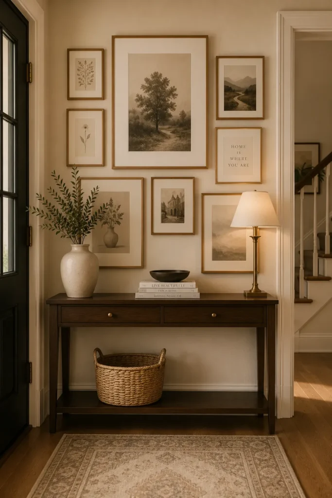
- A console gives the gallery a strong visual foundation.
- Artwork and furniture feel more connected when arranged together.
- Small accessories can reinforce colors from the wall display.
- This setup works beautifully in entryways and living rooms.
A console table can transform an empty corner into a complete decorative zone when paired with carefully arranged artwork. Hang a gallery above the console, keeping the overall width visually connected to the furniture below. Then add a few simple accessories such as a lamp, ceramic vase, stacked books, or small plant. The furniture anchors the wall display and makes the entire arrangement feel intentional. Choose artwork that complements the console’s finish, whether that means warm wood, painted white, black metal, or a combination of materials.
Keep the console surface relatively uncluttered so the artwork remains the main attraction. One tall object, one low accessory, and a small decorative piece are often enough to create balance. If the corner is narrow, select a slim console with minimal depth to preserve walking space. In my experience, this combination is particularly useful in entryways because it provides both decoration and a practical place for everyday items. A mirror can also be included if you want additional light reflection, but avoid adding so many elements that the corner loses its clean visual structure.
21. Travel-Inspired Gallery
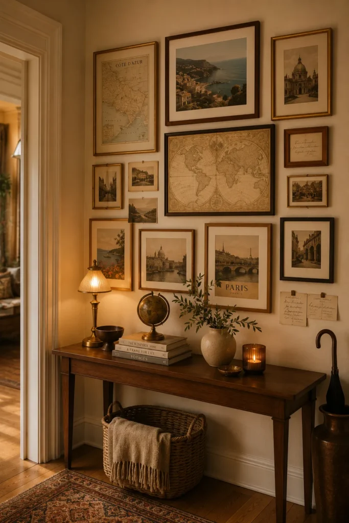
- Travel memories give the gallery a personal story.
- Maps and photographs create varied shapes and subjects.
- Warm frames make the collection feel collected over time.
- This idea works well for meaningful, personalized interiors.
Turn your favorite journeys into a visual collection with a travel-inspired gallery. Combine destination photographs, vintage postcards, maps, architectural prints, or small souvenirs displayed in frames. Choose memories that share a few colors so the arrangement feels cohesive even when the subjects are completely different. Warm walnut, brass, or natural wood frames can reinforce the collected character. Instead of arranging everything perfectly, allow the pieces to vary in size and orientation. The result feels personal and authentic, giving an empty corner a story that reflects places and experiences meaningful to you.
You do not need dozens of travel memories to create this look. Start with three to five meaningful pieces and gradually add more as you collect new photographs or keepsakes. A small console beneath the gallery can hold travel books, a ceramic souvenir, or a simple decorative object. Keep the display organized enough that individual memories remain easy to appreciate. This style works especially well in hallways, home offices, and living spaces because it naturally encourages conversation. I’ve found that personal galleries often feel more timeless than trend-driven decor because their meaning continues long after the decorating project is finished.
Conclusion
Small wall spaces can make a big difference when you use them thoughtfully. These Corner Wall Gallery Ideas give you practical inspiration for mixing frames, artwork, photographs, and decorative accents without making the area feel crowded. Choose one idea that fits your room, then adapt the colors, spacing, and frame sizes to suit your style. In my experience, even a simple arrangement can make an overlooked corner feel intentional and complete. Save this post on Pinterest, try your favorite layout, and share it with someone who is ready to give an empty wall a fresh new look.