24 Elegant Neutral Color Palette for Living Room Ideas
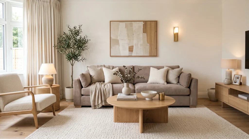
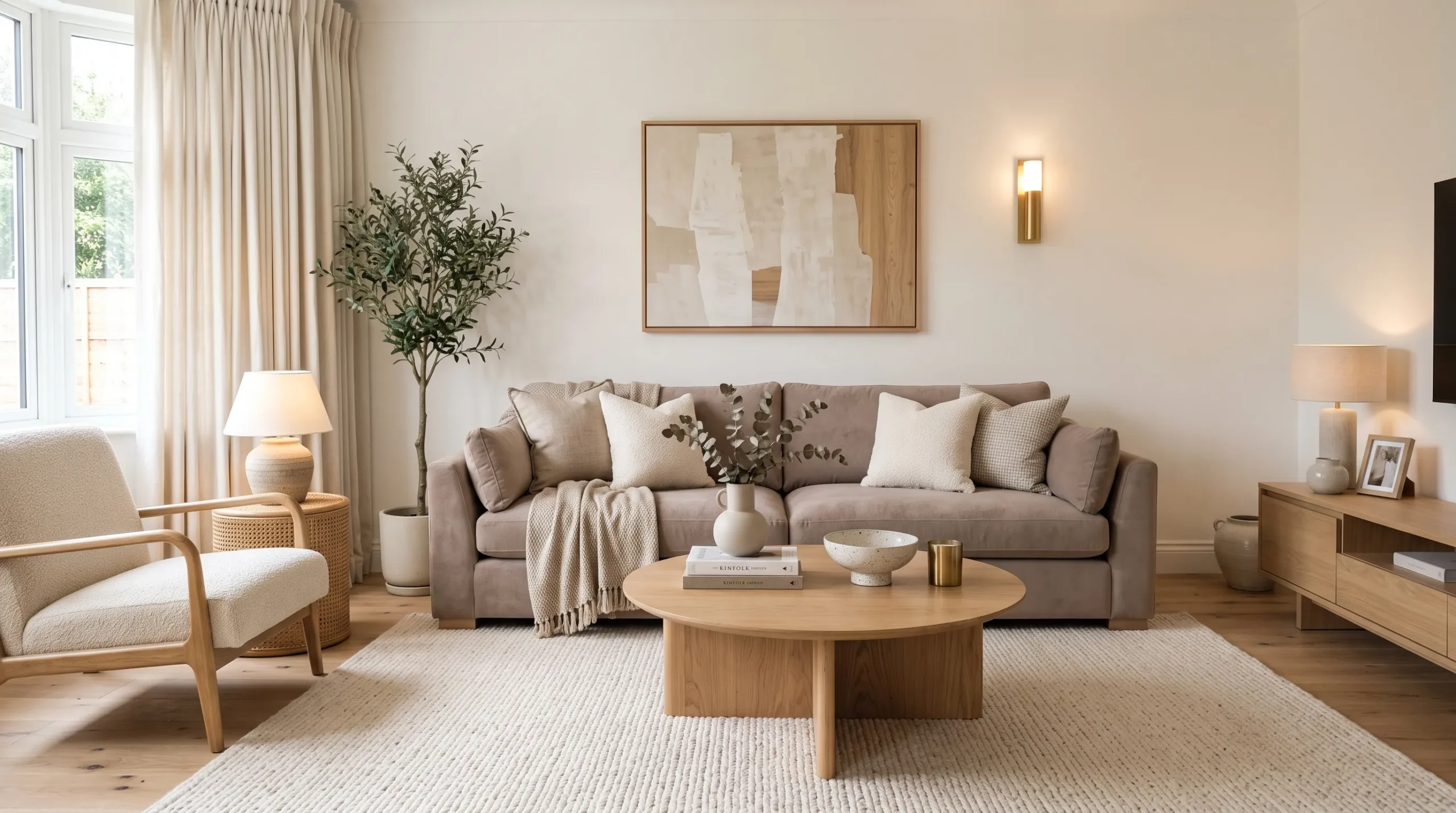
A beautiful living room doesn’t need bold colors to make a lasting impression. Sometimes, the softest shades create the most elegant spaces. A neutral color palette for living room design can bring warmth, balance, and a timeless feel while giving you plenty of freedom to personalize your home. From creamy ivory and warm beige to sophisticated greige, taupe, and natural wood, the right combination can completely change how your space looks and feels. In my experience, layering neutral shades with different textures makes a room feel finished without looking crowded. These 24 ideas will help you create a calm, stylish living room that feels welcoming every day.
1. Soft Taupe Seating
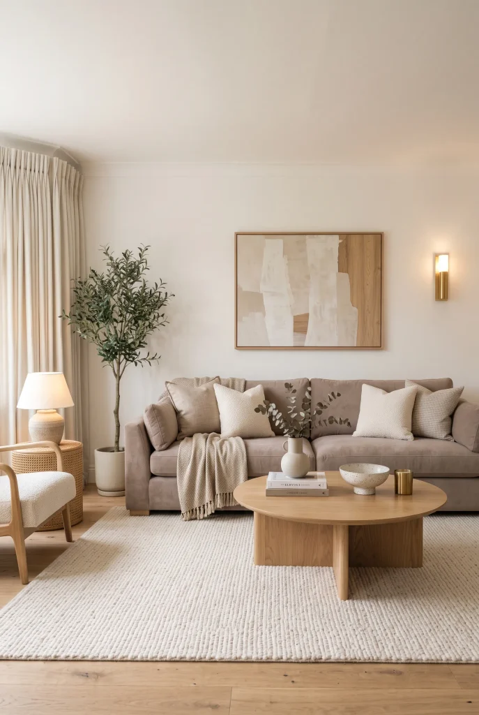
- Taupe seating adds warmth while staying beautifully understated.
- Cream accessories keep the darker upholstery from feeling heavy.
- Rounded furniture creates a softer, more relaxed appearance.
- Natural wood details bring an organic touch to the palette.
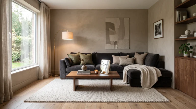
A soft taupe sofa can become the perfect anchor for a calm, polished living room without overpowering the rest of the decor. Pair it with warm white walls, an ivory rug, and light oak furniture to create gentle contrast between each surface. The slightly deeper upholstery also makes the room feel more grounded than an entirely cream arrangement. Add cushions in oatmeal, beige, and muted ivory for a cohesive layered look. In my experience, choosing fabrics with visible texture makes neutral seating feel much richer and more inviting, especially when the room uses simple furniture shapes.
Taupe is also practical because it sits comfortably between beige and gray, making it easy to coordinate with many existing pieces. If your room already has warm flooring or wooden furniture, choose a taupe with subtle brown undertones for better harmony. For cooler spaces, a greige-leaning taupe can create a more balanced appearance. Keep curtains light and let natural daylight brighten the surrounding surfaces. A textured throw, ceramic vase, and woven basket can add personality without introducing competing colors. The finished arrangement feels sophisticated enough for entertaining but comfortable enough for everyday relaxation.
2. Natural Linen Neutrals
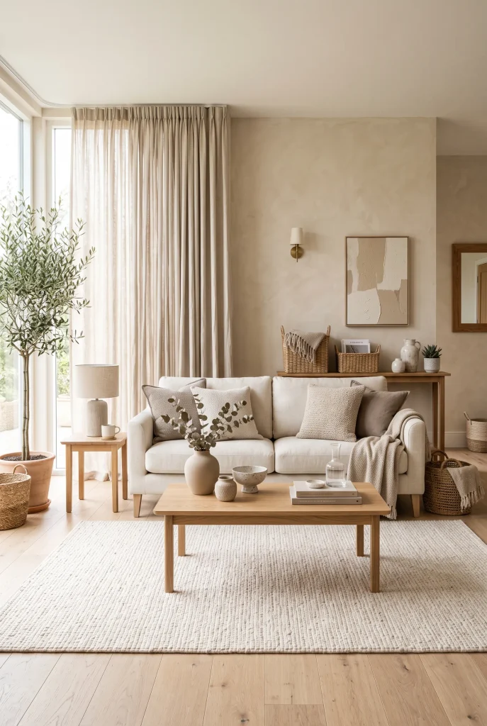
- Linen upholstery gives neutral furniture a relaxed, lived-in quality.
- Woven textures add visual interest without introducing bold colors.
- Light wood keeps the room feeling fresh and organic.
- Soft curtains help diffuse harsh daylight beautifully.
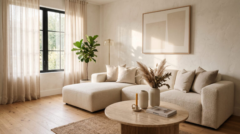
Few materials make a neutral living room feel as naturally inviting as linen. A cream or oatmeal linen sofa paired with woven accents creates softness while maintaining a clean, sophisticated appearance. Use natural oak furniture, an ivory rug, and beige curtains to build a palette that feels connected to nature. The slight wrinkles and visible weave of linen add character that perfectly suits casual interiors. I’ve noticed that rooms with several tactile materials often feel more complete even when they use very few colors, because texture creates the visual variety that color normally provides.
This look works particularly well in bright living rooms where you want the atmosphere to remain airy rather than stark. Choose sheer or loosely woven curtains to soften incoming sunlight, then layer the seating with cotton, linen, and woven cushions. A jute-style rug can introduce another organic texture, while smooth ceramic pieces provide a subtle contrast. Avoid matching every neutral shade exactly; small differences in cream, oatmeal, sand, and beige will make the room feel more natural. The overall effect is relaxed, timeless, and easy to maintain as your decorating preferences evolve.
3. Warm White Balance
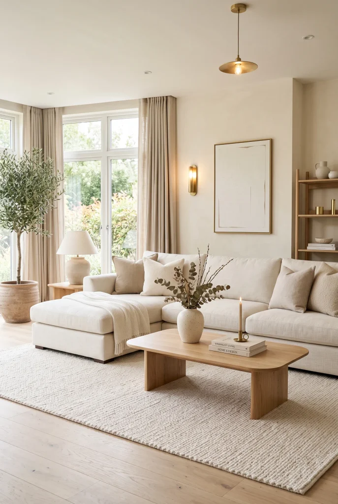
- Warm white creates brightness without the coldness of pure white.
- Creamy upholstery makes the room feel softer and more comfortable.
- Pale wood adds gentle contrast against light surfaces.
- Brass accents introduce a subtle polished finish.
Warm white can make a living room feel bright, spacious, and remarkably peaceful when it is layered with slightly deeper neutrals. Instead of using one identical white everywhere, combine creamy walls with ivory seating, an off-white rug, and pale beige accessories. These small tonal differences keep the room from looking flat. Add pale oak furniture to introduce warmth and a few brass details for understated elegance. The result is especially attractive when natural daylight enters through large windows. Rather than feeling stark, the space appears soft, welcoming, and carefully balanced throughout the day.
The best results come from treating warm white as a foundation rather than the only color in the room. Introduce contrast through texture, shape, and small changes in tone instead of strong decorative colors. A boucle cushion beside a smooth linen pillow, for example, creates interest without disturbing the calm palette. If the room feels too pale, add a medium beige throw or natural wood side table. Keep artwork simple with cream, tan, and muted charcoal details. This approach creates an elegant neutral color palette for living room styling that remains versatile and easy to refresh.
4. Greige Accent Walls
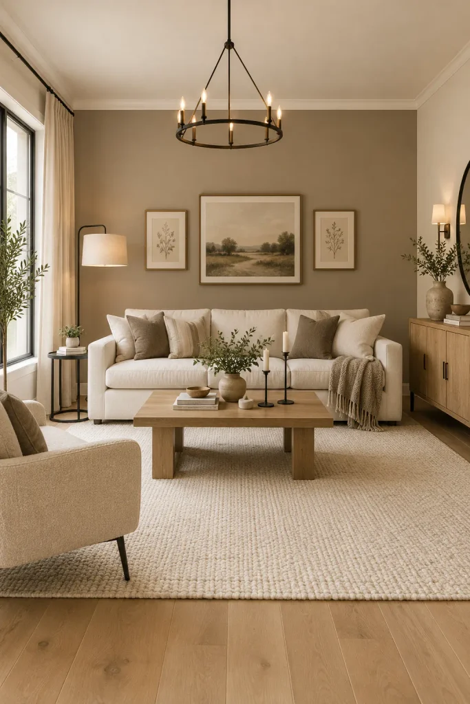
- A greige accent wall adds depth without introducing a strong color.
- Keeping the remaining walls lighter makes the room feel spacious.
- Wood furniture warms the muted wall tone beautifully.
- Minimal artwork prevents the accent wall from becoming visually crowded.
A greige accent wall is an easy way to give a neutral living room more architectural depth while keeping the overall palette calm. Place the accent behind the main sofa or television area so it naturally becomes the room’s visual anchor. Choose a warm greige with subtle beige undertones, then balance it with cream upholstery, ivory textiles, and light wood. The contrast should remain gentle rather than dramatic. I’ve noticed this approach works especially well in open-plan homes because the accent wall can define the living zone without making the entire space feel visually divided.
When choosing greige paint, always consider how much natural light the room receives. A sunny space can handle a slightly deeper shade, while a darker room usually benefits from a lighter, warmer version. Test samples during both daytime and evening because undertones can change noticeably under artificial lighting. Pair the wall with simple artwork, textured cushions, and a soft rug rather than adding many decorative colors. This creates a cohesive backdrop for everyday furniture while leaving plenty of flexibility. Seasonal pillows, throws, or greenery can then refresh the room without competing with the foundation.
5. Sandstone Texture
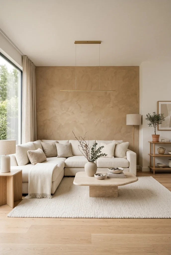
- Sandstone tones introduce an earthy quality to pale interiors.
- Textured surfaces create interest without relying on bright colors.
- Stone and wood work naturally together in neutral rooms.
- Soft textiles keep hard materials from feeling too cold.
Earthy sandstone tones can give a neutral living room a warmer, more grounded personality while still feeling elegant. Think creamy beige, sandy taupe, warm ivory, and muted stone rather than strong yellow or orange. These shades look especially beautiful beside natural wood and textured fabrics. A stone coffee table, woven cushions, and wool rug can reinforce the organic feeling without making the room look rustic. In my experience, repeating one earthy tone across several small accessories creates stronger cohesion than choosing many unrelated neutrals. The room feels connected, calm, and naturally layered.
You can introduce sandstone-inspired color through paint, upholstery, artwork, ceramics, or even a textured feature wall. If your existing furniture is mostly cream, adding a sandy rug or stone-colored accent chair may be enough to change the atmosphere. Keep larger surfaces relatively light so the room remains airy, then use deeper beige tones around the seating area for definition. Natural imperfections in stone, wood grain, and woven materials add character that flat surfaces cannot provide. The final space feels sophisticated but approachable, making it suitable for both relaxed evenings and casual gatherings.
View: 25 Top Modern Colorful Living Room Ideas to Try Today
6. Mocha Accent Details
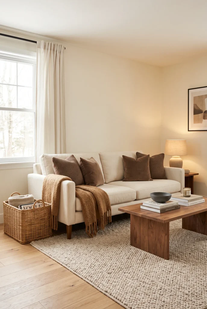
- Mocha accents add richness to an otherwise pale neutral scheme.
- Small brown details can visually anchor larger cream furnishings.
- Walnut furniture creates a natural connection between tones.
- Use darker shades sparingly for an elegant, uncluttered finish.
A few mocha accents can transform a pale living room from simple to sophisticated without overwhelming its neutral character. Start with a cream sofa and ivory walls, then introduce mocha through cushions, a throw, ceramics, or a walnut coffee table. These deeper brown tones create visual anchors that help lighter furnishings stand out. The secret is restraint: a handful of repeated mocha details usually looks more polished than covering the room in dark accessories. I’ve seen this work particularly well in spaces where homeowners want warmth and contrast but still prefer a soft, minimal overall aesthetic.
Mocha also pairs beautifully with natural materials, making it easy to build a welcoming room around existing furniture. Try combining walnut wood with beige linen, cream boucle, and an ivory wool rug for a layered look. If the room already contains dark flooring, keep the mocha accents smaller so the space does not become visually heavy. For a lighter floor, you can use slightly stronger brown elements without losing brightness. Add warm lighting in the evening to bring out the richness of the brown tones and create a comfortable, sophisticated atmosphere.
7. Layered Oatmeal Textures
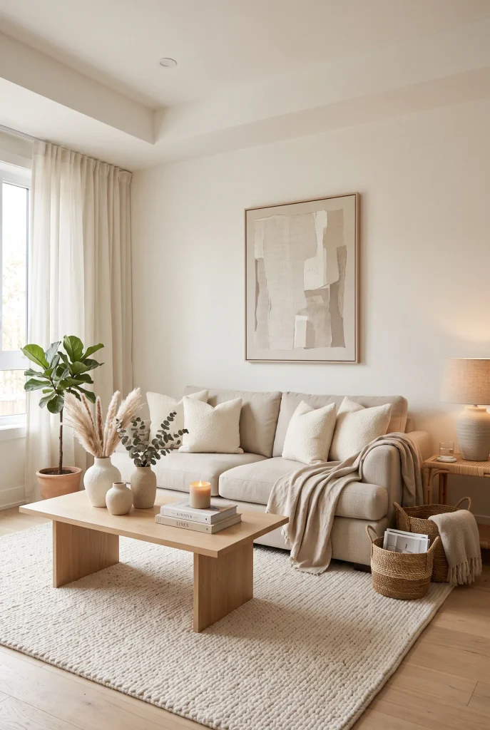
- Oatmeal tones make a neutral room feel warmer and more inviting.
- Layered fabrics add depth without introducing extra colors.
- Boucle, linen, and wool create pleasing tactile contrast.
- Pale wood furniture keeps the arrangement naturally balanced.
Oatmeal is one of those quiet neutral shades that can make a living room feel instantly softer. Use it across upholstery, cushions, throws, and rugs, then vary the textures so the similar colors do not appear repetitive. A boucle cushion beside a linen pillow and wool throw creates subtle contrast while keeping the palette cohesive. Pair these fabrics with warm white walls and pale oak furniture for an airy foundation. In my experience, texture becomes especially important in neutral rooms because it adds the visual richness that brighter colors might otherwise provide.
For a polished result, avoid covering every surface in exactly the same oatmeal shade. Instead, move gradually between cream, beige, oatmeal, and soft taupe. This creates gentle tonal variation while maintaining a peaceful appearance. Choose one dominant fabric, such as linen upholstery, then use smaller textured pieces to complement it. A woven basket or handmade ceramic vase can introduce another layer without making the room feel cluttered. Soft daylight will highlight the differences between materials beautifully, while warm lamps in the evening make the palette feel even cozier and more welcoming.
8. Cream And Walnut
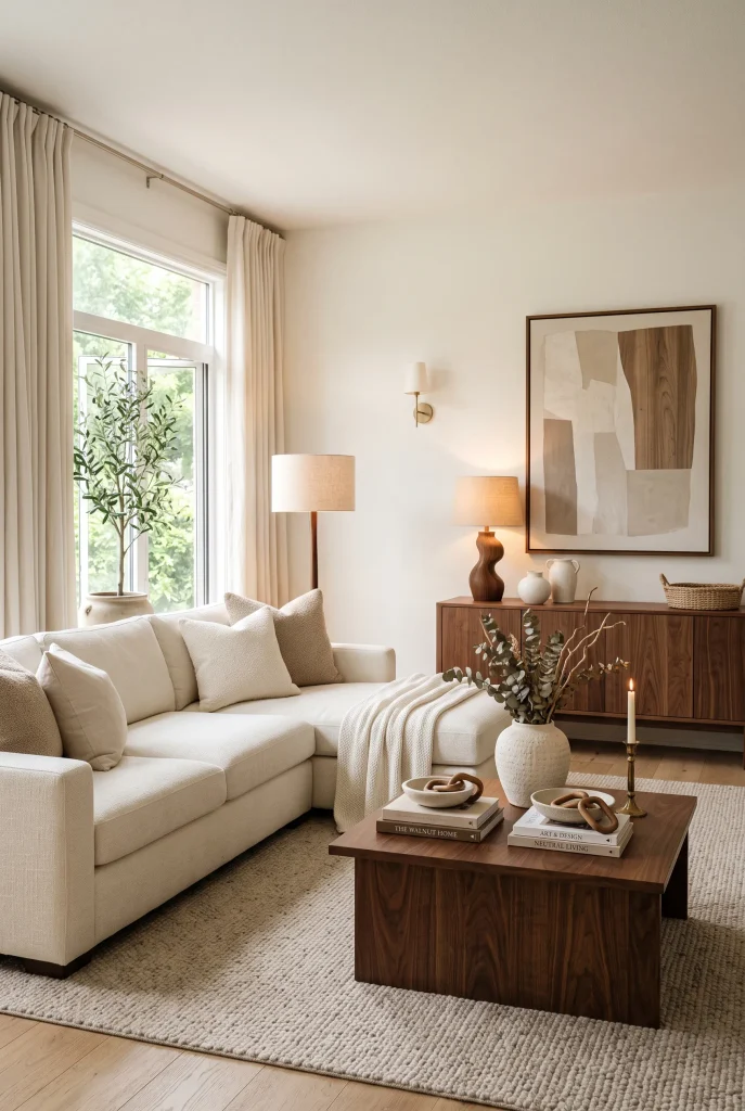
- Walnut furniture gives creamy interiors stronger visual grounding.
- Cream upholstery keeps darker wood from making the room feel heavy.
- Repeating walnut in two or three places creates cohesion.
- Soft textiles balance the richness of the wood.
Cream and walnut create a timeless combination that feels warm, refined, and surprisingly versatile. Start with creamy walls, an ivory sofa, and a soft beige rug, then introduce walnut through the coffee table, sideboard, or occasional chair. The deep wood tone creates enough contrast to define the furniture without needing black accents. Keep textiles light and relaxed to prevent the room from becoming too formal. I’ve noticed that repeating the same wood tone in several locations helps the entire space feel intentional, especially when the room contains a mixture of modern and traditional furniture.
The balance between light upholstery and dark wood also makes this palette practical for different room sizes. In a smaller living room, use one substantial walnut piece and keep the remaining furniture lighter to preserve an open feeling. In a larger room, two or three walnut elements can help visually connect separate seating areas. Add cream ceramics, beige artwork, and natural woven accessories to soften the contrast. Warm lighting works particularly well with walnut because it brings out the wood’s natural depth. The finished room feels sophisticated without sacrificing comfort or everyday practicality.
9. Muted Stone Palette
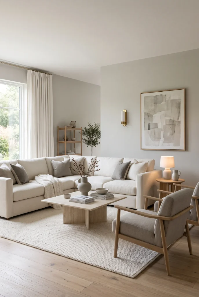
- Stone-inspired shades create a calm, contemporary foundation.
- Mixing gray-beige and cream prevents the room from feeling too cool.
- Pale stone surfaces add understated sophistication.
- Warm wood helps balance cooler neutral undertones.
Muted stone shades bring a refined, architectural quality to a neutral living room. Combine soft greige walls with cream seating, pale stone surfaces, and light oak flooring for a palette that feels modern without becoming cold. The key is choosing stone colors with enough warmth to complement natural materials. A beige-gray armchair, ivory rug, and simple ceramic accessories can create variation while keeping the overall design restrained. This approach works particularly well when you prefer clean lines and minimal decoration but still want the room to feel comfortable and visually complete.
Stone-inspired neutrals are also useful when you want a sophisticated backdrop that will not compete with artwork or statement furniture. Keep the larger pieces within a narrow tonal range, then introduce variation through finishes such as matte ceramics, lightly veined stone, natural wood, and woven fabric. If the room begins to feel too gray, add warmer beige cushions or a honey-toned wood accessory. If it feels too warm, introduce a subtle gray-beige accent. These small adjustments help create balance while preserving the calm, elegant character of the overall neutral scheme.
10. Beige And Black
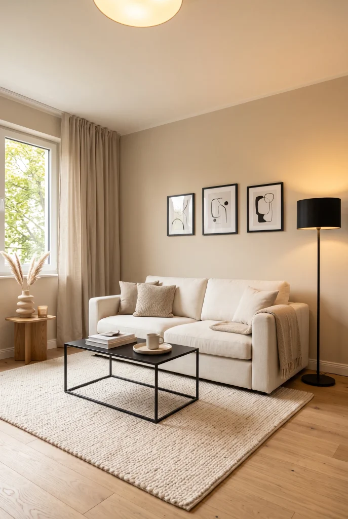
- Black accents give soft beige furnishings sharper definition.
- A few dark details can anchor a bright room beautifully.
- Natural oak prevents the contrast from feeling harsh.
- Repeat black accents around the room for visual balance.
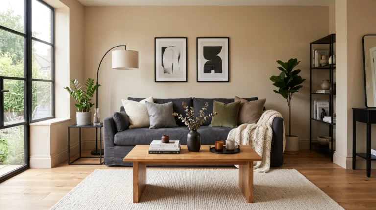
Beige and black create a striking balance between softness and structure. Begin with warm beige walls, a cream sofa, and an ivory rug, then introduce black through smaller elements such as a floor lamp, picture frames, or coffee table legs. The dark accents draw attention to important features without taking over the room. Keep the number of black pieces limited so the space remains light and welcoming. In my experience, this combination works especially well for homeowners who love neutral interiors but want a little more definition and a cleaner, more contemporary finish.
The easiest way to make this contrast feel natural is to repeat black in several small locations rather than using one oversized dark feature. For example, combine a black lamp with a framed print and a small decorative object on the coffee table. Warm wood can sit between the light and dark tones, creating a softer transition. If your room is small, keep the walls and larger furniture light and reserve black for accessories. This maintains visual openness while still adding personality. The result is an elegant space that feels balanced, modern, and easy to style.
11. Soft Gray Harmony
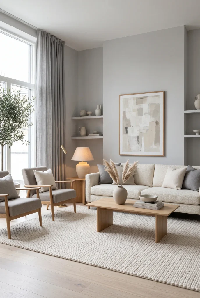
- Soft gray creates a calm foundation without overwhelming the room.
- Cream accents prevent gray from feeling cold or sterile.
- Pale wood adds warmth and organic contrast.
- Layering several gray tones creates subtle visual depth.
Soft gray can create an incredibly peaceful living room when it is balanced with warmer neutrals. Rather than using gray everywhere, combine light gray walls with cream seating, ivory textiles, and pale wood furniture. This prevents the room from feeling overly cool while keeping the overall appearance sophisticated. Choose fabrics with visible texture, such as linen, wool, or boucle, to add dimension. I’ve noticed that warm lighting makes soft gray interiors particularly inviting in the evening, while natural daylight keeps the same palette feeling fresh and airy during the day.
For the best balance, mix gray tones with subtle beige and cream rather than relying on a single shade. A greige armchair can bridge the gap between gray walls and a cream sofa, while a pale oak coffee table adds natural warmth. Keep artwork understated with shades of stone, charcoal, ivory, or taupe. If the room receives little sunlight, avoid very blue-gray paint because it can make the space appear colder. Instead, select a warm gray with beige undertones. The finished room feels serene, polished, and adaptable to many decorating styles.
12. Monochrome Cream Layers
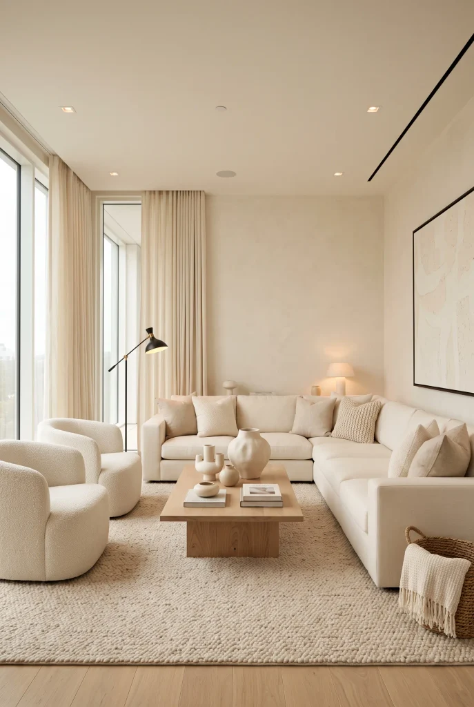
- Different cream shades create a sophisticated monochromatic effect.
- Texture keeps an all-light room from appearing flat.
- Sculptural accessories add interest without adding strong color.
- Light wood provides gentle contrast while preserving the palette.
A monochromatic cream scheme can make a living room feel remarkably elegant when different textures and subtle tones are layered thoughtfully. Combine ivory walls with a cream sofa, off-white chairs, beige flooring accents, and warm linen curtains. Rather than matching every item perfectly, allow small differences between cream, ivory, ecru, and soft beige. These variations create depth while preserving the peaceful character of the room. In my experience, adding tactile materials is essential here because boucle, linen, wool, and woven fibers give the eye plenty to discover without introducing additional colors.
The secret to making this palette feel welcoming rather than bland is contrast through texture and shape. Try pairing a smooth ceramic vase with a chunky woven basket, or place a boucle chair beside a sleek wooden table. Keep the furniture arrangement open and avoid overcrowding the room with accessories. Natural daylight will emphasize the subtle tonal differences, while warm lamps create a cozy evening atmosphere. A few sculptural pieces can provide visual focus without disturbing the monochromatic effect. The result is light, calm, sophisticated, and remarkably easy to personalize.
13. Greige And Oak
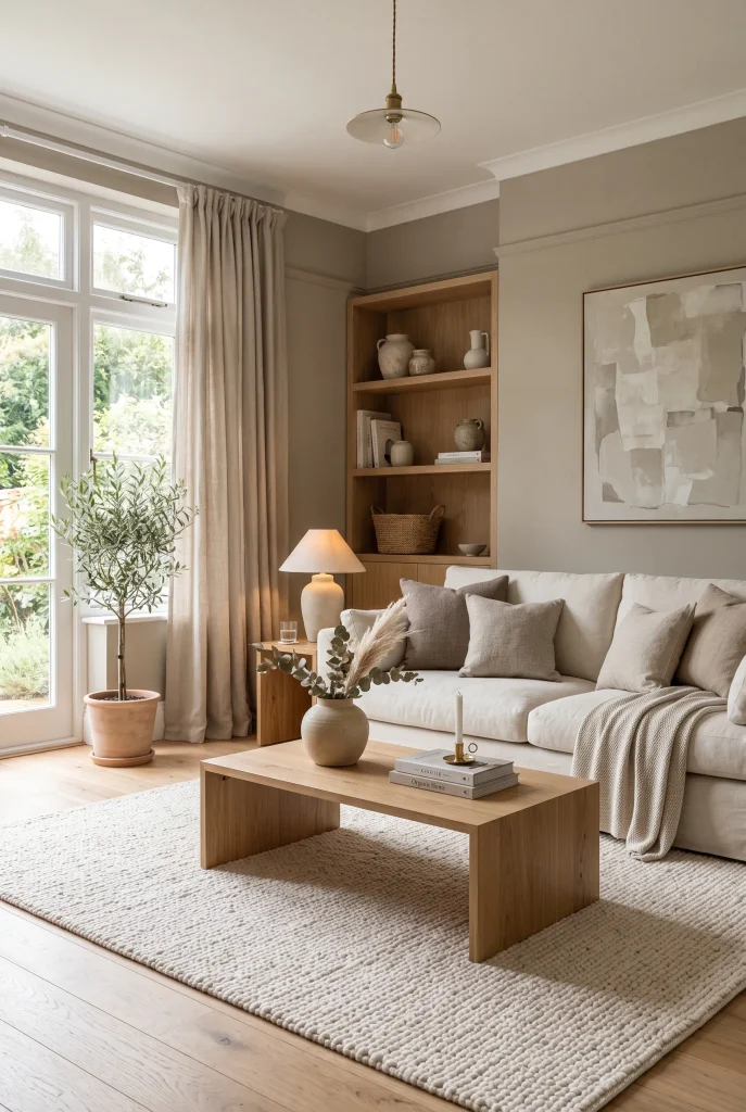
- Greige walls create a soft bridge between beige and gray.
- Oak furniture adds warmth and natural character.
- Cream upholstery keeps the overall room feeling bright.
- Repeating wood tones makes the space feel cohesive.
Greige and oak make a dependable combination when you want a living room that feels modern but not stark. Use warm greige on the walls, then introduce a cream sofa, ivory rug, and light oak coffee table. The wood adds natural warmth while the greige provides enough depth to prevent the room from looking washed out. Keep cushions within beige, cream, and taupe tones for an easy layered effect. I’ve noticed that this pairing works especially well in rooms with plenty of daylight because the changing light brings out the subtle warmth in both the paint and wood.
To make the palette feel more sophisticated, repeat the oak finish in small furniture pieces rather than introducing several unrelated wood colors. A matching side table, shelf, or frame can quietly connect the room. Choose linen curtains in a warm ivory shade to soften the windows and allow plenty of light through. If the space feels too neutral, add one or two charcoal details for definition without changing the overall color story. This combination creates a comfortable foundation that can easily support modern, Scandinavian, farmhouse, or transitional decorating styles.
14. Taupe And Ivory
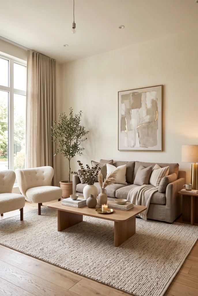
- Taupe gives ivory interiors more depth and warmth.
- Ivory walls keep the darker neutral tones visually light.
- Soft brass details add a refined finishing touch.
- Mixing matte and woven textures creates subtle sophistication.
Taupe and ivory create a beautifully balanced combination for a living room that feels both relaxed and refined. Use ivory on the walls and larger textiles, then introduce taupe through the sofa, accent chairs, or cushions. The deeper neutral adds enough contrast to define the seating area while keeping the atmosphere soft. Pair these colors with warm wood and natural fabrics for a comfortable finish. In my experience, this palette is particularly forgiving because small changes in lighting or accessories rarely disturb its overall harmony, making it a practical choice for everyday homes.
The strongest results come from varying the intensity of taupe instead of using one shade throughout the room. Try a medium taupe sofa with lighter mushroom cushions and a deeper brown wood table. Keep the rug and curtains closer to ivory so the room retains an airy quality. A small amount of brushed brass can introduce polish without overpowering the neutral scheme. For added texture, layer linen, boucle, wool, and ceramics across the space. The finished room feels warm and elegant without looking overly formal, and its simple color structure makes seasonal updates surprisingly easy.
15. Layered Beige Tones
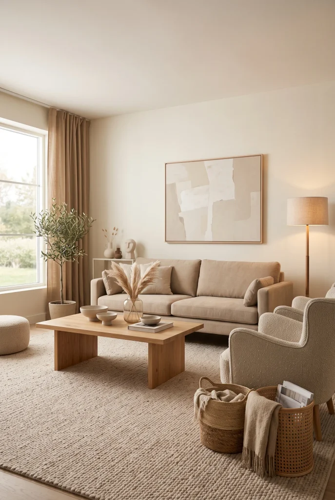
- Layering beige shades creates depth without visual clutter.
- Different undertones make the room feel more natural.
- Woven accessories add character to simple furniture.
- Warm lighting enhances the richness of the palette.
Layering several beige tones is an easy way to create a polished living room without relying on bold colors. Start with cream walls, then add a sand-colored sofa, oatmeal cushions, tan curtains, and a slightly darker beige rug. The gradual shifts between shades give the eye enough variation to keep the room interesting. Natural wood and woven accessories strengthen the warm, organic feeling. I’ve seen this approach work particularly well in homes where owners want a peaceful backdrop but still need the room to feel finished rather than completely minimal.
Pay attention to undertones when combining beige pieces because yellow, pink, and gray undertones can look noticeably different beside each other. Choose shades that share a similar warmth for a more cohesive result. You can then create contrast through materials instead of color by mixing linen, wool, rattan, wood, and ceramic surfaces. Keep the largest pieces in lighter tones and reserve deeper beige or caramel shades for smaller accents. This keeps the room visually open while adding enough warmth and dimension to make the space feel inviting throughout the day.
16. Cream Boucle Comfort
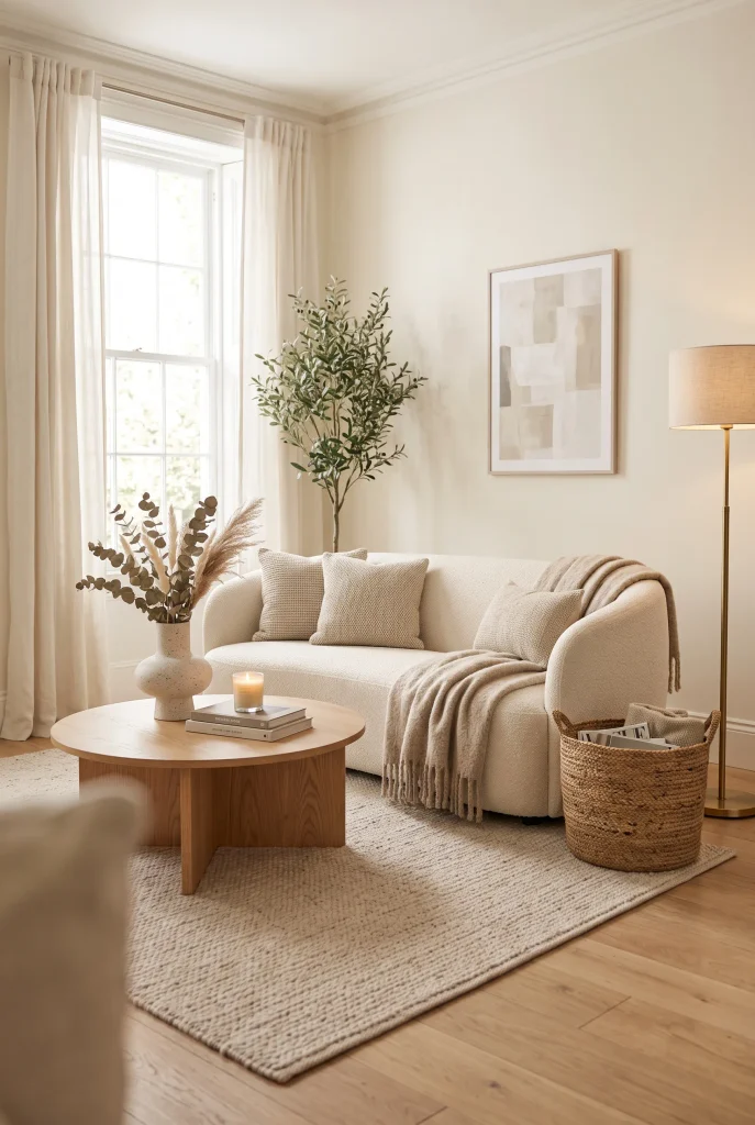
- Boucle upholstery adds softness and visible texture.
- Cream furniture keeps the room bright and welcoming.
- Warm wood creates contrast against plush fabrics.
- A textured rug makes the seating area feel more complete.
Nothing makes a soft neutral living room feel more inviting quite like plush boucle upholstery. A cream boucle sofa can become the centerpiece while ivory walls, beige textiles, and pale wood maintain a light appearance. The nubby surface catches natural and artificial light differently, adding dimension without introducing another color. Keep the surrounding furniture simple so the texture remains noticeable. In my experience, boucle works especially well when paired with smoother materials such as linen curtains or a sleek wooden table, creating contrast that makes the room feel thoughtfully layered rather than overly coordinated.
Because boucle has a strong tactile presence, you do not need many accessories to make the room feel finished. Add an oatmeal throw, a simple ceramic vase, and one woven basket for practical texture. If you have a busy household, consider boucle on an accent chair or smaller seating piece instead of every major item. Balance the creamy upholstery with a beige or taupe rug to define the seating zone. Soft daylight will emphasize the fabric beautifully, while warm lamps make it feel cozy at night. The overall effect is comfortable, elegant, and effortlessly welcoming.
17. Natural Stone Accents

- Natural stone introduces subtle variation and organic character.
- Pale surfaces maintain the room’s airy appearance.
- Stone pairs naturally with wood and linen.
- Choose lightly textured finishes for understated visual interest.
Natural stone can add a quiet sense of luxury to a neutral living room without making the space feel formal. A limestone or travertine-style coffee table works beautifully with cream seating, beige rugs, and warm white walls. The natural variations in stone provide visual interest that does not compete with the rest of the decor. Pair it with light oak, linen, and woven materials to maintain an organic atmosphere. I’ve noticed that one substantial stone element often makes more impact than several small decorative pieces, especially when the rest of the room remains intentionally simple.
When choosing stone accents, consider both the color and finish. Warm ivory or sandy stone generally works well with beige and cream interiors, while cooler gray stone can complement greige palettes. A matte or softly honed surface usually feels more relaxed than highly polished finishes. Keep accessories minimal around the table so its natural texture remains visible. Add a wool rug underneath to soften the harder material and create a comfortable foundation. This combination brings together organic texture, gentle contrast, and practical functionality, resulting in a living room that feels timeless and carefully considered.
18. Muted Mushroom Tones
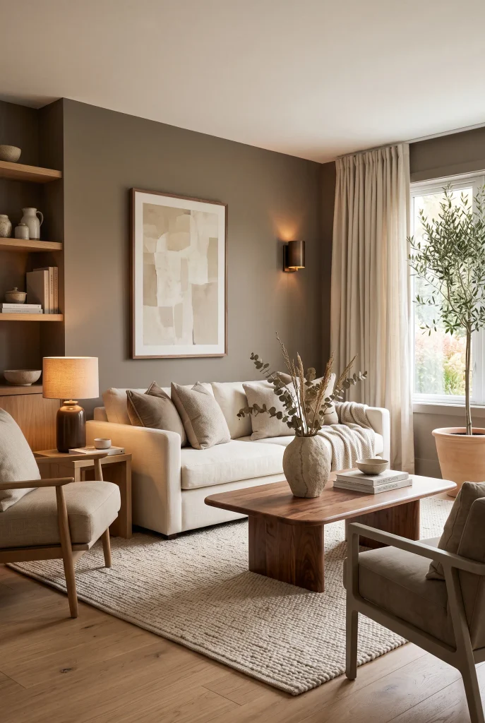
- Mushroom tones add depth while staying softer than dark brown.
- Cream furniture prevents the palette from becoming too heavy.
- Walnut accents enhance the earthy character.
- Tonal accessories keep the room cohesive and refined.
Mushroom is a sophisticated neutral that sits beautifully between taupe, beige, and soft brown. Use it on an accent wall, upholstered chair, or larger textile to give the living room a little more depth. Pair the shade with cream seating and an ivory rug so the overall design stays light. Walnut furniture can reinforce the earthy quality without introducing a dramatic contrast. This combination feels especially suitable when you want a room with more richness than pale beige alone. In my experience, mushroom tones look most elegant when surrounded by plenty of natural texture.
To keep mushroom shades from making the room appear dark, balance them with lighter surfaces around the space. Cream curtains, ivory upholstery, and pale artwork can reflect available daylight, while mushroom cushions or an accent chair provide definition. Choose accessories in closely related shades such as oatmeal, stone, and warm taupe rather than introducing unrelated colors. A small amount of black or aged brass can add structure if needed. The finished room feels grounded, warm, and sophisticated while remaining flexible enough for both minimalist and more layered decorating styles.
19. Warm Greige Sofa
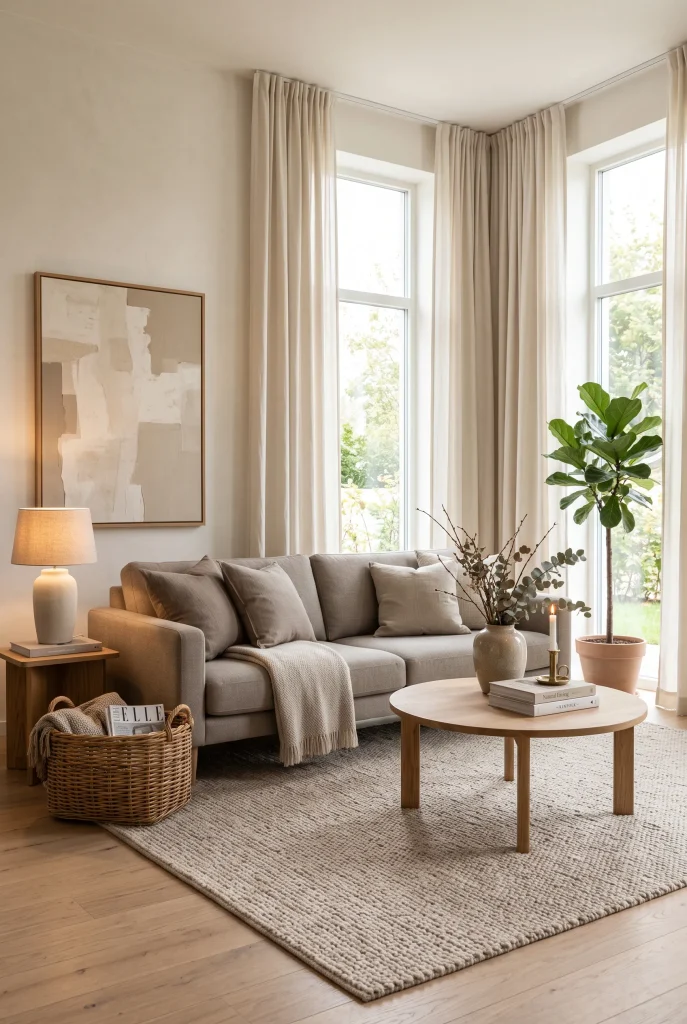
- Warm greige upholstery adds subtle depth to pale interiors.
- Ivory walls keep the sofa from making the room feel heavy.
- Oak furniture adds natural warmth and contrast.
- Layered beige textiles create a polished, comfortable finish.
A warm greige sofa offers an easy middle ground when beige feels too warm and gray feels too cool. Place it against ivory or soft white walls, then build around it with cream cushions, a beige rug, and light oak furniture. This combination creates gentle contrast while keeping the room visually calm. Greige also works well with different decorating styles, from contemporary to transitional. I’ve noticed that choosing upholstery with a little texture, such as linen or woven fabric, makes the neutral shade feel richer and less flat, especially in rooms with simple furniture.
To make the sofa feel integrated rather than isolated, repeat its undertone in several smaller pieces throughout the room. A taupe cushion, mushroom vase, or warm beige throw can quietly connect the colors. Keep the curtains lighter than the sofa so the windows remain visually open. If the room needs more definition, introduce a small amount of charcoal through artwork or lighting. Avoid adding too many competing neutral shades because the beauty of greige comes from its subtle transitions. The result is a relaxed, sophisticated seating area that feels both current and timeless.
20. Ivory And Tan
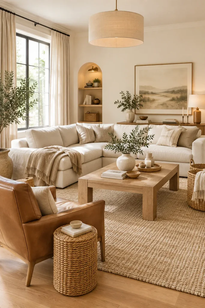
- Tan accents bring warmth and character to ivory surroundings.
- Leather can add durable contrast to soft fabrics.
- Light wood keeps the palette natural and balanced.
- Repeating tan details creates a cohesive visual rhythm.
Ivory and tan create a warm, uncomplicated foundation that feels inviting without becoming overly rustic. Keep the walls and main sofa close to ivory, then introduce tan through an accent chair, cushions, rug details, or wood furniture. A tan leather chair can be particularly effective because its smooth surface contrasts with linen, boucle, or wool. The palette stays neutral while gaining more visual character. In my experience, this combination is especially useful for living rooms that need to feel comfortable and polished at the same time, because the colors work naturally with both soft and structured materials.
For a cohesive arrangement, spread tan elements across the room instead of concentrating them in one area. A tan cushion near the sofa, wooden coffee table, and woven basket can create enough repetition without making the room feel brown. Use ivory curtains to maintain brightness around the windows, especially in smaller spaces. Add simple ceramic accessories in cream or sand for another layer of texture. If you want a more contemporary finish, introduce a few matte black details. The finished room feels warm, airy, practical, and easy to update with seasonal decorative pieces.
21. Soft Beige Contrast
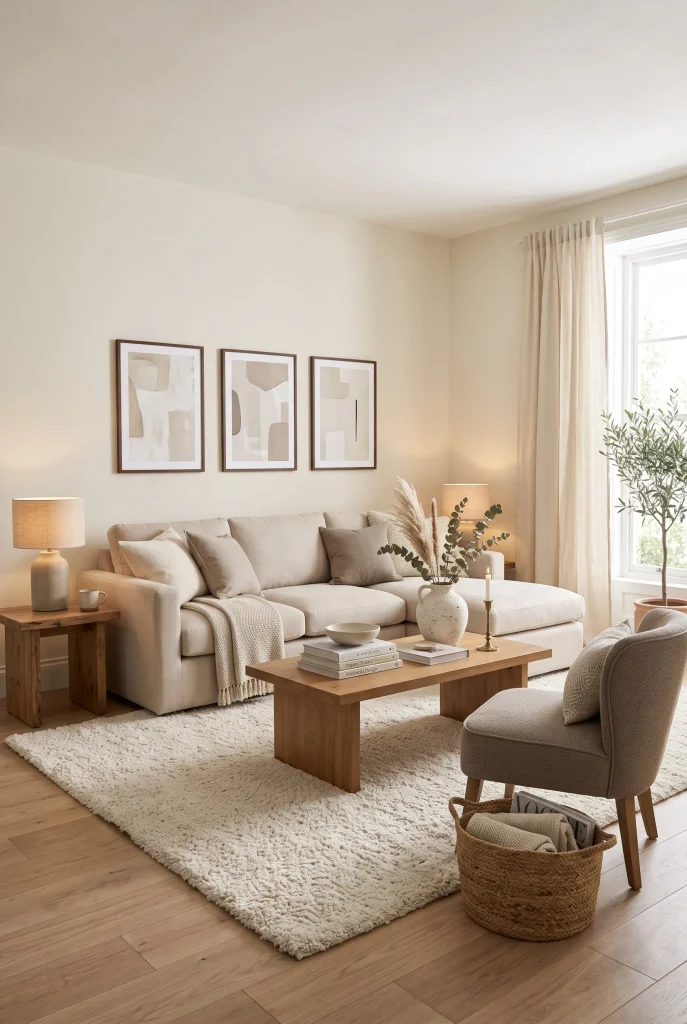
- Slightly different beige shades create gentle definition.
- A darker accent chair can anchor the seating arrangement.
- Medium wood tones add warmth without overpowering the palette.
- Textured accessories prevent tonal colors from looking repetitive.
Soft beige contrast proves that a neutral room does not need dramatic colors to feel visually interesting. Use cream walls as the lightest layer, then choose a slightly deeper beige sofa and a taupe accent chair. An ivory rug can separate the seating from the floor while a medium oak table adds natural warmth. The small differences between these shades create a quiet sense of depth. I’ve noticed that this approach works particularly well when furniture needs to look coordinated without appearing like a matching set, giving the room a more natural and collected character.
The key is maintaining enough difference between adjacent pieces so each one remains visible. If the sofa and walls are nearly identical, use texture or a slightly darker rug to create separation. Add cushions in oatmeal, sand, and warm ivory rather than introducing bright colors. Curtains can stay close to the wall tone for a seamless appearance, while artwork with subtle charcoal or brown details provides focus. This creates a balanced neutral color palette for living room spaces where comfort, flexibility, and visual calm matter. The finished design feels understated, elegant, and easy to personalize.
22. Cream And Greige
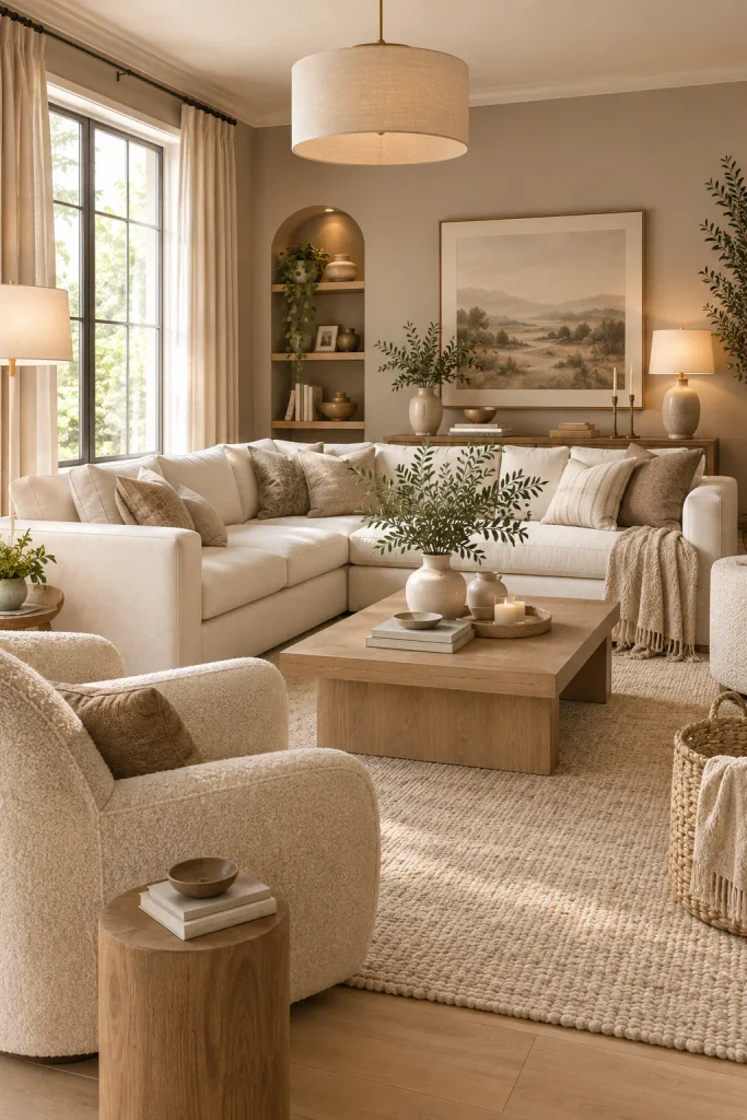
- Cream keeps the room bright and visually open.
- Greige walls provide subtle depth behind lighter furniture.
- Natural oak adds warmth between the two neutral tones.
- Textured fabrics make the restrained palette feel inviting.
Cream and greige create a beautifully balanced foundation for a sophisticated living room. Use warm greige on the walls, then layer ivory seating, cream cushions, and a soft beige rug across the room. The slightly deeper wall color gives the lighter furniture definition without creating a dramatic contrast. Natural oak furniture can add warmth and prevent the palette from feeling too cool. In my experience, this combination works particularly well when the room has simple architectural details because the subtle tonal shifts create interest without needing bold artwork or colorful accessories.
To make the arrangement feel polished, use texture as your main source of variation. Pair a smooth cream sofa with a boucle chair, woven basket, wool rug, and linen curtains. Keep the curtains close to the wall color if you want a seamless, spacious appearance. For more definition, add small accents in taupe or charcoal through cushions, frames, or lighting. Avoid using too many different beige shades because the beauty of cream and greige comes from its controlled simplicity. The result is a calm, adaptable space that feels equally suitable for relaxing, entertaining, or everyday family life.
23. Warm Beige Walls
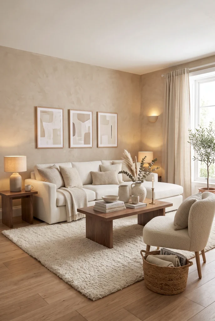
- Warm beige walls create an inviting backdrop for light furniture.
- Cream upholstery keeps the room feeling fresh and spacious.
- Walnut accents provide richer contrast against pale surfaces.
- Natural textures make the space feel comfortable and lived-in.
Warm beige walls can completely change the atmosphere of a living room by adding softness without making the space feel dark. Choose a gentle beige with warm undertones, then pair it with cream seating, an ivory rug, and natural wood furniture. This creates a gradual transition between wall, furniture, and flooring instead of sharp color changes. Add oatmeal cushions or a woven throw to reinforce the warmth. I’ve noticed that beige walls often make neutral furniture feel more connected to the room, especially when the same undertones appear in the rug, curtains, and decorative accessories.
Before committing to a beige wall color, test it in the actual room because lighting can dramatically change how the shade appears. Morning sunlight may make it look lighter and warmer, while evening lamps can bring out deeper golden undertones. Balance the walls with lighter curtains and upholstery so the room does not feel enclosed. Walnut or medium oak furniture can provide useful contrast, while cream ceramics and neutral artwork keep the overall look cohesive. This approach creates a welcoming foundation that can easily adapt to modern, farmhouse, traditional, or transitional furniture.
24. Taupe And Natural Wood
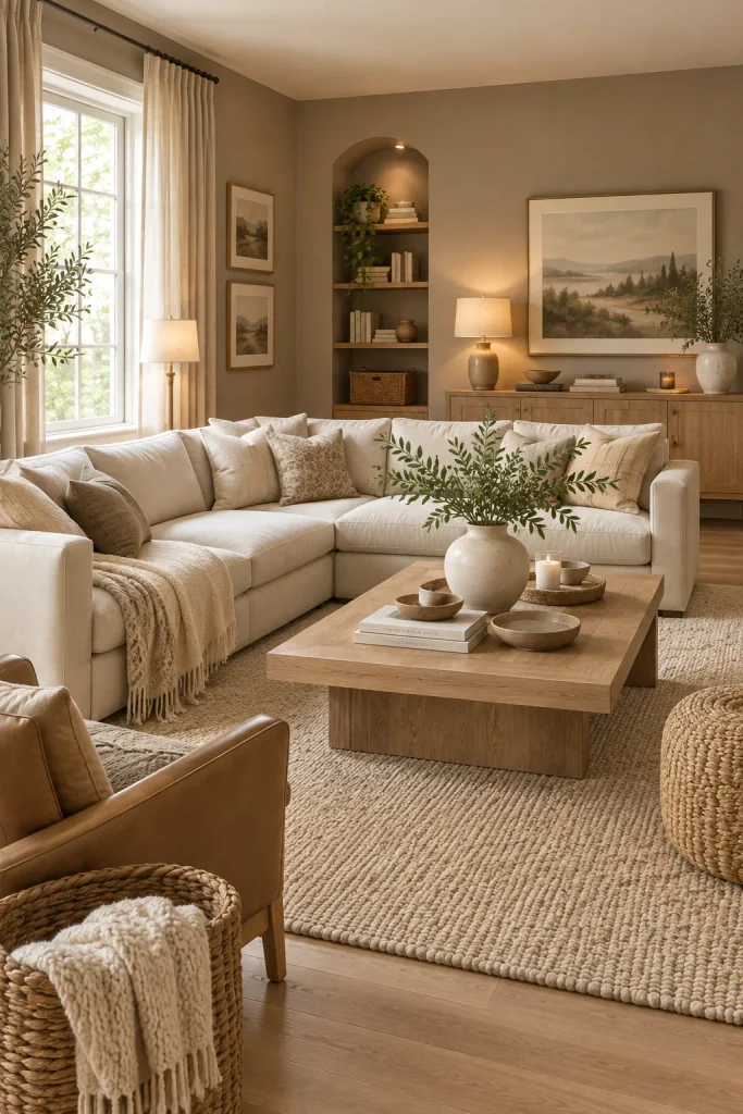
- Natural wood brings warmth to sophisticated taupe surroundings.
- Cream furniture creates a lighter focal point.
- Repeated wood finishes help connect separate furniture pieces.
- Woven accessories reinforce the organic neutral atmosphere.
Taupe and natural wood create an earthy combination that feels sophisticated without becoming overly formal. Use taupe on the walls or larger upholstered pieces, then introduce light or medium wood through coffee tables, shelving, and side furniture. Cream seating can act as a bright focal point between the deeper taupe and warm wood. Add woven baskets, linen curtains, and an ivory rug to soften the harder surfaces. In my experience, natural wood is particularly effective in taupe rooms because its organic grain adds visual movement while keeping the overall color palette restrained.
For a balanced look, choose one primary wood tone and repeat it throughout the space rather than mixing several unrelated finishes. Light oak works beautifully when you want an airy Scandinavian-inspired feel, while medium walnut creates a richer, more traditional appearance. Keep decorative colors subtle with shades of cream, oatmeal, sand, and muted brown. If the room feels too warm, add a small charcoal or soft gray accent for balance. The finished space feels grounded and natural, while the simple palette gives you plenty of freedom to change artwork, cushions, and accessories later.
Conclusion
The right neutral shades can turn an ordinary living room into a space that feels warm, balanced, and effortlessly elegant. From layered beige and ivory to greige, taupe, soft gray, and natural wood, these ideas show how small changes can create a completely different atmosphere. A thoughtful neutral color palette for living room styling also gives you flexibility, making it easy to refresh cushions, throws, artwork, and accessories as your taste changes. I’ve seen how simple texture and tonal layering can transform a space without a major makeover. Save your favorite ideas on Pinterest, try one in your own home, and share this inspiration with someone planning a room refresh.