25 Top Modern Colorful Living Room Ideas to Try Today
Ready to make your living room feel more lively, personal, and unforgettable? A modern colorful living room can bring warmth and character to a space that currently feels plain or too neutral. You do not need to repaint every wall or replace all your furniture to create a beautiful transformation. Sometimes, one colorful sofa, patterned rug, vibrant chair, or carefully chosen artwork can completely change the atmosphere. In this guide, you’ll discover 25 practical ideas for combining bold shades with modern furniture, natural textures, and calming neutrals. I’ve noticed that the best colorful rooms usually balance strong accents with plenty of visual breathing room, making them stylish, comfortable, and easy to live with.
1. Jewel-Toned Sofa
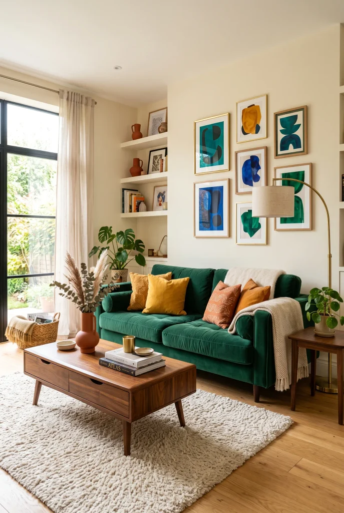
- A jewel-toned sofa instantly becomes the room’s visual anchor.
- Emerald, sapphire, or ruby shades add richness without needing many accessories.
- Keep surrounding furniture neutral so the sofa feels intentional rather than overwhelming.
- I’ve noticed textured upholstery makes bold colors look more sophisticated and inviting.
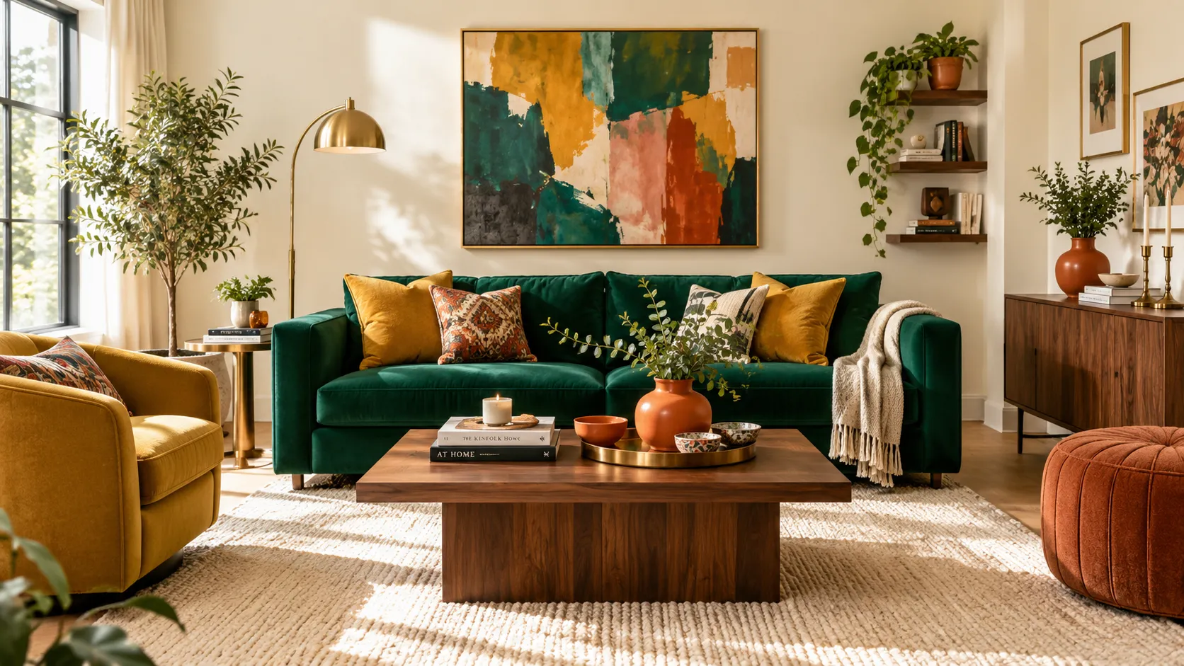
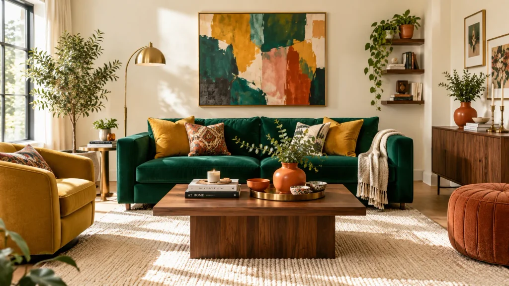
A rich jewel-toned sofa can completely change the personality of a living room without requiring a full renovation. Emerald green, sapphire blue, or deep ruby upholstery creates an immediate focal point while keeping the overall design polished. Pair the sofa with warm ivory walls, light wood flooring, and a soft neutral rug to prevent the stronger color from dominating. A few cushions in mustard, terracotta, or muted blue can connect the sofa with smaller decorative details. In my experience, choosing one saturated furniture piece first makes it much easier to build a cohesive colorful palette around it.
The beauty of this approach is that it works particularly well in everyday homes where you want personality without visual clutter. Keep the coffee table, curtains, and larger supporting pieces relatively simple, then let artwork and accessories echo the sofa’s undertones. Natural daylight will reveal the fabric texture during the day, while a warm floor lamp creates a softer atmosphere at night. If your room feels plain or forgettable, replacing a basic neutral sofa with a jewel-toned alternative can deliver a surprisingly dramatic improvement. The result feels colorful, comfortable, layered, and intentionally designed rather than randomly decorated.
2. Color-Blocked Walls
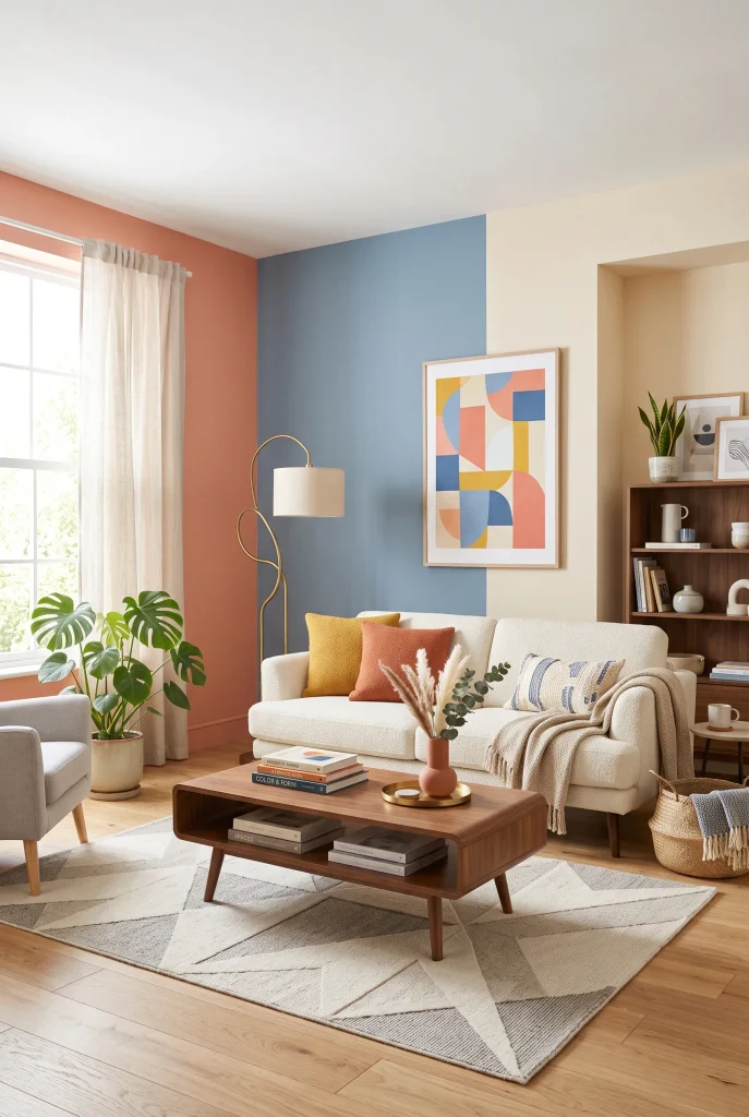
- Color blocking adds architectural interest without expensive structural changes.
- Use two or three related shades instead of covering every wall with bright colors.
- Paint can visually define a seating zone in an open-plan room.
- Choose furniture colors that repeat one wall shade for a more connected look.
Color-blocked walls are an easy way to introduce multiple shades while keeping a modern living room visually organized. Instead of painting every surface a different color, divide one wall into intentional sections using complementary tones such as dusty blue, muted coral, and warm cream. This technique can highlight a sofa, reading corner, or television area without adding bulky furniture. It also gives a plain room more architectural character. For a balanced result, keep the larger furniture pieces simple and repeat one of the wall colors through cushions, artwork, or a small decorative object.
This approach is especially useful when an open-plan space needs subtle visual boundaries. A painted section behind the sofa can make the seating area feel more established, while a contrasting vertical block can emphasize ceiling height. I’ve seen this work well in rooms where adding another piece of furniture would make the layout feel crowded. Matte paint usually keeps the effect contemporary because it avoids excessive shine. Before committing, test your chosen shades in daylight and evening light. Colors can look noticeably different throughout the day, so samples help you avoid an unexpected result.
3. Vibrant Accent Chairs
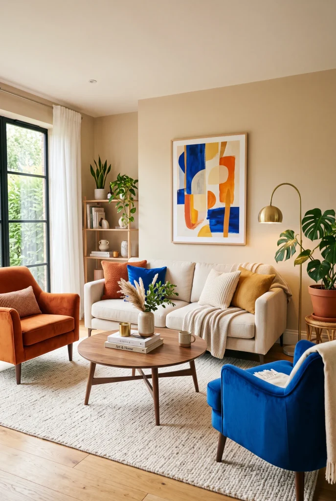
- Bright accent chairs add personality without committing to a colorful sofa.
- Pair two different shades when their intensity feels visually balanced.
- Angle chairs slightly toward the sofa to create a welcoming conversation area.
- Neutral flooring and walls help saturated upholstery stand out beautifully.
Vibrant accent chairs offer a flexible way to bring stronger color into a living room while keeping the main furniture timeless. A burnt-orange chair beside a cobalt-blue option can create an energetic contrast, especially when both are surrounded by cream, beige, or light wood finishes. The trick is to repeat tiny hints of those chair colors elsewhere so they feel connected to the room. Try a blue vase, orange cushion, or colorful artwork rather than introducing several unrelated shades. This creates a deliberate palette while allowing the chairs to remain the most noticeable decorative feature.
Accent chairs are also practical because they can be moved or replaced more easily than a large sofa. Position them slightly toward the main seating area to encourage conversation and make the room feel more social. A rounded silhouette can soften a modern space, while clean angular lines create a sharper contemporary look. If your existing room already has neutral furniture, colorful chairs can provide the transformation you want without starting from scratch. I’ve noticed this approach works especially well for renters or homeowners who want noticeable color but prefer to make changes gradually.
4. Colorful Gallery Wall
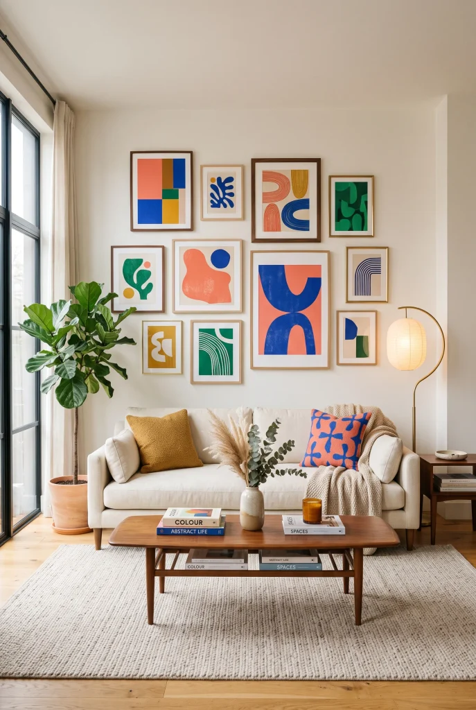
- A gallery wall introduces several colors without overwhelming the furniture.
- Mix abstract artwork with simple graphic prints for visual variety.
- Repeat one or two artwork colors through cushions or ceramics.
- Keep consistent spacing between frames so the display feels polished.
A colorful gallery wall can turn an ordinary living room wall into an instant focal point while giving you plenty of freedom to experiment with different shades. Choose artwork featuring two or three strong colors, then repeat those tones subtly throughout the room with cushions, vases, or books. A cream sofa and light wood furniture create a calm foundation that lets the artwork stand out. The arrangement does not need to be perfectly symmetrical, but consistent spacing keeps the display intentional. I’ve noticed that mixing different frame sizes often makes a gallery wall feel more collected and personal.
The key is to treat the artwork as part of the room’s overall color story rather than as separate decoration. For example, a cobalt detail in one print can reappear in a small ceramic vase, while a mustard accent can connect with a cushion on the sofa. This simple repetition creates cohesion without making everything match. Before hanging the frames, arrange them on the floor and photograph the layout to check the balance. This small step can prevent unnecessary holes in the wall and helps you see whether the colors and shapes work together from a distance.
View: 25 Corner Sofa Designs for a Cozy Modern Living Room
5. Playful Pattern Mix
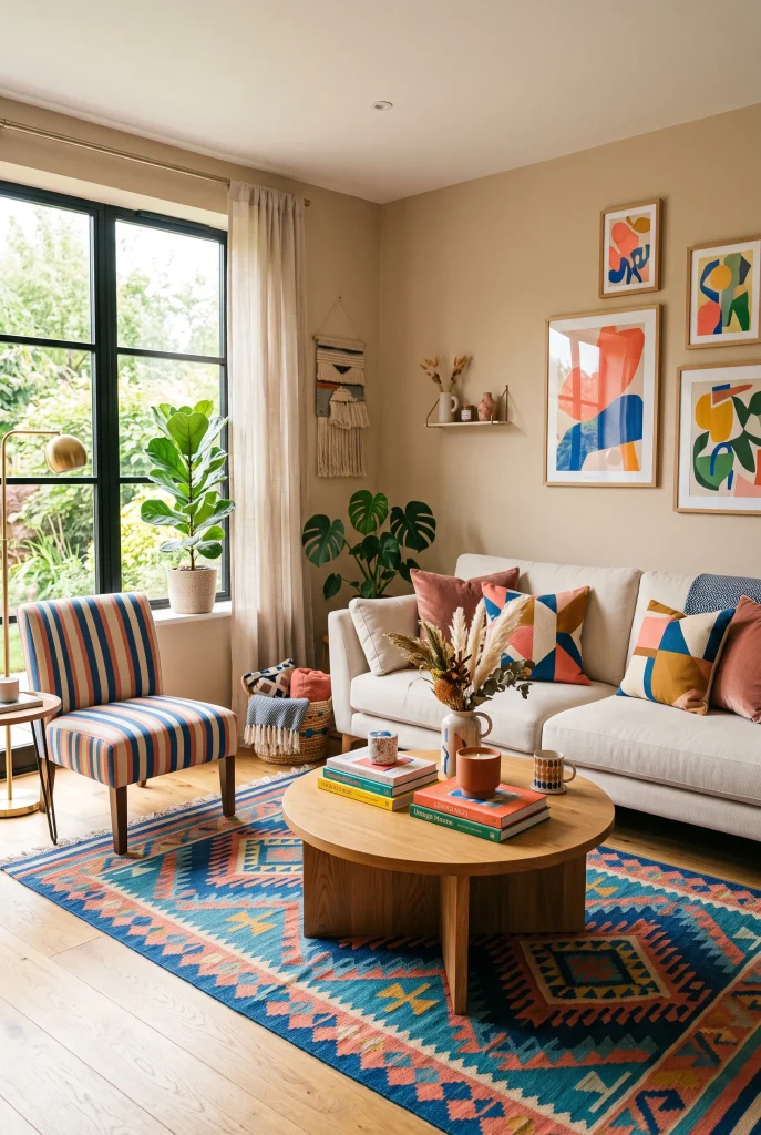
- Pattern mixing makes a neutral room feel energetic and expressive.
- Combine different patterns through cushions, rugs, and occasional furniture.
- Keep a shared color palette so contrasting prints still feel connected.
- Use one larger pattern and smaller supporting patterns for visual balance.
Playful patterns can bring energy into a modern living room without relying entirely on bright solid colors. Start with one larger patterned element, such as a geometric rug, then introduce smaller designs through cushions, curtains, or an accent chair. The easiest way to keep everything cohesive is to share at least one color between the different patterns. For instance, coral and blue can appear across a rug, cushions, and artwork in slightly different proportions. This creates movement while preventing the room from looking chaotic. A neutral sofa provides the visual breathing room needed between stronger patterns.
Pattern mixing also gives you an easy way to refresh a room seasonally without replacing expensive furniture. Swap cushion covers, throws, or smaller rugs when you want a different atmosphere. In my experience, the most successful combinations usually include variation in scale: a large geometric rug paired with medium stripes and smaller organic motifs feels more balanced than several equally busy prints. Keep the walls and major furniture relatively calm if your accessories are already expressive. The finished space should feel lively and layered, but still comfortable enough for everyday relaxing and entertaining.
6. Bold Colorful Rug
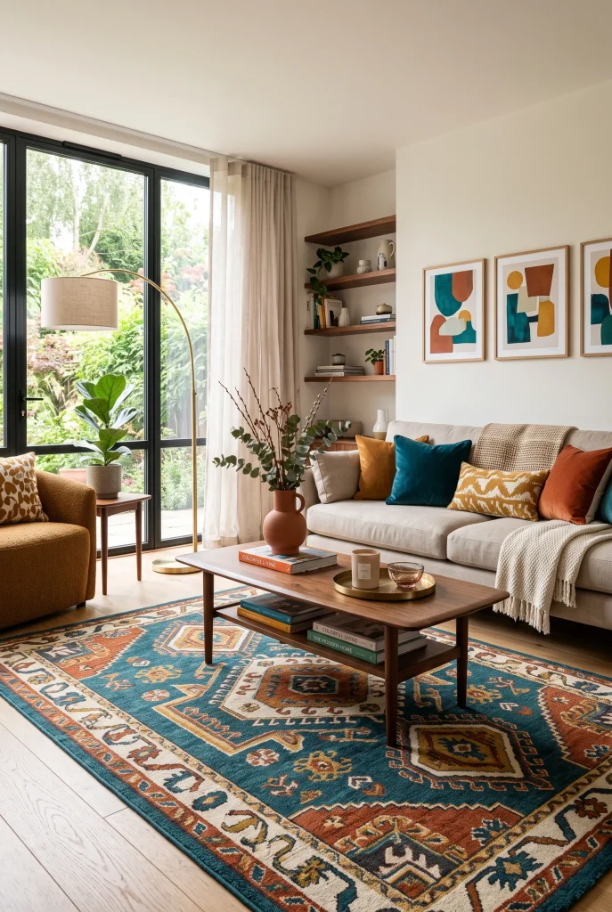
- A colorful rug can anchor the entire seating arrangement.
- Choose rug colors that already appear in artwork or upholstery.
- Keep larger furniture neutral when the rug has a busy pattern.
- Extend the rug beneath the sofa and chairs to visually connect the seating zone.
A bold colorful rug can become the foundation for an entire living room palette, especially when the walls and larger furniture are neutral. Look for a design combining shades such as teal, rust, mustard, and cream, then pull small accents from the rug into cushions, artwork, or ceramics. This creates a coordinated appearance without making the room feel overly matched. Position the rug beneath the front legs of the sofa and chairs so the seating arrangement feels connected. The right size matters just as much as the pattern because an undersized rug can make an otherwise spacious room feel disconnected.
Beyond adding color, a rug also brings softness and warmth beneath modern furniture. It can visually define a seating area in an open-plan home and make hard flooring feel more comfortable. If you already own neutral furniture, changing the rug is one of the simplest ways to create a noticeable transformation. I’ve noticed that patterned rugs are particularly forgiving in busy households because their varied colors can disguise small everyday marks better than very pale solid designs. Balance the strong floor pattern with simpler curtains and walls for a room that feels colorful yet composed.
7. Terracotta Sofa
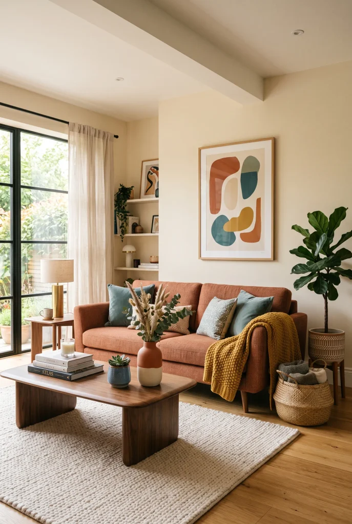
- Terracotta brings warmth and personality without feeling overly bright.
- Pair it with muted teal or dusty blue for balanced contrast.
- Warm wood furniture naturally complements earthy upholstery.
- Use cream textiles to soften the stronger sofa color.
A terracotta sofa brings instant warmth to a modern living room and works especially well when you want color that still feels grounded. Its earthy orange-red tone pairs beautifully with cream, beige, natural wood, and muted blue accents. Add a few teal cushions or a dusty blue throw to create contrast without making the palette too loud. Walnut or light oak furniture reinforces the natural character of the upholstery. The result is a colorful space that feels welcoming rather than overly decorated. In my experience, earthy shades are often easier to live with long-term because they remain visually comfortable.
Terracotta also works beautifully across different lighting conditions. In bright daylight, the upholstery can feel fresh and energetic, while warm evening lamps make the color appear deeper and cozier. Keep the surrounding walls relatively light to prevent the room from becoming visually heavy. A textured ivory rug and simple linen curtains can provide softness around the stronger sofa. If you are nervous about committing to a bold color, choose a slightly muted terracotta rather than an intensely saturated orange. This creates the same colorful impact while giving you more flexibility when changing accessories later.
8. Cobalt Blue Accents
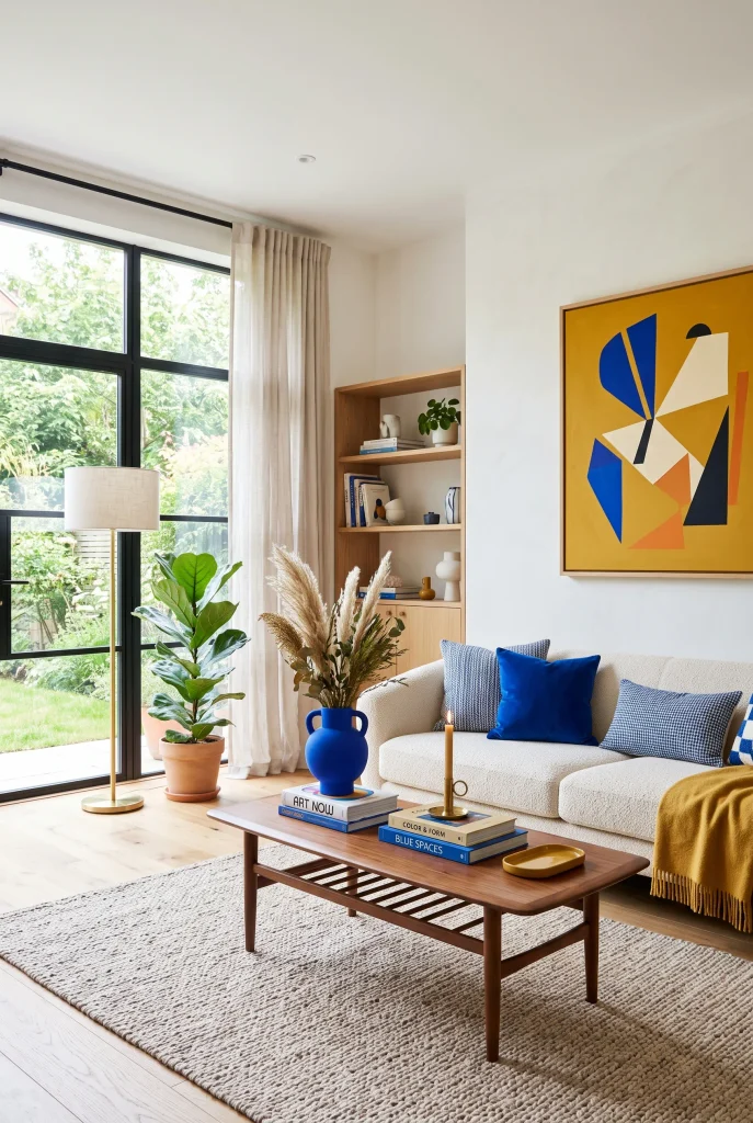
- Cobalt blue creates a crisp, energetic focal point.
- Use it through cushions, artwork, ceramics, or one accent chair.
- Pair strong blue with warm neutrals to prevent a cold appearance.
- Repeat the shade in several small areas for visual continuity.
Cobalt blue can give a modern living room a sharper, more energetic character without requiring a complete redesign. Instead of covering large surfaces with the shade, introduce it through cushions, artwork, ceramics, or a single accent chair. Against cream upholstery and warm white walls, cobalt immediately catches the eye and creates a fresh contrast. Adding walnut furniture or brass lighting helps balance the cooler blue tone with warmer materials. This approach is especially useful when your existing room already has neutral foundations and simply needs stronger visual personality without becoming overwhelming.
For the most cohesive result, repeat cobalt in at least two or three places around the room. A blue cushion can connect with a small vase, artwork detail, or decorative book, creating a subtle visual path across the space. Avoid introducing too many competing bright colors at once; let cobalt have a clear supporting cast of warm neutrals and one secondary accent. I’ve noticed that this makes bold blue feel more sophisticated and intentional. It also allows you to change the accent color later simply by replacing smaller accessories rather than major furniture pieces.
9. Mustard Yellow Details
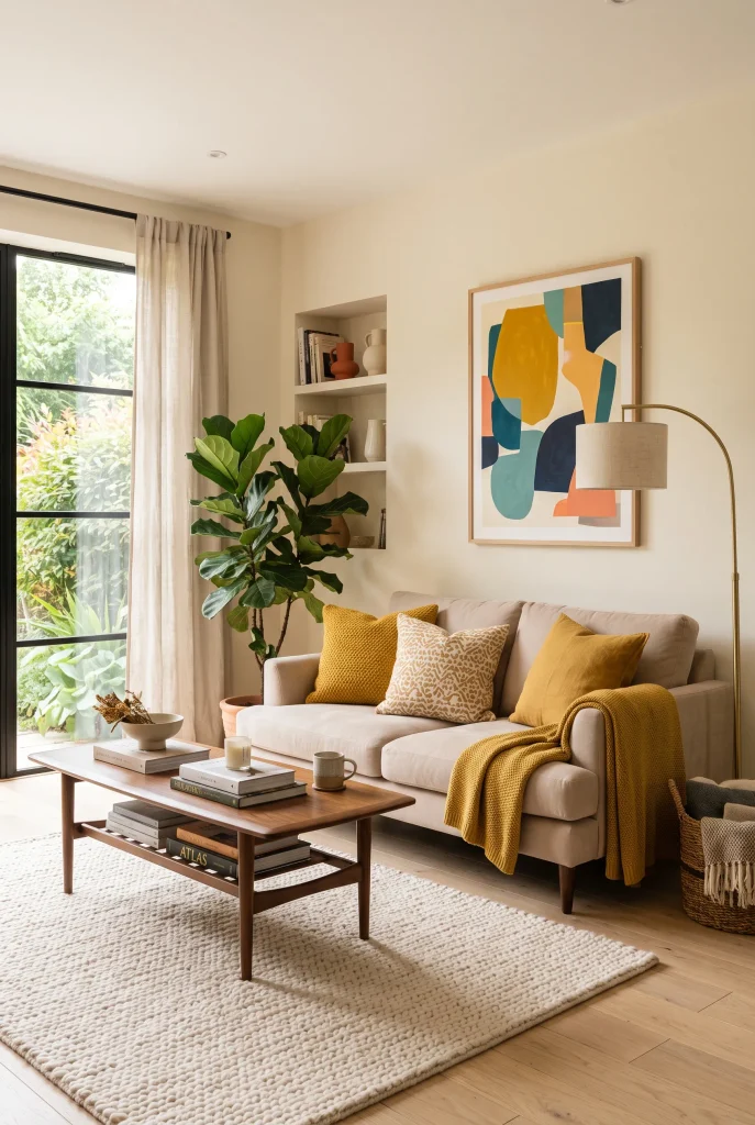
- Mustard yellow adds warmth without the intensity of neon shades.
- Introduce it through cushions, throws, artwork, or an accent chair.
- Pair it with cream and natural wood for a softer modern look.
- A small amount can brighten a room dramatically.
Mustard yellow is an excellent choice when a living room feels flat but you do not want an extremely bright color scheme. Its warm golden tone adds energy while remaining sophisticated against beige, cream, and natural wood. Try mustard cushions on a neutral sofa, then echo the color in artwork or a small ceramic accessory. Walnut furniture and woven textures make the palette feel richer and more grounded. Rather than spreading yellow evenly across the room, concentrate it in a few carefully chosen details. This keeps the space visually interesting while preserving the calm foundation many modern homes need.
The shade is also surprisingly versatile because it works across different decorating styles and seasons. During the day, natural light makes mustard accents feel cheerful and fresh, while warm lamps deepen the golden undertones at night. If your room has cooler colors such as blue or sage, mustard can provide the warmth needed to balance them. I’ve seen small changes like replacing plain cushions with mustard covers make a surprisingly noticeable difference. Start with inexpensive accessories before committing to larger pieces, especially if you are still discovering which intensity of yellow feels right in your home.
10. Emerald Green Curtains
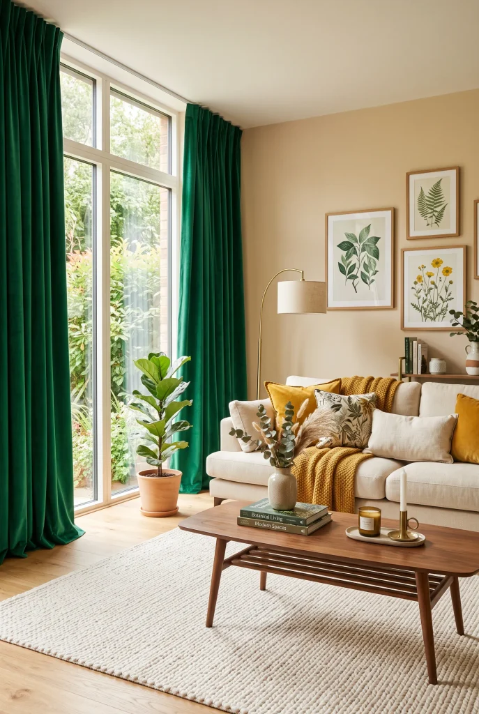
- Emerald curtains add strong color while keeping the furniture flexible.
- Floor-to-ceiling panels can make windows and ceilings appear taller.
- Warm cream upholstery balances the deeper green beautifully.
- Choose textured or linen-look fabric for a softer, more refined finish.
Emerald green curtains can introduce dramatic color without making the entire living room feel busy. Framing large windows with floor-to-ceiling panels draws attention upward and can make the ceiling appear taller. The deep green works particularly well with cream upholstery, warm beige walls, natural oak, and brass details. Add a few mustard or muted blue accents to create a layered palette without competing with the curtains. If your furniture is already neutral, this simple textile change can create a surprisingly strong transformation. I’ve noticed that full-length curtains also make rooms feel more finished and intentionally styled.
The fabric choice matters because the same green can feel completely different depending on its texture and weight. Linen-look curtains create an airy daytime appearance, while heavier woven fabric gives the room a richer, more cocooning atmosphere. Let the panels extend close to the floor and mount the curtain rod slightly above the window frame when possible. This helps emphasize vertical height. Keep the rest of the room moderately restrained so the curtains remain the primary color statement. The result is sophisticated, comfortable, and visually striking without requiring permanent changes to walls or major furniture.
11. Coral Accent Sofa
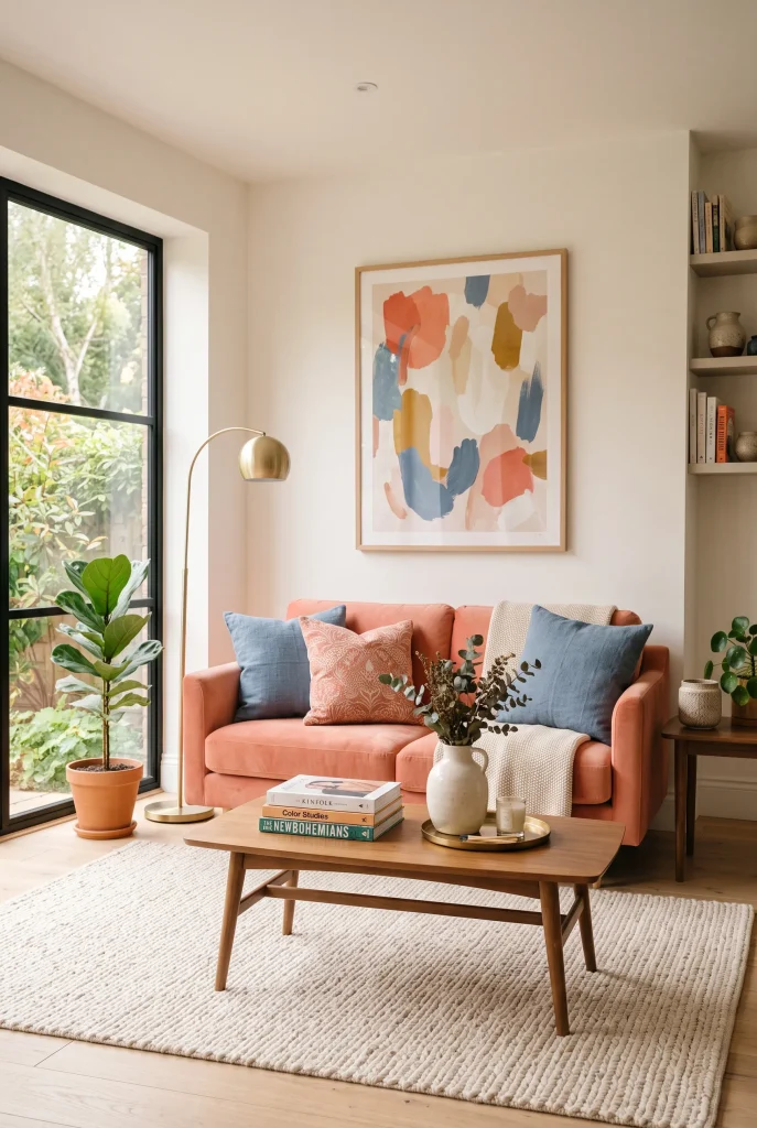
- Coral adds a cheerful warmth without feeling as heavy as deeper reds.
- Pair it with dusty blue for a balanced warm-cool contrast.
- Keep flooring and walls light to maintain an airy appearance.
- Soft upholstery makes a strong color feel more approachable.
A coral sofa can instantly make a modern living room feel brighter, friendlier, and more expressive. The shade sits beautifully between pink and orange, giving it enough warmth to create personality without becoming overly intense. Pair it with dusty blue cushions or artwork for a sophisticated contrast, then add cream textiles and pale wood to keep the overall composition light. Coral works particularly well in rooms with generous daylight because natural illumination brings out its warm undertones. For homeowners who find traditional neutral furniture too predictable, this is an easy way to introduce character through one major piece.
Balance is important when working with a noticeable sofa color. Rather than adding several equally bright accessories, repeat coral in just a few small details and let softer shades do the supporting work. A patterned cushion, ceramic vase, or artwork detail can be enough to connect the sofa with the rest of the room. I’ve noticed that muted versions of coral are generally easier to style because they sit comfortably beside both warm and cool neutrals. The finished space feels colorful and modern while remaining practical enough for everyday lounging, family time, and casual entertaining.
12. Multicolor Throw Pillows
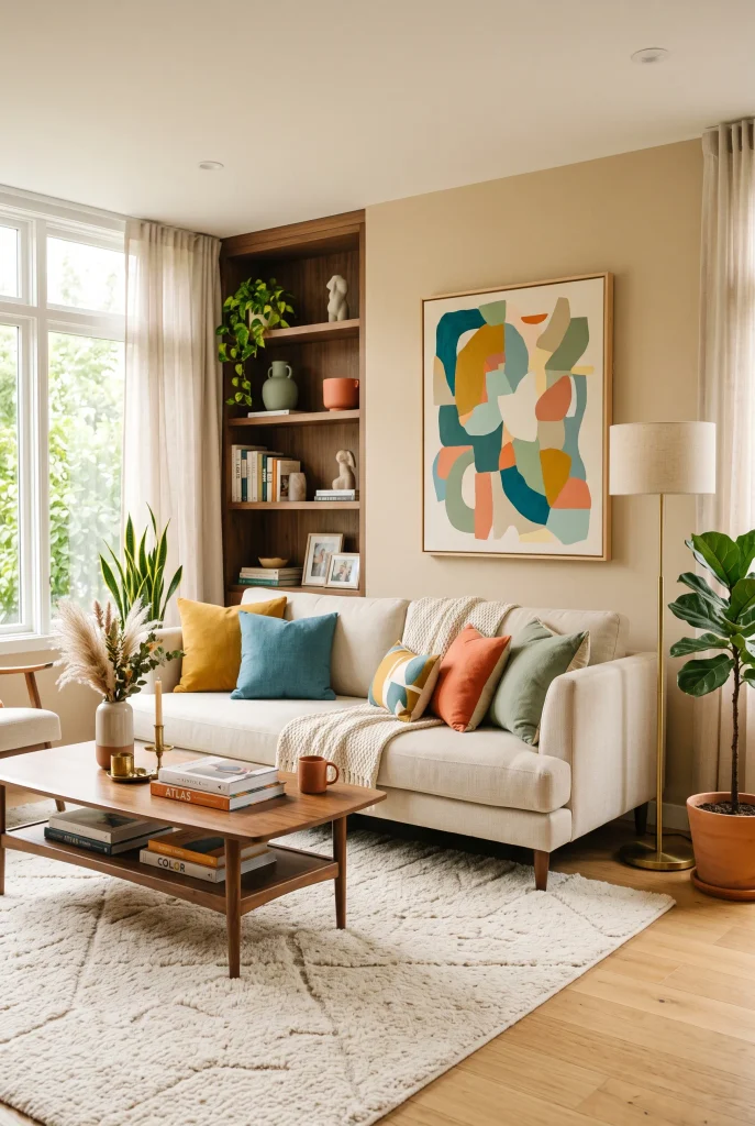
- Multicolor pillows are an affordable way to experiment with stronger shades.
- Mix solids, subtle patterns, and varied textures for depth.
- Repeat colors already present in artwork or rugs for cohesion.
- Replace covers seasonally to refresh the room without major spending.
Multicolor throw pillows can transform a neutral seating area in minutes, making them one of the easiest ways to experiment with a more expressive palette. Choose three or four coordinated shades, such as mustard, teal, coral, and sage, then combine solid colors with subtle patterns and tactile fabrics. Place the strongest colors toward the center or alternate them across the sofa so the arrangement feels balanced. Because pillow covers are inexpensive compared with furniture, you can test different combinations without making a major commitment. This flexibility makes colorful styling much easier for beginners.
The best pillow arrangements usually have variation without complete randomness. Combine velvet, linen, boucle, or woven textures to create depth, while keeping at least one color consistent across several pieces. Look at your existing rug, artwork, or curtains for inspiration before buying anything new. If one shade already appears in the room, repeating it through pillows will immediately make the space feel more coordinated. In my experience, changing pillow covers is one of the quickest ways to give a familiar room a completely different mood. It is a small upgrade with a noticeable visual payoff.
13. Teal Feature Wall
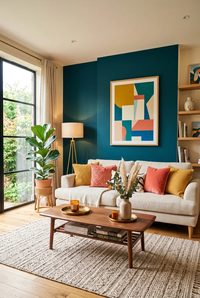
- A teal feature wall creates a strong focal point without overwhelming the whole room.
- Keep surrounding walls light to maintain brightness and openness.
- Warm wood and brass accents soften the cooler teal shade.
- Repeat small teal details through cushions or artwork for cohesion.
A teal feature wall can give a modern living room instant depth and personality while keeping the rest of the space calm. Painting the wall behind the sofa is often enough to establish a clear focal point, especially when the remaining walls stay warm white or soft beige. Teal works beautifully with cream upholstery, light oak, walnut, and brass because these warmer materials prevent the blue-green shade from feeling too cold. Add small touches of coral or mustard through artwork and cushions to create contrast. The result feels colorful, sophisticated, and visually balanced rather than overly dramatic.
Before painting, test your chosen teal on the actual wall because natural and artificial lighting can change how the color appears. A deeper teal can feel luxurious in a well-lit room, while a softer version may work better in spaces with limited daylight. Keep the wall relatively uncluttered so its color remains visible and impactful. If you are unsure about using such a strong shade, start with one feature wall instead of committing to the entire room. I’ve noticed that this approach gives homeowners plenty of personality while preserving flexibility with furniture and future decorating changes.
14. Rainbow Artwork
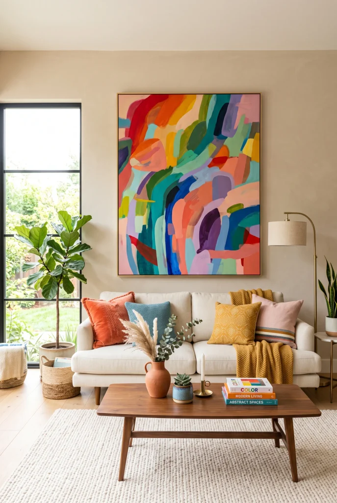
- Oversized artwork can introduce several colors without repainting the room.
- Pull two or three accent shades from the artwork into nearby accessories.
- Keep the surrounding furniture simple so the artwork remains the focal point.
- Abstract designs add movement while maintaining a modern aesthetic.
A large piece of colorful abstract artwork can become the visual starting point for an entire modern living room. Look for artwork that combines several shades you genuinely enjoy, then repeat only a few of those colors through cushions, ceramics, or a small accent chair. This approach creates a coordinated palette without requiring every item to match. Place the artwork above the sofa where it can naturally anchor the seating arrangement. Soft beige walls and light flooring provide enough breathing room around the composition. The result feels expressive, polished, and personal while remaining easy to update later.
Artwork-led decorating is particularly useful when you are unsure which colors belong together. Instead of choosing paint, furniture, and accessories separately, let one statement piece establish the palette first. You can then select supporting shades from its smaller details. I’ve noticed this makes colorful decorating feel much less intimidating because the artwork becomes a practical reference point. Choose a frame that complements the room rather than competing with the image, and leave enough wall space around the piece to preserve its impact. A carefully selected artwork can make even simple furniture feel intentionally styled.
15. Mustard Accent Chair
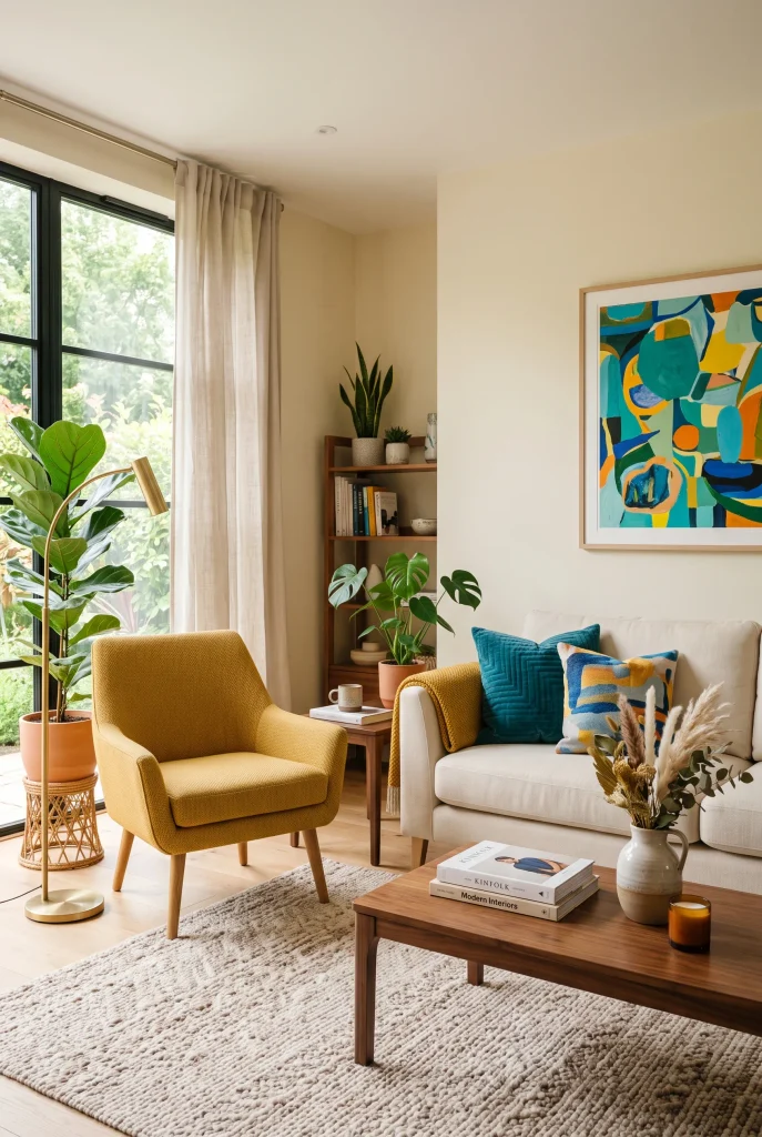
- A mustard chair adds warmth without requiring a colorful sofa.
- Position it opposite or beside the sofa to balance the seating area.
- Pair mustard with teal, cream, and natural wood for contrast.
- Choose a sculptural shape for extra visual interest.
A mustard accent chair can add a cheerful burst of color while keeping the main seating arrangement neutral and versatile. Its golden tone works especially well with cream sofas, warm white walls, light oak, and walnut furniture. For stronger contrast, introduce teal cushions or a small blue detail in nearby artwork. Position the chair where it supports conversation rather than simply filling an empty corner. This makes the color addition feel purposeful as well as decorative. A curved or sculptural silhouette can make the chair even more noticeable without requiring additional accessories or complicated styling.
This type of accent works particularly well when you want to refresh an existing room gradually. Instead of replacing your sofa or repainting the walls, one colorful chair can immediately change the room’s visual balance. Keep nearby accessories relatively restrained so the chair has enough space to stand out. A textured rug underneath can help connect it with the rest of the seating area. In my experience, mustard is especially easy to combine with earthy neutrals because it adds warmth without looking excessively bright. It creates an inviting focal point while keeping the overall design comfortable and contemporary.
16. Colorful Built-In Shelves
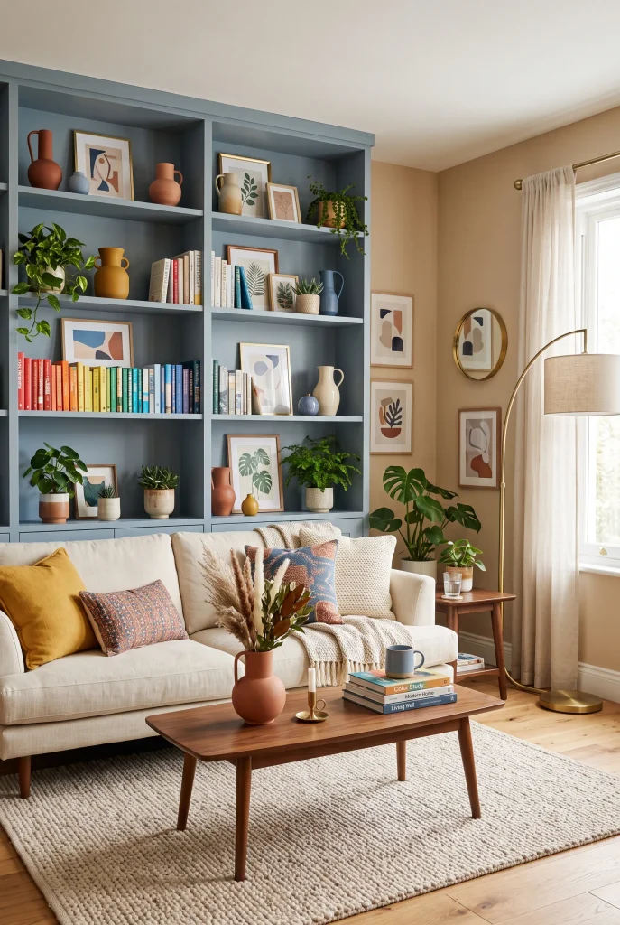
- Painted shelving adds color while providing useful storage and display space.
- Use books and accessories to introduce several coordinated accent shades.
- Leave some shelves partially empty to avoid a cluttered appearance.
- Repeat the shelf color through small decorative objects for cohesion.
Colorful built-in shelves can combine practical storage with a strong decorative statement, making them ideal for living rooms that need both personality and organization. Painting the shelving in muted blue, sage, terracotta, or another favorite shade creates a defined feature without covering every wall. Fill the shelves with books, framed prints, ceramics, plants, and a few meaningful objects. Keep some sections intentionally open so the display can breathe. The combination of colored cabinetry and carefully selected accessories gives the room depth while keeping everyday storage visually integrated into the overall design.
The most successful shelves usually balance color, height, texture, and empty space. Avoid placing similarly sized objects together in every compartment because the arrangement can quickly look repetitive. Instead, combine tall books, small ceramics, framed artwork, and trailing plants at different levels. If the shelves are already colorful, choose a calmer sofa and rug to maintain visual balance. I’ve noticed that grouping accessories by color rather than filling every shelf randomly makes the whole display feel more intentional. It also makes seasonal updates easier because you can replace a few small pieces without changing the entire arrangement.
17. Colorful Ceiling
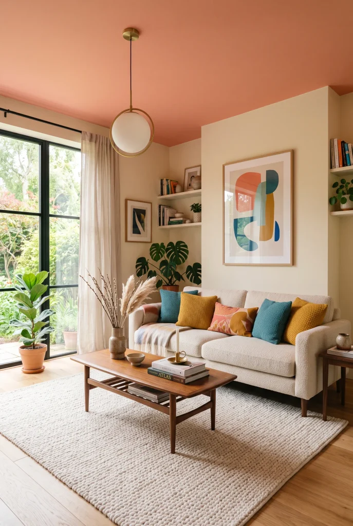
- A colorful ceiling adds personality in an unexpected place.
- Softer shades work well when the room has limited natural light.
- Keep walls and major furniture neutral to emphasize the ceiling.
- Use a pendant light to visually connect the ceiling with the seating area.
A colorful ceiling can completely change the atmosphere of a modern living room while leaving the walls and furniture relatively simple. Soft coral, muted blue, sage, or warm yellow can create a surprising overhead focal point without consuming valuable wall space. This technique works particularly well with neutral sofas, light flooring, and understated rugs because the ceiling becomes the unexpected source of personality. Choose a shade that connects with one or two accessories below, such as a cushion or artwork detail. The effect feels playful but refined, especially when the color is slightly muted rather than intensely saturated.
Lighting becomes especially important when using color overhead because the shade can change dramatically from morning to evening. Test a small paint sample before committing, and observe it under both daylight and artificial lighting. A simple pendant can further emphasize the ceiling and visually anchor the seating area beneath it. If you prefer subtle color, choose a ceiling shade only slightly deeper than the walls. For a stronger statement, use a contrasting hue while keeping everything below calmer. I’ve noticed this approach can make a familiar room feel surprisingly fresh without adding another piece of furniture.
18. Pink Sofa Cushions
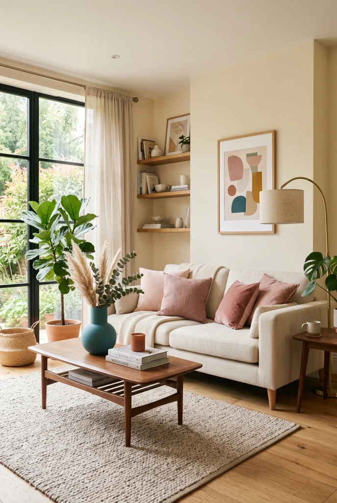
- Pink cushions add softness without making the room feel overly feminine.
- Mix blush and dusty rose for subtle tonal depth.
- Pair pink with teal or green for a fresh modern contrast.
- Textured fabrics make the color feel richer and more sophisticated.
Pink cushions can soften a modern living room while introducing just enough color to make a neutral sofa feel fresh and interesting. Blush, dusty rose, and muted pink shades work particularly well with cream upholstery, warm ivory walls, and natural wood. Add a small teal or green accessory nearby for contrast, then repeat one pink tone in artwork or a throw. Using several related shades creates depth without making the sofa look overly coordinated. The result feels warm, relaxed, and contemporary, especially when the cushions feature different fabrics such as linen, velvet, and boucle.
Because cushions are easy to change, they are a practical starting point if you are experimenting with colorful decorating for the first time. Try placing the darker pink cushions toward the back and lighter shades toward the front to create a layered appearance. Avoid filling every available space with accessories; a few carefully chosen pieces usually create a stronger effect. I’ve noticed that dusty pink looks particularly elegant beside warm wood and brass because those materials bring out its subtle warmth. This simple update can make an existing neutral seating area feel noticeably more welcoming.
19. Blue Accent Cabinet
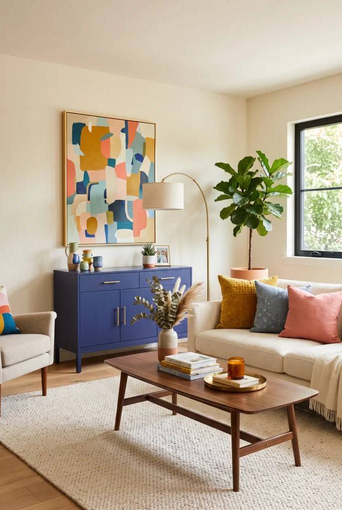
- A blue cabinet adds color while providing useful hidden storage.
- Choose brass or warm metal hardware to soften deeper blue tones.
- Style the top with ceramics, artwork, or a small plant.
- Keep surrounding furniture simple so the cabinet becomes a clear focal point.
A blue accent cabinet can bring both color and function into a modern living room, making it a smart choice when you want more personality without sacrificing storage. Deep navy, cobalt, or muted blue cabinetry looks especially polished against warm cream walls and light oak flooring. Brass handles can introduce warmth, while mustard or terracotta accessories create small points of contrast. Use the cabinet to hide everyday clutter, then style its top with a few carefully selected objects. This combination of practical storage and strong color helps the room feel organized while still having a distinctive decorative feature.
Placement can make the cabinet even more effective. Use it along a long empty wall, beneath artwork, or beside the main seating area where its color can visually balance the sofa. Avoid overcrowding the surrounding space because the cabinet already provides a substantial block of color. A textured rug and natural wood furniture can soften the overall composition. In my experience, painted storage pieces are particularly useful in rooms where adding more open shelving would create visual clutter. You get the personality of colorful furniture while keeping less attractive everyday items neatly out of sight.
20. Green And Coral
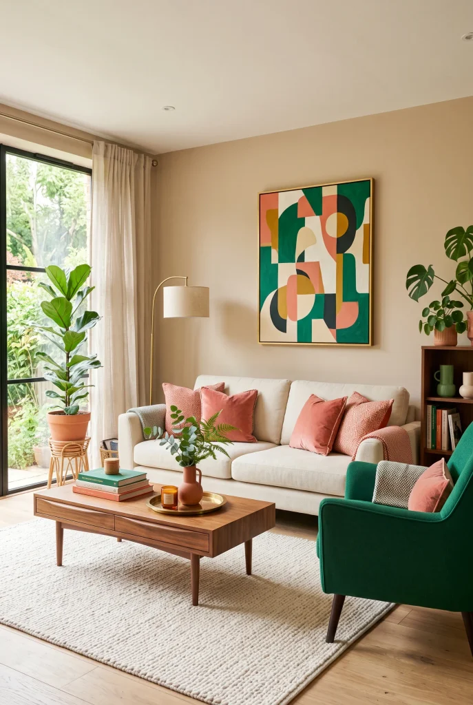
- Green and coral create a lively warm-and-cool color balance.
- Use one shade as the dominant color and the other as an accent.
- Cream and natural wood help soften the stronger combination.
- Repeat both shades in small accessories for a connected appearance.
Green and coral create a lively combination that can make a modern living room feel fresh without relying on a large number of colors. Emerald or sage green provides a grounded base, while muted coral introduces warmth and energy. Try using green on one substantial piece, such as an accent chair or curtains, then bring coral into cushions, artwork, or ceramics. Cream upholstery and natural wood can bridge the two shades and prevent the contrast from becoming too intense. This balance creates a room that feels colorful, welcoming, and thoughtfully layered rather than visually overwhelming.
The secret is controlling the proportions between the two colors. If both appear equally strongly across the room, the palette can feel busy. Instead, allow one shade to dominate and use the other as a supporting accent. For example, a green chair can become the main statement while coral appears in two cushions and an artwork detail. I’ve noticed that slightly muted versions of both colors are easier to live with because they retain personality without becoming visually tiring. Add neutral textiles and warm lighting to create a comfortable atmosphere that still feels distinctly modern.
21. Rainbow Accent Chair
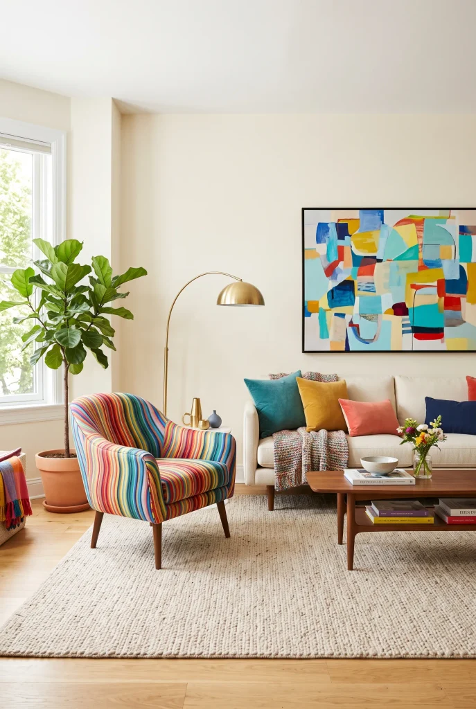
- A multicolor chair can become an instant conversation piece.
- Keep the surrounding furniture neutral so its varied colors remain clear.
- Repeat just one or two chair colors through nearby accessories.
- Choose a comfortable shape so the statement piece remains practical.
A rainbow-inspired accent chair can bring several colors into a modern living room through one carefully chosen piece. Instead of adding bright shades across every surface, let the chair provide the main burst of personality while cream upholstery, warm walls, and natural wood keep the surrounding space calm. Look for upholstery that combines colors such as teal, coral, mustard, pink, or green in a balanced pattern. This makes the chair easier to coordinate with existing decor. The result feels playful and artistic while still fitting comfortably into a clean contemporary setting.
Because a multicolor chair already contains several shades, avoid surrounding it with too many competing patterns. Choose one or two colors from the upholstery and repeat them subtly through cushions, artwork, or ceramics. Placement also matters; position the chair where it can be appreciated visually while still contributing to the seating arrangement. I’ve noticed that statement chairs work best when they serve a genuine purpose rather than simply filling an empty corner. A comfortable chair beside a sofa can create a useful reading or conversation spot while giving the entire room a stronger decorative identity.
22. Colorful Coffee Table
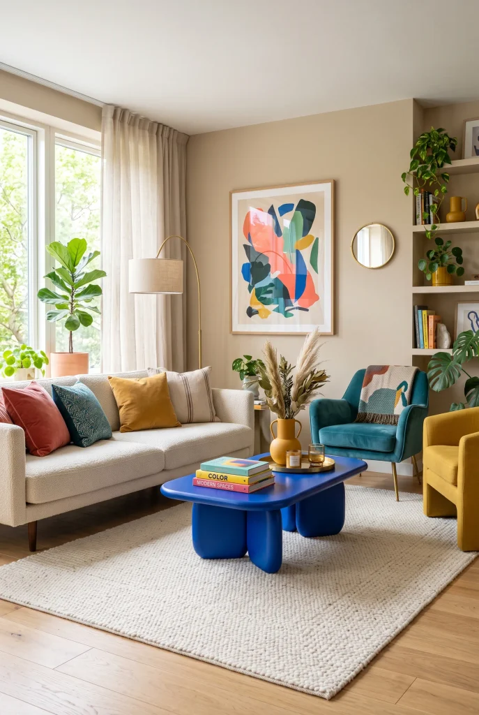
- A colorful coffee table adds personality at the center of the seating area.
- Sculptural shapes make the piece feel modern and artistic.
- Choose a shade that connects with artwork or upholstery.
- Keep tabletop styling minimal so the furniture remains visually strong.
A colorful coffee table can turn the center of a living room into an unexpected focal point. Instead of choosing another neutral wood or glass design, consider a sculptural table in cobalt blue, coral, mustard, or deep green. Because the piece sits between the main seating areas, its color naturally becomes visible from several angles. Keep the sofa and larger furniture relatively understated so the table can make its statement without creating visual competition. A few carefully selected books, a ceramic bowl, or a small vase can complete the surface without hiding its distinctive shape.
The table should still work practically, especially if the living room is used every day. Choose a durable finish that can handle cups, books, and regular cleaning, and consider rounded edges when children or pets share the space. A strong color can also help connect different seating pieces that might otherwise feel unrelated. For example, a blue table can visually bridge a green chair and coral cushions. In my experience, colorful smaller furniture is a useful compromise for people who want a bold interior but are not ready to invest in a brightly colored sofa or large cabinet.
23. Colorful Floor Lamp
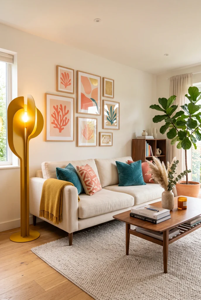
- A colorful floor lamp combines decorative impact with useful lighting.
- Choose a sculptural silhouette to make the lamp feel like artwork.
- Place it beside a sofa or reading chair for practical illumination.
- Repeat its color subtly through cushions or decorative objects.
A colorful floor lamp can add a striking accent while solving a practical lighting need in the living room. Choose a sculptural design in mustard, cobalt, coral, or another saturated shade, then position it beside a sofa or reading chair. During the day, the lamp works as a decorative object; in the evening, it creates a warm pool of light that makes the seating area feel more inviting. Pairing it with neutral furniture keeps the color focused and prevents the room from becoming visually crowded. This is a simple way to combine style and everyday function.
Think about the lamp’s height, shade direction, and bulb temperature before choosing one. A tall arc lamp can extend over a sofa, while a compact sculptural design may work better beside an accent chair. Warm white lighting generally complements colorful interiors because it softens strong shades after sunset. I’ve noticed that lighting often makes the difference between a room looking attractive in photographs and actually feeling comfortable at night. Use the lamp to create a secondary focal point, while keeping overhead lighting softer so the room retains a layered, relaxed atmosphere.
24. Mixed Color Seating
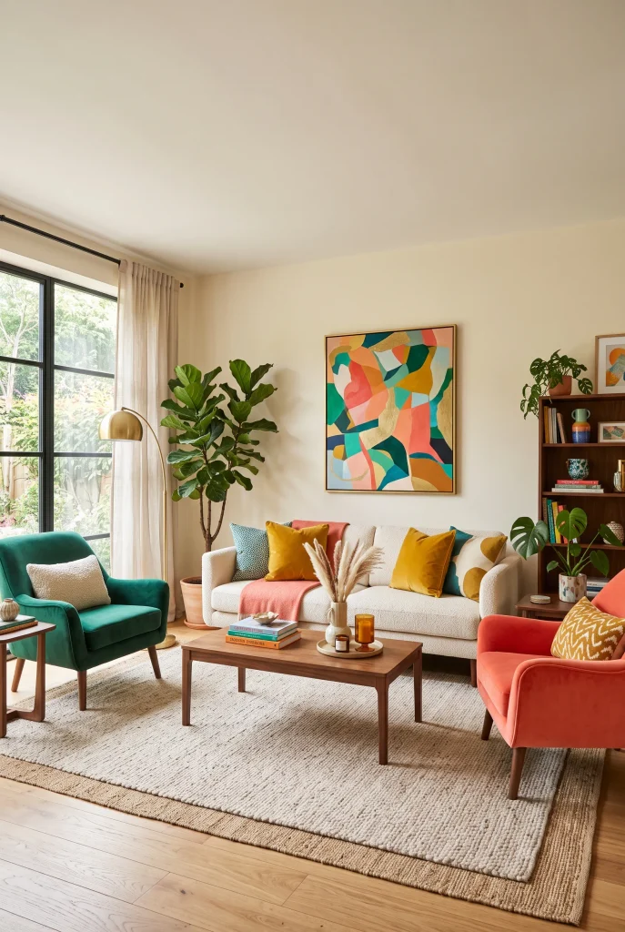
- Mixing seating colors creates a layered, collected appearance.
- Keep furniture silhouettes similar to maintain visual consistency.
- Use a neutral sofa as the anchor between stronger accent shades.
- Repeat small color details across cushions, artwork, and accessories.
Mixed-color seating can make a modern living room feel much more curated than a matching furniture set. Start with a neutral cream or beige sofa, then introduce two accent chairs in complementary shades such as emerald green and muted coral. Similar silhouettes or upholstery textures help the different colors feel connected rather than random. Add a mustard cushion or colorful artwork to bridge the palette. This approach creates clear visual variety while keeping the main seating arrangement comfortable and functional. It is especially effective when you want personality without covering every corner in bold color.
The arrangement should feel balanced from different viewpoints, particularly if the room connects to a dining area or hallway. Place stronger colors opposite or diagonally across from one another so the eye naturally moves around the space. Keep the coffee table, rug, and curtains relatively neutral to provide visual breathing room. In my experience, matching furniture is not necessary for a polished room; repeating shapes, materials, or accent colors can create enough unity. This makes it easier to work with pieces collected over time while still achieving a deliberate, contemporary look.
25. Layered Color Palette
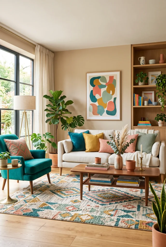
- Layered colors create depth without requiring every piece to be brightly colored.
- Combine one dominant shade with two or three supporting accents.
- Use neutral cream and natural wood to balance the palette.
- Repeat colors at different heights for a cohesive visual flow.
A layered color palette brings all the previous decorating principles together by using several coordinated shades at different visual levels. Start with a calm foundation such as cream walls, light flooring, and neutral upholstery. Then build upward with a dominant accent color, followed by smaller touches of teal, mustard, coral, sage, or another complementary shade. Introduce these tones through furniture, rugs, cushions, artwork, and ceramics rather than concentrating everything in one area. The result feels rich and colorful while maintaining enough neutral space for the room to remain comfortable and visually organized.
The easiest way to make multiple colors work is to control their proportions. Let one shade appear most often, use a second color for supporting furniture or textiles, and reserve the brightest accents for smaller decorative pieces. Varying texture also prevents the palette from feeling flat; combine linen, velvet, woven materials, wood, and ceramics for added depth. I’ve noticed that repeating colors at different heights helps the eye move naturally around the room. Whether your space is large or compact, this method creates a modern colorful living room that feels personal, balanced, and easy to live with.
Conclusion
Color can completely change how your living room looks and feels, especially when bold shades are balanced with warm neutrals, natural materials, and thoughtful textures. These ideas show that creating a modern colorful living room does not have to mean making every corner bright or complicated. Start with one change that excites you, whether it is a colorful chair, patterned rug, artwork, or a fresh set of cushions. I’ve seen how small updates can make a familiar space feel completely new. Save this article on Pinterest, try your favorite idea, and share it with someone who needs colorful living room inspiration.