21 Earth Tone Bathroom Color Palette Ideas Worth Saving
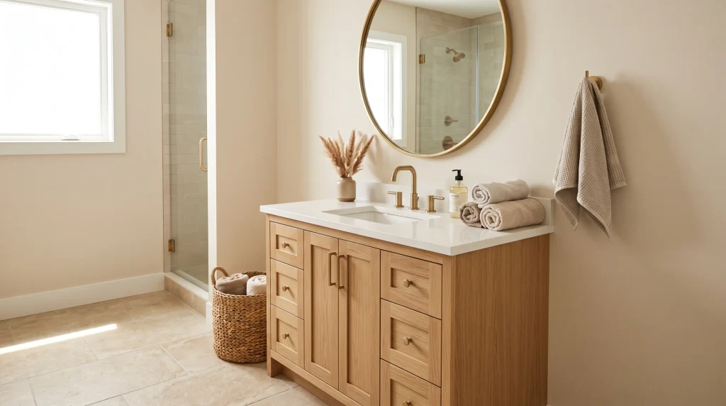
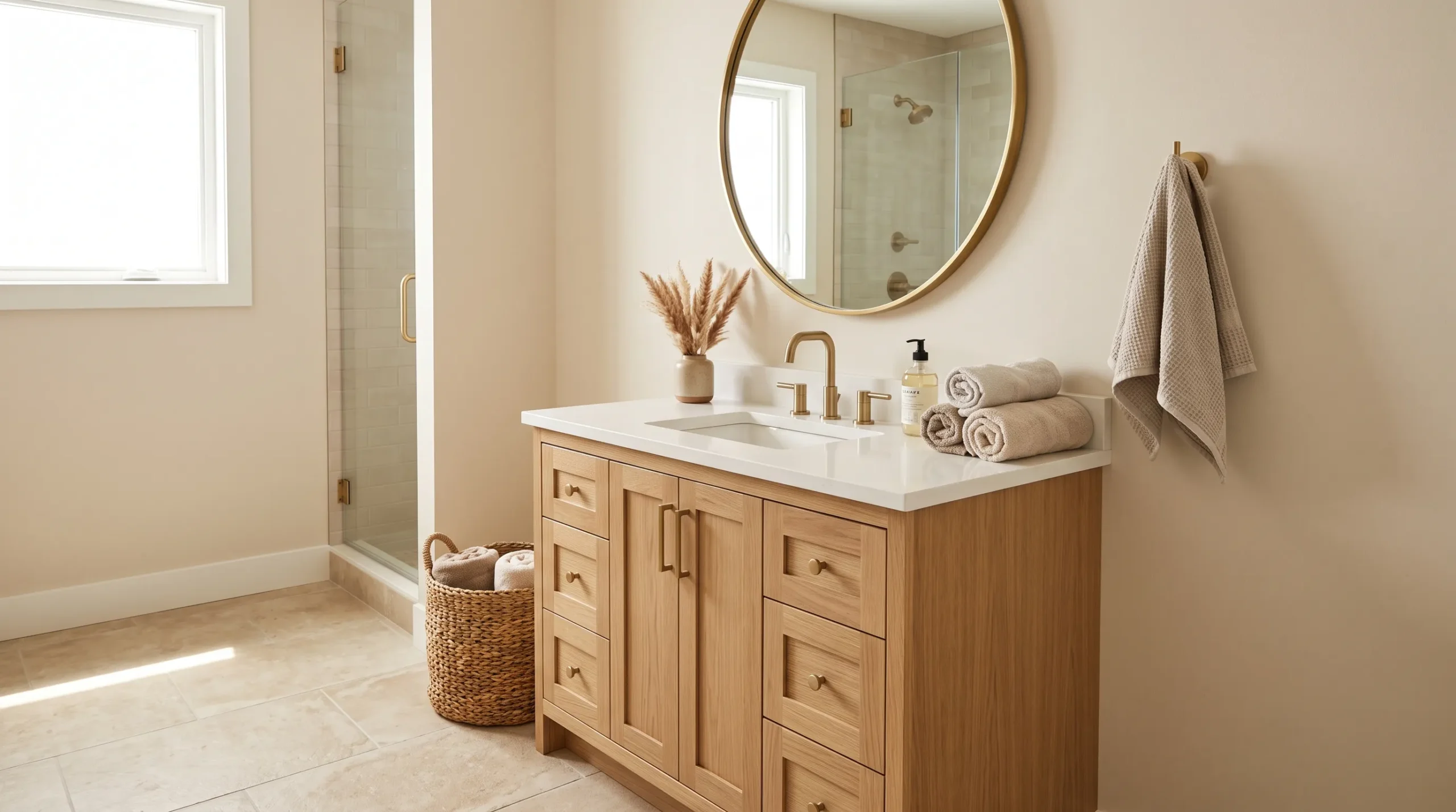
The right bathroom colors can make a simple space feel warm, calming, and beautifully finished. An earth tone bathroom color palette brings together natural shades that feel timeless and easy to live with.
From warm taupe and sandy beige to olive green, terracotta, walnut, and creamy stone, these colors can completely change the mood of your bathroom without requiring a full renovation. They also work beautifully with natural materials, soft textures, and warm lighting. If your bathroom currently feels too plain, too cold, or visually disconnected, these ideas can help create a more balanced look. Even small changes in color and texture can make a noticeable difference when the tones work naturally together.
1. Warm Taupe Walls

- Warm taupe gives the bathroom a soft, grounded foundation.
- Natural wood prevents the neutral palette from feeling flat.
- Brass fixtures add a subtle touch of warmth and polish.
- This combination works especially well in bathrooms with limited natural light.
Warm taupe walls can instantly make a bathroom feel calmer and more connected to nature. This shade sits beautifully between beige and brown, giving the room enough depth without making it feel dark or heavy. Pair it with creamy whites, light oak, and stone-inspired surfaces for a balanced look that feels welcoming rather than overly styled. Warm neutrals are especially useful when you want a bathroom to feel cozy but still clean. They also provide an easy backdrop for changing towels, artwork, baskets, and small decorative accents as your style evolves.
For a polished result, keep the larger elements within the same warm color family instead of introducing too many competing tones. A taupe wall looks beautiful beside limestone flooring, sandy textiles, and pale wood cabinetry. Brushed brass hardware can add gentle contrast without overpowering the palette. If the bathroom is small, use lighter taupe on the walls and reserve deeper earthy shades for accessories or cabinetry. This creates dimension while keeping the room visually open. Soft layered lighting is another important detail because it brings out the warmth in the walls and makes the entire space feel more inviting.
2. Sandy Beige Layers

- Sandy beige creates a light and naturally relaxing bathroom base.
- Layering similar tones adds depth without visual clutter.
- Textured towels and baskets keep the neutral palette interesting.
- Light wood works beautifully with sandy and creamy shades.
Sandy beige is one of those colors that can make a bathroom feel brighter while still giving it warmth. Instead of relying on stark white surfaces, this softer neutral creates a relaxed backdrop that works beautifully with natural materials. Try pairing beige walls with creamy tile, pale oak cabinetry, and woven storage for a gentle layered effect. The key is to vary texture rather than adding lots of colors. A matte wall, lightly textured towel, smooth stone counter, and woven basket can create enough visual interest to make the space feel thoughtfully designed.
If your bathroom already has basic white fixtures, sandy beige can help soften their appearance without requiring a major renovation. Use the shade on walls, shower tile, or even a small accent area, then introduce slightly darker beige through rugs and accessories. Keeping the undertones consistent makes a surprisingly big difference; warm beige looks most cohesive beside warm whites and natural woods. Add greenery sparingly for a fresh contrast. The finished room feels earthy and comfortable while remaining bright enough for everyday routines, morning preparation, and relaxing evening baths.
3. Olive Green Accents

- Muted olive adds nature-inspired color without overwhelming the bathroom.
- A green vanity can become the room’s strongest visual anchor.
- Terracotta accessories introduce a warmer earthy contrast.
- Keep surrounding surfaces neutral so the green feels intentional.
Muted olive green can bring a surprisingly rich earthy character to a bathroom while still feeling calm and timeless. Rather than covering every surface in green, use it selectively on a vanity, cabinet, painted niche, or small accent wall. Surrounding the color with warm ivory, creamy stone, and natural wood keeps the room balanced. This approach is especially helpful if you want more personality than a neutral bathroom can provide. The green feels connected to plants and nature, while the neutral materials stop the space from becoming visually busy or overly themed.
For a cohesive finish, choose olive with warm rather than cool undertones. Pair it with aged brass hardware, light oak shelves, and sandy textiles to create gentle contrast. A small terracotta vase or earthy ceramic container can reinforce the palette without adding another dominant color. One strong earthy accent usually looks more sophisticated than several competing shades. If your bathroom is compact, consider using olive on the vanity while keeping the walls light. This gives the room personality and depth while preserving an airy feeling around the main fixtures.
4. Terracotta Tile Details
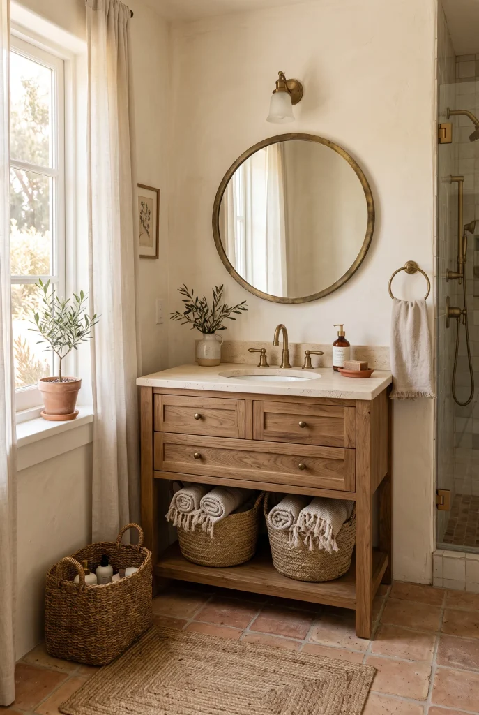
- Terracotta adds warmth and character without making the room feel overly colorful.
- Small-format tiles can create beautiful visual texture underfoot.
- Cream walls help soften the stronger clay tones.
- Aged brass complements terracotta especially well.
Terracotta brings a naturally warm feeling to the bathroom, especially when used as flooring or a small tiled feature. Its clay-inspired color works beautifully with cream, beige, walnut, and natural stone, creating a palette that feels collected rather than overly coordinated. For a subtle approach, use terracotta tiles only on the floor or inside a shower niche. This gives the room an earthy focal point while keeping the larger surfaces calm. The slightly varied tones found in natural-looking terracotta also help hide everyday marks, making the material practical for busy bathrooms.
To keep the color balanced, surround terracotta with softer shades instead of adding several dark finishes. Cream walls, pale stone counters, and natural wood cabinetry create an inviting backdrop that lets the tile stand out. Terracotta looks especially beautiful when paired with warm lighting because its clay undertones become richer in the evening. Choose simple accessories such as linen towels, woven baskets, and handmade-looking ceramics to reinforce the natural character. The result is a bathroom that feels warm and distinctive while still being easy to live with and update.
5. Mushroom Gray Neutrals

- Mushroom gray adds depth without the coolness of traditional gray.
- Walnut cabinetry makes the palette feel warmer and richer.
- Creamy surfaces prevent the room from looking too muted.
- Soft lighting brings out the subtle brown undertones.
Mushroom gray is a useful choice when you want a bathroom that feels neutral but has more depth than plain beige. Its subtle mix of gray and brown gives the walls a grounded appearance that works particularly well with wood, stone, and warm metals. Use it on painted walls or larger tile surfaces, then balance it with creamy white fixtures and natural textures. The color can make a bathroom feel sophisticated without becoming formal. It is also flexible enough to work with both contemporary and transitional interiors, making it a practical choice for a space you want to keep visually timeless.
For a richer earthy bathroom palette, pair mushroom gray with walnut or medium-toned wood rather than pale finishes alone. Cream towels, stone accessories, and woven storage can soften the darker neutral while adding useful texture. If the room receives little daylight, test the paint under both daytime and evening lighting before committing because mushroom shades can shift noticeably. A warm bulb can make the color appear deeper and cozier. Keeping the rest of the finishes simple allows the nuanced wall color to become a quiet feature instead of competing with the room’s other elements.
6. Clay and Cream Contrast

- Clay tones give the vanity or cabinetry a warm focal point.
- Cream surfaces keep the stronger earthy shade feeling light.
- Handmade ceramics add subtle visual texture.
- Brass details connect the warm colors throughout the room.
Clay and cream create an inviting contrast that feels warm without becoming visually heavy. A clay-colored vanity can act as the main statement while creamy walls and stone surfaces keep the bathroom feeling bright. This combination works particularly well when you want earthy color but do not want to commit to dark walls or bold patterned tile. The soft reddish-brown undertones in clay shades pair naturally with beige, ivory, and light wood. Together, these colors create a relaxed atmosphere that feels thoughtfully layered rather than decorated around one dramatic feature.
To make this combination work in a real bathroom, repeat the clay tone in small details instead of introducing several new colors. A ceramic soap dish, small vase, bath mat, or framed artwork can subtly echo the vanity. Choose warm cream rather than icy white for the surrounding surfaces so the colors feel connected. This small adjustment can make a neutral bathroom look much more cohesive. Add natural wood or woven accessories for texture, then use warm lighting to enhance the clay undertones. The finished space feels earthy, comfortable, and polished without appearing overly styled.
View: 21 Scandinavian Home Office Ideas That Feel Calm & Cozy
7. Walnut and Beige
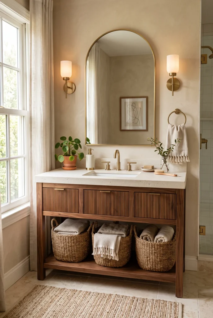
- Walnut brings rich natural depth to a soft neutral bathroom.
- Beige walls keep the darker wood from feeling too heavy.
- Creamy stone surfaces create a smooth transition between tones.
- Woven accessories add warmth without introducing competing colors.
Walnut and beige create a warm, grounded combination that works beautifully when you want a bathroom to feel refined without looking overly formal. The deeper wood grain gives the space visual weight, while beige walls and creamy surfaces keep everything balanced. This pairing is especially useful in bathrooms with simple white fixtures because the natural wood adds character and warmth. Instead of making the room feel dark, walnut can create a comfortable focal point when it is surrounded by lighter finishes. The result feels sophisticated, practical, and naturally connected to earthy materials.
For the best balance, let walnut appear in one or two major elements, such as the vanity and a floating shelf, rather than covering every surface. Pair it with warm beige paint, ivory stone, and softly textured towels. Matte or brushed brass hardware can add another warm layer without competing with the wood grain. Natural daylight can also highlight the subtle variations in walnut beautifully. Keep decorative pieces simple, using ceramics, woven baskets, or a small plant to maintain an organic and uncluttered appearance.
8. Sage and Stone
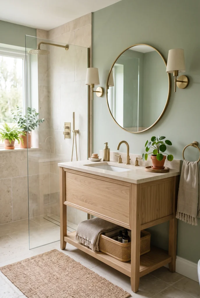
- Sage green adds a gentle nature-inspired color to the room.
- Stone surfaces provide an organic foundation for the soft green.
- Light oak keeps the palette warm and approachable.
- Minimal greenery reinforces the natural connection without clutter.
Sage green and natural stone make an easy combination for a bathroom that feels calm and fresh. The muted green brings a gentle connection to nature, while stone introduces subtle variations in beige, cream, and gray. Together, they create depth without relying on bold patterns or strong contrasts. Use sage on the walls, vanity, or a shower accent area, then surround it with limestone-look tile and light wood. This approach can make even a basic bathroom feel more intentional because each material contributes a slightly different texture and tone.
When choosing sage paint or tile, look for a muted shade rather than an extremely bright green. Softer versions are easier to pair with warm neutrals and tend to feel more timeless. Add brushed brass fixtures for gentle warmth, or choose natural wood hardware for an even more organic effect. Stone-inspired surfaces work particularly well with sage because their natural variation prevents the green from feeling too uniform. Keep towels and accessories within cream, beige, and oatmeal tones so the room stays visually peaceful while still having enough contrast to feel finished.
9. Chocolate Brown Accents
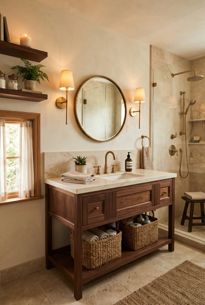
- Chocolate brown adds depth to lighter earthy bathroom colors.
- Dark wood details can create a strong visual anchor.
- Ivory walls keep the deeper shade from overwhelming the room.
- Warm lighting makes brown finishes feel especially cozy.
Chocolate brown can add striking depth to a bathroom when used as an accent rather than the dominant color. Think dark wood cabinetry, a framed mirror, floating shelves, or a small feature wall against warmer ivory and beige surroundings. The contrast makes lighter surfaces feel brighter while giving the room a richer visual foundation. This approach works especially well if you like cozy interiors but still want the bathroom to feel clean and spacious. Natural wood grain can also soften the intensity of dark brown, making it feel more organic than a flat painted finish.
Balance deeper brown accents with plenty of warm light and lighter materials. Cream tile, beige walls, and pale stone can create enough breathing room around the darker elements. If you have a small bathroom, keep chocolate brown closer to eye level or below rather than using it across every wall. A simple woven basket, linen towel, or ceramic accessory can add texture without distracting from the main palette. Repeating the dark accent in two or three places can also create cohesion without making the bathroom feel visually crowded.
10. Greige Stone Palette
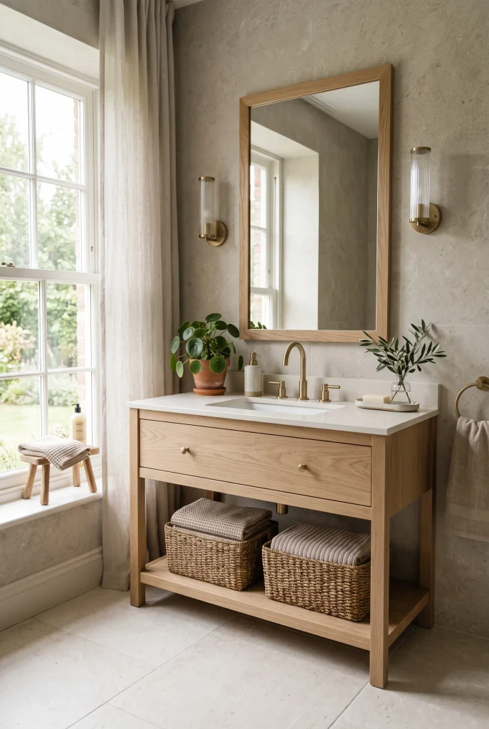
- Greige blends beige warmth with subtle gray depth.
- Stone-look surfaces create an organic, understated backdrop.
- Light oak keeps the palette feeling warm and inviting.
- Textured accessories prevent the neutral colors from looking flat.
Greige is a smart choice when you want the softness of beige with a little more structure and depth. Its balanced mix of warm beige and muted gray works beautifully with stone, wood, and creamy whites, making it easy to build a cohesive bathroom. Use greige on walls or large-format tiles, then introduce light oak and ivory surfaces to keep the room welcoming. This combination is especially useful when existing fixtures are white because the warmer neutral helps them feel integrated rather than stark.
The easiest way to make greige feel earthy is to combine it with natural-looking materials instead of adding lots of decorative color. Choose stone-inspired tile, woven storage, linen towels, and wood accents to create gentle layers. Brushed brass hardware can provide a small amount of warmth, while matte black can create sharper contrast if that suits your style. Large-format greige tiles can also make smaller bathrooms appear more continuous because there are fewer visual breaks. Keep patterns subtle so the natural variations in the surfaces remain the main source of interest.
11. Mocha Wood Tones
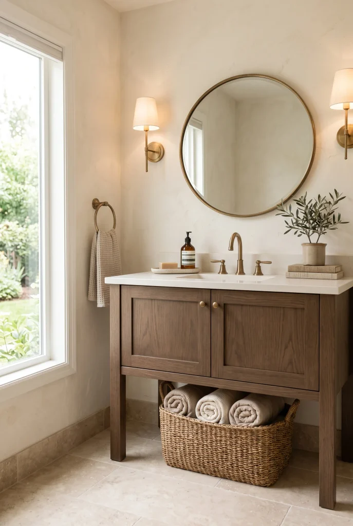
- Mocha wood brings richness without requiring dark painted walls.
- Cream walls create a lighter contrast around deeper cabinetry.
- Travertine-inspired finishes add natural variation and texture.
- Warm metals complete the palette without overpowering the wood.
Mocha wood tones can make a bathroom feel instantly warmer and more substantial. The deep brown color works particularly well on a vanity because it creates a clear focal point without taking over the entire room. Pair it with warm cream walls, beige stone, and ivory surfaces to create contrast while maintaining an earthy feel. This palette is especially effective when you want a bathroom that feels cozy and elevated rather than overly minimal. The natural grain of the wood also adds visual movement, helping simple bathroom layouts feel more detailed.
If the vanity is dark, keep the surrounding finishes relatively light so the room maintains balance. Travertine-look tile, creamy quartz, and beige textiles can soften the deeper wood while preserving its richness. Add antique brass or brushed bronze hardware for another warm layer, but avoid too many metallic finishes at once. A small woven basket or natural fiber stool can reinforce the organic quality of the space. Repeating the mocha tone in one smaller detail, such as a mirror frame or shelf, helps the bathroom feel connected without making every element match.
12. Creamy Limestone Tones

- Creamy limestone creates a naturally soft foundation.
- Pale oak adds warmth without creating strong contrast.
- Tonal layering keeps the bathroom calm but visually interesting.
- Subtle stone variation adds character to simple surfaces.
Creamy limestone tones can give a bathroom a relaxed, spa-like feeling while staying firmly within a warm earthy palette. The soft ivory and beige variations found in limestone-inspired finishes add subtle depth without demanding attention. Use the look across flooring, shower walls, or a vanity backsplash, then bring in pale wood and warm white fixtures. Because the colors remain close together, the bathroom feels visually continuous and peaceful. This is particularly helpful in smaller spaces where too many contrasting finishes can make the room appear fragmented.
To keep a limestone-inspired bathroom from looking too plain, focus on texture and material variation. Pair smooth stone surfaces with woven baskets, lightly textured towels, and natural wood cabinetry. Brushed brass hardware can introduce a small amount of contrast while maintaining the warm undertone. If you are selecting tile, consider finishes with gentle veining or natural-looking variation rather than perfectly uniform pieces. This small detail can make neutral bathrooms feel more authentic and less flat. Finish the space with minimal greenery or handmade ceramics for an understated, naturally collected look.
13. Rust and Oatmeal
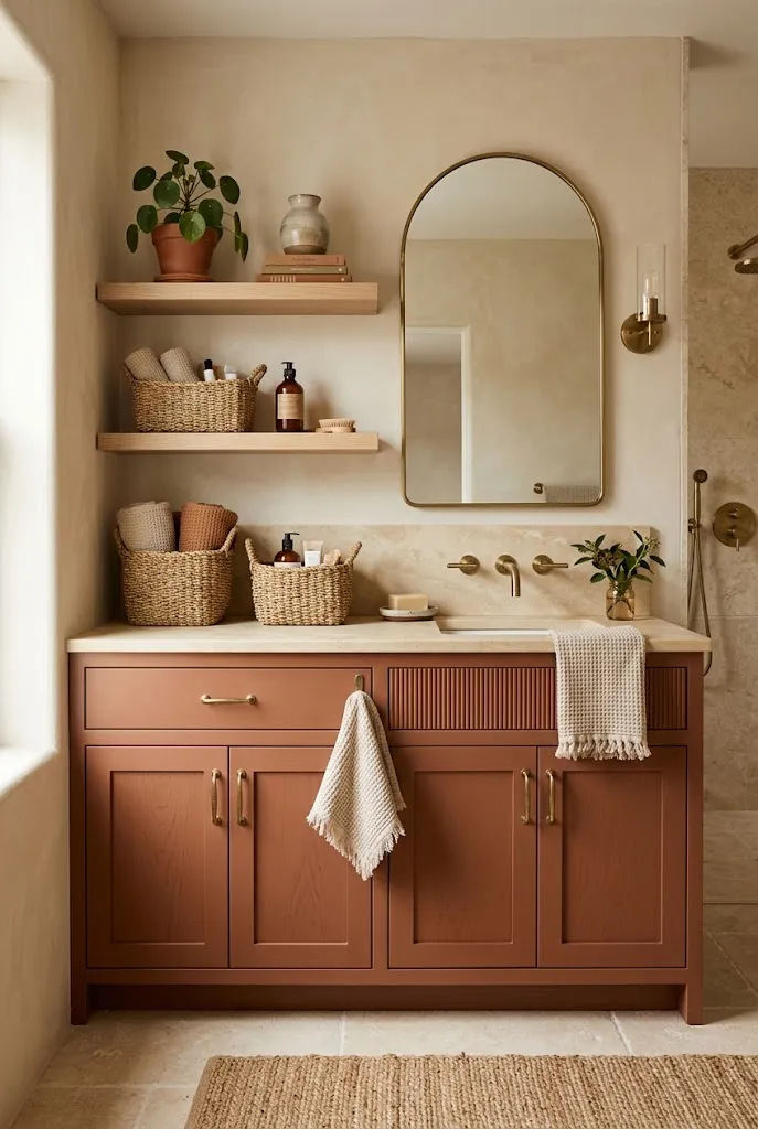
- Muted rust adds personality without becoming overly bright.
- Oatmeal walls soften the stronger clay-inspired shade.
- Pale wood keeps the combination natural and approachable.
- Textured fabrics make the palette feel warmer and more layered.
Rust and oatmeal create a warm, inviting combination that feels earthy without looking too dark. A muted rust vanity or accent tile can introduce a beautiful clay-inspired color, while oatmeal walls provide a soft neutral backdrop. The two shades work naturally together because both have warm undertones. Add pale wood, creamy stone, and simple linen textiles to keep the bathroom feeling balanced. This approach is ideal when you want more color than a beige bathroom offers but still prefer a calm palette that feels comfortable and easy to live with.
Use rust as a controlled accent rather than covering every surface with it. A vanity, shower niche, small tile section, or decorative ceramic piece can provide enough color to make the room memorable. Oatmeal towels and warm ivory accessories can repeat the softer side of the palette throughout the space. Muted earthy colors often look more sophisticated when their intensity is balanced with natural textures. Keep the flooring light and choose warm lighting to bring out the rust tones without making the bathroom feel visually heavy or overly saturated.
14. Espresso and Sand
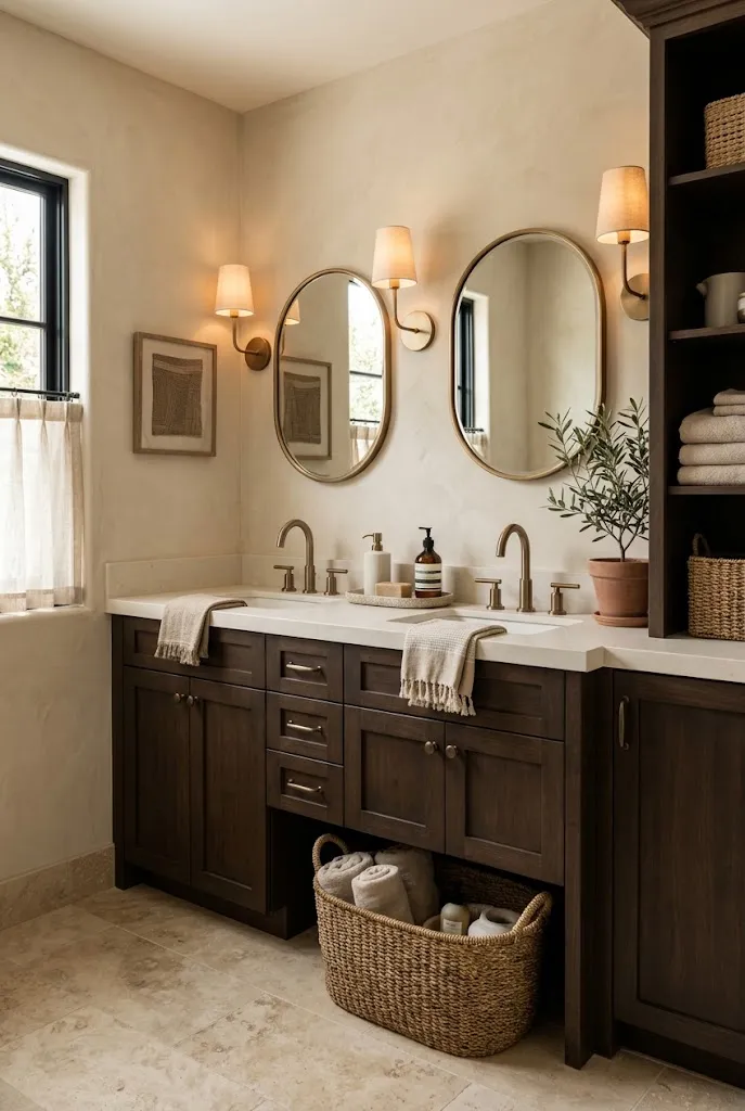
- Espresso adds dramatic depth to an otherwise soft neutral palette.
- Sand-colored walls keep the room visually warm and open.
- Travertine-inspired surfaces soften the darker cabinetry.
- Bronze hardware creates a cohesive warm-metal connection.
Espresso and sand create a dramatic but balanced bathroom palette by combining a deep brown with a lighter natural neutral. An espresso vanity can become a strong anchor against sand-colored walls, especially when paired with creamy stone and warm ivory fixtures. The contrast gives the room definition without relying on black or cool gray. This combination works particularly well in bathrooms where you want a richer appearance while still maintaining a comfortable, natural atmosphere. Wood grain or matte finishes can make the deep brown feel softer and more organic.
Because espresso is visually strong, use it strategically rather than across multiple large surfaces. Keep the walls, flooring, and countertop within lighter sand, cream, and beige tones so the darker cabinetry has room to stand out. Add woven storage and linen textiles for softness, then use brushed bronze or aged brass hardware for continuity. Warm layered lighting is especially helpful in the evening because it prevents the deep brown from appearing too stark. Repeating espresso in one small accessory or frame can also make the palette feel more intentional without adding unnecessary visual weight.
15. Dusty Rose Earth Tones
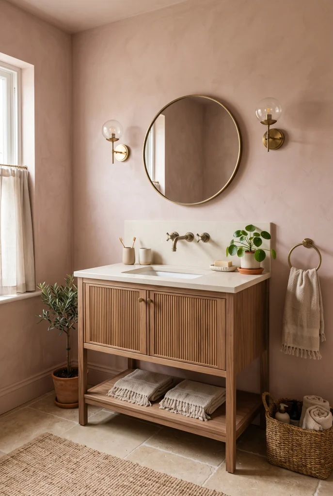
- Dusty rose adds gentle color while maintaining an earthy feeling.
- Warm beige prevents the pink undertone from becoming too sweet.
- Walnut provides deeper contrast and natural warmth.
- Antique brass complements the muted rosy tones beautifully.
Dusty rose can work surprisingly well in an earthy bathroom when the shade is muted and paired with warm natural materials. Instead of a bright pink, choose a dusty clay-like version with beige or brown undertones. Use it on walls, a vanity, or a small tiled feature, then balance it with warm beige flooring and creamy stone. The result feels softer than traditional earthy browns while still remaining grounded. This palette is a useful option when you want a bathroom with personality that does not rely on bold, saturated colors.
The surrounding materials make all the difference with dusty rose. Walnut or medium-toned wood can add depth, while linen towels and handmade ceramics reinforce the relaxed character of the palette. Antique brass fixtures provide a warm metallic detail that connects naturally with the rosy undertones. If you are unsure about using the color throughout the room, start with one wall or a vanity and keep everything else neutral. Muted rose shades become especially inviting under soft evening light, making the bathroom feel warm and comfortable without losing its sophisticated appearance.
16. Beige and Black Accents

- Beige keeps the bathroom warm while black adds definition.
- Matte black fixtures create crisp visual contrast.
- Light oak softens the stronger dark details.
- A black-framed mirror can repeat the accent without overwhelming the room.
Beige and black create a clean contrast that can make an earthy bathroom feel more modern and structured. The key is keeping beige as the dominant color while using black in smaller, intentional details. Think matte black faucets, mirror frames, cabinet pulls, or light fixtures against warm beige walls and creamy stone. This prevents the bathroom from feeling too stark while still giving the space a sharper visual edge. Light wood cabinetry can soften the contrast further, creating a comfortable balance between natural warmth and contemporary simplicity.
For a cohesive result, repeat black in two or three places rather than scattering it throughout the room. A black-framed mirror paired with matching fixtures can make the design feel deliberate without requiring major changes. Choose warm beige rather than gray-beige so the room retains its earthy character. Woven baskets, linen towels, and natural wood accessories can add softness around the darker accents. This combination works particularly well when the bathroom already has simple white fixtures because the black details give those basic elements a more finished and intentional appearance.
17. Caramel and Ivory
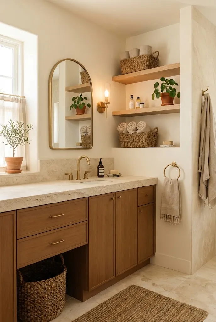
- Caramel adds warmth without the heaviness of deep brown.
- Ivory creates a bright, soft contrast around the richer tone.
- Light wood keeps the palette connected to natural materials.
- Brushed brass enhances the warm undertones beautifully.
Caramel and ivory create a welcoming bathroom palette that feels warm, soft, and naturally layered. A caramel-colored vanity or cabinet can provide enough contrast to define the space, while ivory walls and countertops keep the overall look light. This pairing works particularly well with natural wood because the colors share similar warm undertones. Instead of looking overly matched, the palette feels connected through subtle variations in beige, tan, and brown. It is a practical choice for creating an inviting bathroom without relying on dramatic colors or complicated patterns.
To make the combination feel richer, add different textures rather than introducing many additional shades. A woven basket, ribbed ceramic container, linen towel, or lightly textured rug can give the neutral palette more dimension. Brushed brass hardware works naturally with caramel and can add a polished finishing detail. If your bathroom receives strong sunlight, test the colors before painting because warm ivory and caramel can appear noticeably deeper in bright conditions. Keeping the ceiling and larger fixtures light helps this palette stay airy, especially in compact bathrooms with limited floor space.
18. Deep Olive and Cream
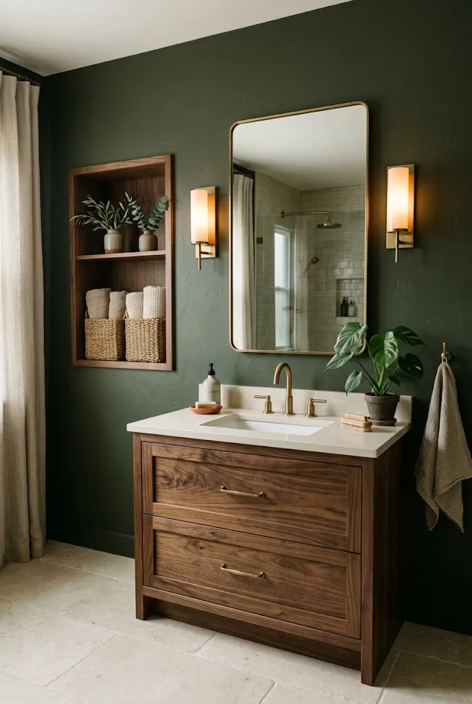
- Deep olive creates a dramatic nature-inspired focal point.
- Cream surfaces keep the darker color balanced.
- Walnut adds another natural layer without competing with olive.
- Warm brass brings subtle brightness to the deeper palette.
Deep olive and cream can create a bathroom that feels richer and moodier while still maintaining an earthy connection. Use deep olive on walls, cabinetry, or a feature area, then balance it with creamy stone, ivory fixtures, and warm neutral textiles. The contrast makes the lighter elements appear brighter while giving the room a stronger sense of depth. This palette works especially well when you want something more dramatic than beige but still prefer colors inspired by nature. Natural wood can soften the darker green and prevent the space from feeling overly formal.
When using deep olive, lighting becomes an important part of the design. Layer ceiling lights with wall sconces or warm accent lighting so the darker surfaces do not disappear in the evening. Walnut, aged brass, and woven textures can add warmth without introducing unrelated colors. If the bathroom is small, consider limiting deep olive to the vanity or one wall instead of using it everywhere. This controlled approach gives a dramatic effect while preserving visual openness. Finish with cream towels and simple ceramics for a balanced, comfortable look that still feels distinctive.
19. Taupe and Natural Wood
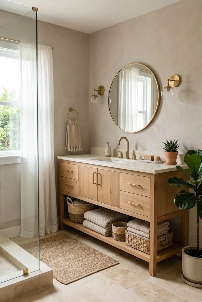
- Taupe creates a soft backdrop that works with many wood tones.
- Natural oak adds warmth and subtle texture.
- Creamy stone keeps the combination light and balanced.
- Woven accessories reinforce the organic character.
Taupe and natural wood create an easygoing bathroom palette that feels warm without becoming overly dark. Soft taupe walls provide enough color to give the room depth, while natural oak cabinetry introduces visible grain and a lighter organic texture. The combination works particularly well with creamy stone, warm white fixtures, and neutral textiles. Because the colors are naturally understated, they can make a bathroom feel peaceful and organized without looking bare. This is a useful approach when you want a timeless foundation that can adapt to different decorating styles over time.
For a more layered look, choose wood with a visible but subtle grain and pair it with slightly varied taupe and beige surfaces. A woven basket under the vanity, linen towels, or a simple wooden stool can add texture without cluttering the space. Brushed brass fixtures provide a gentle highlight while staying within the warm color family. If your bathroom has limited natural light, choose a lighter taupe and pale wood to preserve brightness. Keeping the undertones consistent is more important than matching every shade exactly because small variations make the room feel natural.
20. Warm Clay Walls

- Clay walls create a strong earthy foundation with natural warmth.
- Pale wood balances the richer wall color.
- Creamy stone keeps the bathroom visually open.
- Handmade ceramics add subtle texture and character.
Warm clay walls can transform an ordinary bathroom into a space with much more character. The earthy reddish-brown undertone creates warmth while still feeling connected to natural materials such as stone and terracotta. Pair the walls with pale oak, creamy tile, and ivory fixtures so the color has room to breathe. This combination can work especially well in bathrooms that feel too plain because the wall color becomes an architectural feature without requiring complicated decoration. The overall effect feels relaxed, grounded, and slightly Mediterranean while remaining practical for everyday use.
Because clay is naturally noticeable, keep the rest of the palette simple and warm. Choose stone surfaces with beige or cream undertones rather than cool gray, and use natural textiles to soften the stronger wall color. Aged brass hardware can add a refined detail without creating harsh contrast. If you are uncertain about painting all four walls, try clay on one accent wall or around the vanity first. Earthy wall colors can look different throughout the day, so viewing a sample in morning and evening light can help you choose the right depth before committing.
21. Forest Green Vanity
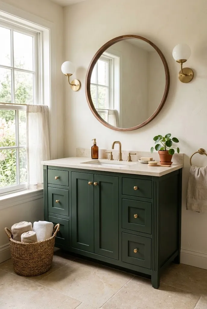
- Forest green gives the vanity a strong nature-inspired presence.
- Ivory walls keep the deeper color from dominating.
- Walnut details add warmth and natural depth.
- Brass fixtures create a polished contrast against the green.
A forest green vanity can become the focal point of an earthy bathroom without requiring a full color makeover. Its deep natural tone pairs beautifully with warm ivory walls, beige stone, and natural wood. Unlike a brighter green, forest green has enough depth to feel sophisticated while still bringing an outdoor-inspired quality into the room. Keeping the color concentrated on the vanity also makes it easier to balance. The surrounding neutral finishes provide visual breathing room, allowing the cabinetry to stand out without making the bathroom feel enclosed.
For the strongest result, choose a forest green with slightly warm or neutral undertones and pair it with creamy rather than icy white surfaces. Walnut or oak can repeat the natural theme, while brushed brass hardware adds a subtle highlight. Keep countertop styling simple with one ceramic container, a small tray, or a woven basket so the vanity remains the main feature. If your bathroom is compact, a floating green vanity can preserve visible floor area and make the room feel lighter. This approach gives you a rich earthy accent while keeping the overall design practical and balanced.
Conclusion
A bathroom does not need bold colors or complicated decorating to feel beautiful. The right combination of warm neutrals, natural greens, clay tones, wood, and stone can create a space that feels comfortable, polished, and connected to nature. These earth tone bathroom color palette ideas offer plenty of ways to refresh your space, whether you are changing a vanity, painting the walls, or simply adding new accessories. Save this article on Pinterest so you can revisit your favorite combinations later. Try one idea that fits your space, and share these inspirations with someone planning their own bathroom refresh.