21 Pot Painting Ideas You’ll Want to Try This Year
A plain plant pot can become one of the cutest details in your home with just a little paint. Pot painting ideas make it easy to turn simple planters into colorful, artistic pieces that match your style. Whether you love soft botanical designs, modern geometric patterns, cheerful colors, or warm earthy finishes, there is an option to try.
You do not need advanced painting skills or expensive supplies to get started. Many of these ideas use simple shapes, brushstrokes, borders, and color combinations that beginners can easily recreate. Even a small painted detail can make a basic planter feel much more intentional. From a windowsill to a living room shelf, these creative updates can bring personality and fresh color into everyday spaces.
1. Painted Stripes
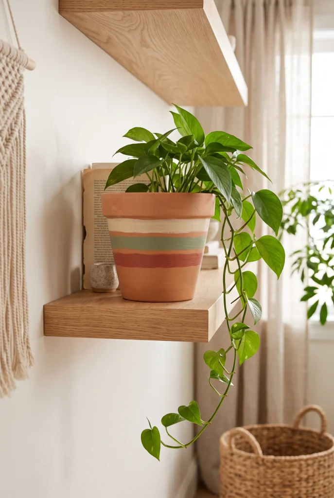
- Stripes instantly make a basic terracotta pot feel more intentional.
- Two or three colors are enough to create a polished look.
- Matching the paint to nearby decor keeps the pot from feeling disconnected.
- Painter’s tape helps create crisp, even edges.
- Slightly imperfect hand-painted lines can add a charming handmade touch.
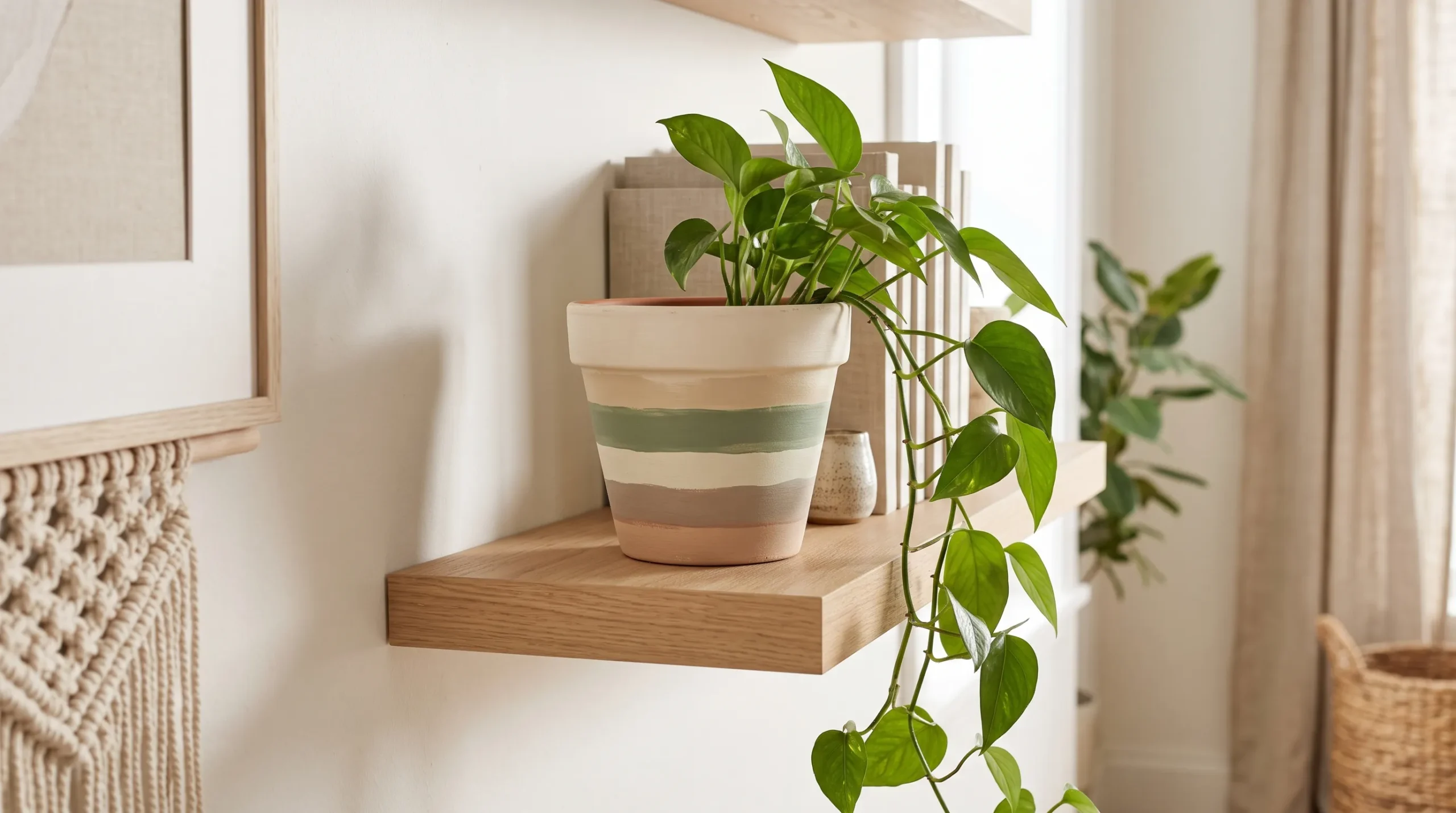
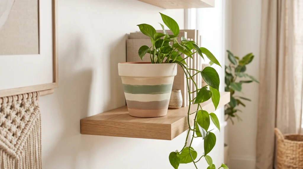
A plain terracotta pot can become a beautiful focal point with just a few clean stripes. Choose two or three colors that already appear in the room, then paint horizontal or vertical bands around the pot for an easy coordinated look. This technique works especially well on small planters because the pattern adds personality without making the container feel busy. Slightly uneven hand-painted lines can look more charming than perfectly measured ones. Use painter’s tape for crisp edges, let each layer dry fully, and finish with a suitable sealer if the pot will sit outdoors.
For a softer result, vary the stripe widths instead of making every band identical. A warm white and muted sage combination feels calm, while terracotta with cream and dusty blue gives a more collected look. The finished planter can brighten a windowsill, shelf, entry table, or covered patio without requiring expensive accessories. If you are painting several pots, repeat one color across the group to create visual connection. Matte paint gives a modern handmade appearance, while a satin finish is easier to wipe clean. Add a simple leafy plant, and the painted container becomes part of the overall decor.
2. Floral Details

- Small flowers can make a plain planter feel personal and decorative.
- A limited palette keeps delicate artwork from looking overwhelming.
- Tiny botanical details work beautifully with cottage, vintage, and romantic rooms.
- A fine brush makes small petals and leaves easier to control.
- Let each color dry before adding overlapping details.
Tiny painted flowers can turn an ordinary planter into something that feels collected and special. Instead of covering the entire surface, create small clusters around the front or scatter simple blooms at different heights. This approach keeps the design light while adding plenty of character. Floral patterns are especially lovely in bedrooms, kitchens, reading corners, and sunny windows. For beginners, start with five-petal flowers and simple leaves rather than complicated botanical drawings. One of the easiest pot painting ideas is to repeat the same small flower in slightly different sizes, creating a relaxed handmade pattern.
You can make the design look more sophisticated by choosing colors that complement the plant itself. Lavender flowers pair beautifully with silvery foliage, while soft yellow blooms look cheerful beside deep green leaves. A neutral ceramic base also gives colorful details plenty of room to stand out. If your hand is not perfectly steady, embrace small variations rather than trying to make every flower identical. Those differences create a handcrafted quality that store-bought planters often lack. Finish the pot with a compatible protective coating if needed, especially when the planter will be handled or displayed outdoors.
3. Geometric Patterns
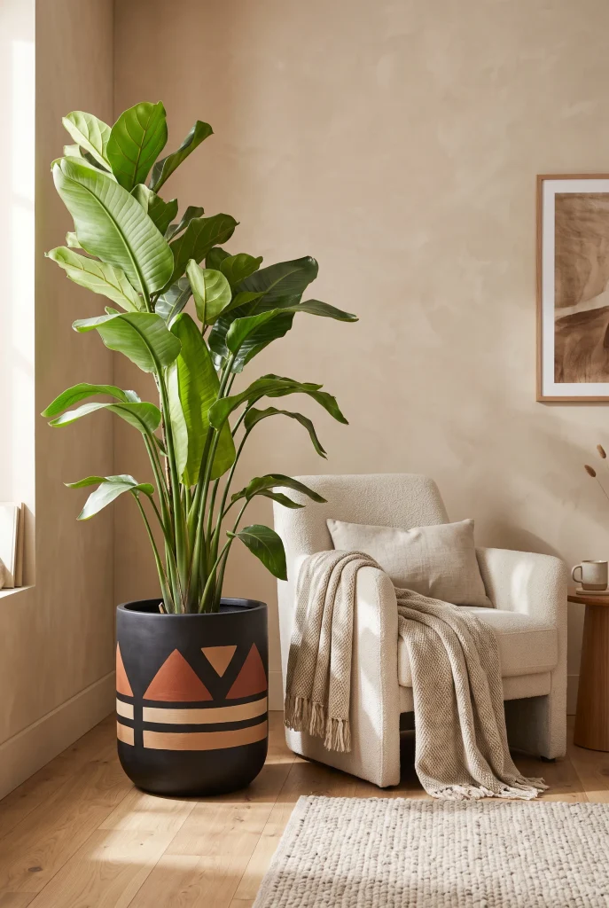
- Simple shapes create a modern look without requiring advanced painting skills.
- Triangles, arches, dots, and blocks are easy patterns for beginners.
- Earthy shades make bold geometry feel warmer and more livable.
- Repeating one shape creates a stronger visual rhythm.
- Keep surrounding decor simple so the planter remains the focal point.
Geometric designs are a great way to give a simple planter a modern personality. Think beyond complicated patterns and start with easy shapes such as arches, half circles, triangles, or small blocks. Two contrasting colors can create enough impact without making the pot feel visually heavy. This style works particularly well in contemporary, minimalist, and earthy interiors where clean lines already play an important role. Simple geometric patterns look especially effective when the plant itself has soft, organic leaves. That contrast between structured paint and natural greenery makes the entire display feel balanced.
For a cleaner result, lightly sketch the pattern with a pencil before painting. Painter’s tape can also help when working with straight lines or larger color blocks. Warm beige, clay, olive, cream, and charcoal are excellent choices for an earthy palette, while black and white create a sharper contemporary effect. You do not need to cover every inch of the pot; leaving some of the original surface visible can make the design feel lighter. Place the finished planter near simple furniture so the painted pattern becomes an intentional accent rather than competing with surrounding decor.
4. Ombre Finish
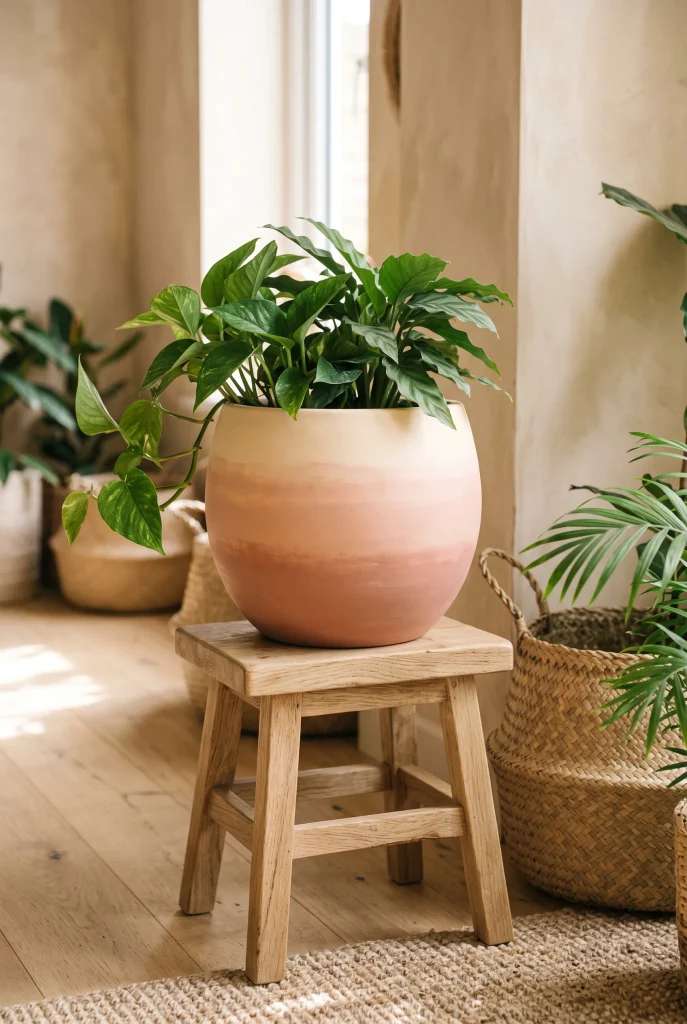
- An ombre finish adds depth without needing a complicated pattern.
- Blending similar shades creates a soft, expensive-looking effect.
- Warm colors work beautifully with natural terracotta and green foliage.
- Use thin layers of paint to make color transitions smoother.
- This technique is especially pretty on rounded or textured pots.
An ombre planter gives a basic container a soft, artistic finish while keeping the overall look simple. Choose two or three shades from the same color family, then gradually blend them from light to dark. Warm cream, blush, peach, terracotta, and muted sage are easy choices for a relaxed home. This technique works especially well on rounded pots because the curved surface naturally supports a gradual color transition. If you are new to painting, thin your colors slightly and work in small sections. Building several light layers usually creates a smoother result than applying one thick coat.
The beauty of an ombre finish is that it adds color without creating a busy pattern. A pale upper section can keep the planter feeling fresh, while a deeper shade near the bottom gives it visual weight. Try coordinating the darkest color with a nearby cushion, vase, artwork, or rug for a pulled-together display. Softer transitions tend to look more sophisticated than strong, dramatic changes. Place the finished pot on a shelf, plant stand, or console where natural light can highlight the gradual tones. Add leafy greenery, and the planter becomes an effortless decorative accent.
5. Checkerboard Pattern
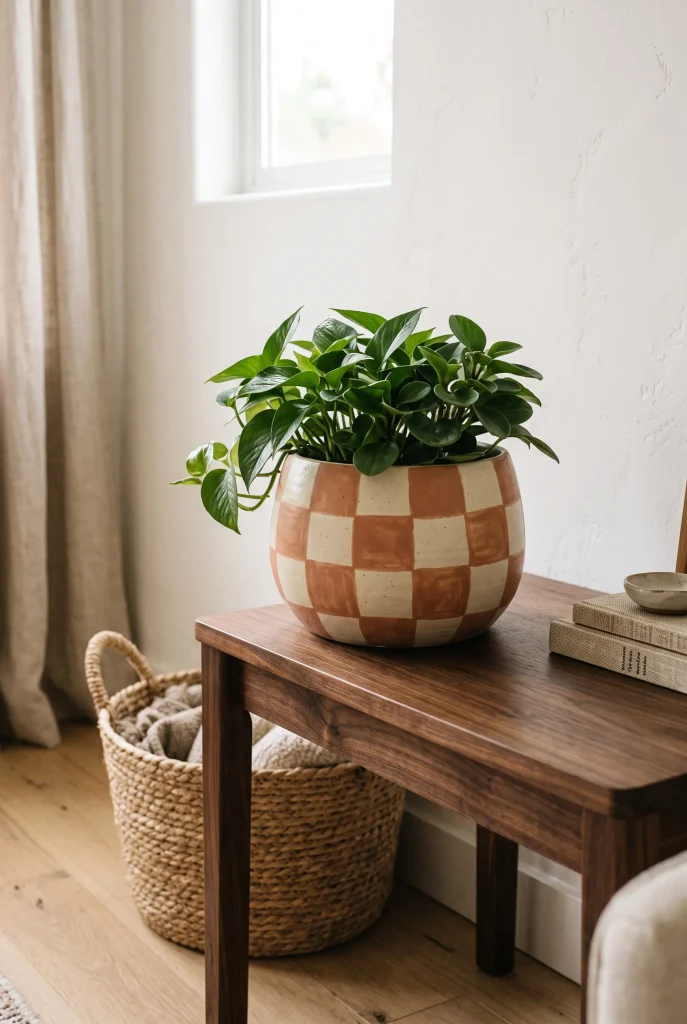
- Checkerboard patterns bring instant personality to simple planters.
- Muted colors make the pattern feel stylish rather than overly playful.
- Small squares are ideal for compact pots and tabletop plants.
- Painter’s tape can create cleaner edges and more consistent shapes.
- Keep surrounding decor simple so the planter remains the focal point.
A checkerboard planter can make even the simplest houseplant feel more styled and intentional. Instead of using stark black and white, try softer combinations such as cream and terracotta, sage and beige, or dusty blue and warm white. These muted pairings feel easier to live with and work beautifully alongside natural materials. Start by dividing the pot into sections with light pencil marks, then paint alternating squares once the base coat has completely dried. The pattern does not need to be perfectly precise to look appealing. Small handmade variations can give the finished piece a relaxed, creative quality.
The size of the squares can completely change the mood of the planter. Larger blocks create a bold graphic effect, while smaller checks feel more detailed and playful. For a balanced display, pair the patterned pot with a simple plant that has a clear leaf shape rather than highly colorful foliage. This keeps the design from becoming overwhelming. Place it on a console, bookshelf, kitchen counter, or bedside table where the pattern can be noticed easily. If you are creating multiple planters, use the same two colors across different patterns to make the collection feel coordinated.
6. Minimalist Arches

- A single arch can transform a plain pot with very little paint.
- Large shapes are easier for beginners than detailed illustrations.
- Olive, clay, beige, and cream create a calm earthy palette.
- Leaving plenty of the base color visible keeps the design minimal.
- Rounded shapes pair naturally with leafy plants and organic interiors.
A single painted arch is one of the easiest ways to create a modern planter without covering its entire surface. Choose one contrasting color and place a large rounded arch on the front of a neutral pot. The simple shape adds a clear focal point while leaving plenty of the original finish visible. This works especially well with organic-modern, Japandi, minimalist, and contemporary interiors. Use a pencil to lightly outline the arch before filling it with paint. If you want a softer appearance, choose a muted shade such as olive, clay, dusty blue, or warm taupe instead of a bright color.
The placement of the arch can also change the character of the finished piece. Centering it creates a clean, symmetrical appearance, while shifting it slightly to one side gives the planter a more artistic feel. For an even easier version, paint two small arches beside each other or repeat one shape around the pot. Keeping the rest of the planter undecorated helps this style look intentional rather than unfinished. Display the pot against a light wall or on pale wood furniture so the painted shape remains easy to see without competing with the plant.
View: 17 Popular Interior Design Styles You’ll Want to Try
7. Botanical Leaves
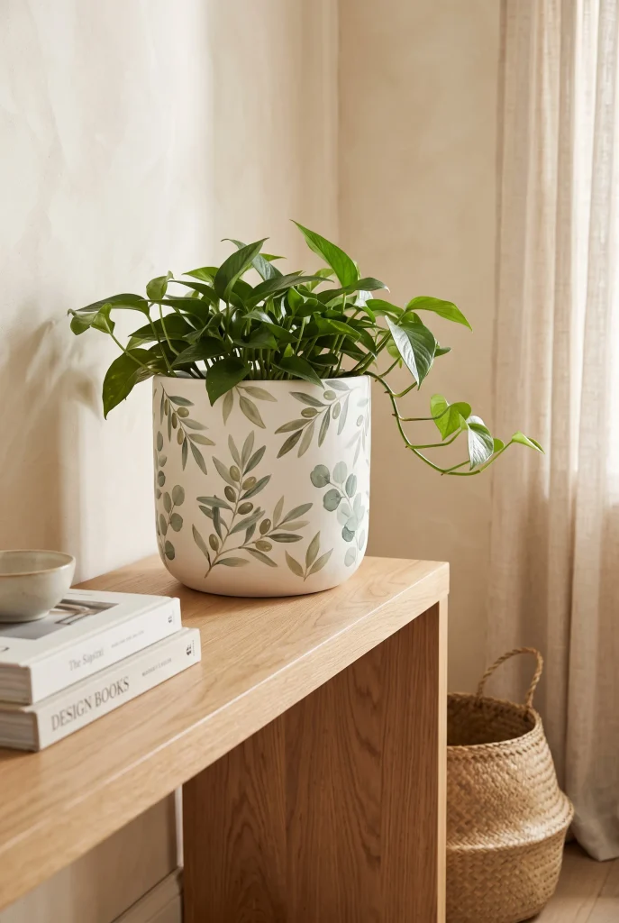
- Painted leaves bring a natural, relaxed feeling to plain containers.
- Simple leaf shapes are beginner-friendly and easy to repeat.
- Olive, sage, and eucalyptus tones work beautifully with greenery.
- Varying leaf sizes makes the pattern feel more natural.
- A neutral base keeps the botanical artwork fresh and understated.
Bring a little of the garden indoors by painting simple botanical leaves around a plain planter. You do not need detailed artwork; a few curved stems with oval or pointed leaves can create a beautiful effect. Sage, olive, eucalyptus, and muted forest green all work well against cream, beige, or terracotta backgrounds. Keep the leaves slightly different in size and direction so the pattern feels natural rather than mechanically repeated. This style is especially useful when you want a decorative planter that still feels connected to the greenery growing from it.
For a more polished finish, begin with thin stems before adding the leaves around them. You can concentrate the design on one side of the pot or create a loose border around the entire surface. A matte finish works nicely with botanical artwork because it keeps the colors soft and natural. Botanical details look particularly effective beside other organic materials such as rattan, linen, light wood, and woven baskets. Place the finished pot near a window, on a shelf, or beside a reading chair where both the painted leaves and real foliage can create a layered natural display.
8. Polka Dot Pattern

- Polka dots add playful detail without requiring advanced painting skills.
- Different dot sizes can create a more relaxed handmade appearance.
- Neutral or earthy colors keep the pattern easy to style.
- A small sponge can help create evenly shaped larger dots.
- This design works particularly well on rounded planters.
If you want something cheerful and easy, polka dots are a reliable choice for transforming a basic planter. Use a neutral base and add dots in one or two coordinating colors for a pattern that feels playful without becoming overwhelming. You can make every dot identical, or vary the sizes slightly for a more handmade appearance. A small round brush works well for tiny dots, while the end of a clean sponge can create larger circles. This is also a fun project to do with children because the pattern does not require perfect precision.
The color combination determines whether the finished pot feels modern, whimsical, or earthy. Cream dots on terracotta create a warm natural look, while black dots on white feel more graphic and contemporary. For a softer design, try blush, sage, dusty blue, or muted mustard. Keep the plant simple so the pattern remains visible rather than hiding behind dense foliage. Place the planter somewhere at eye level, such as a bookshelf, console, or kitchen shelf. If you are decorating several pots, vary the dot placement while keeping the same color palette for a coordinated collection.
9. Color Block Design
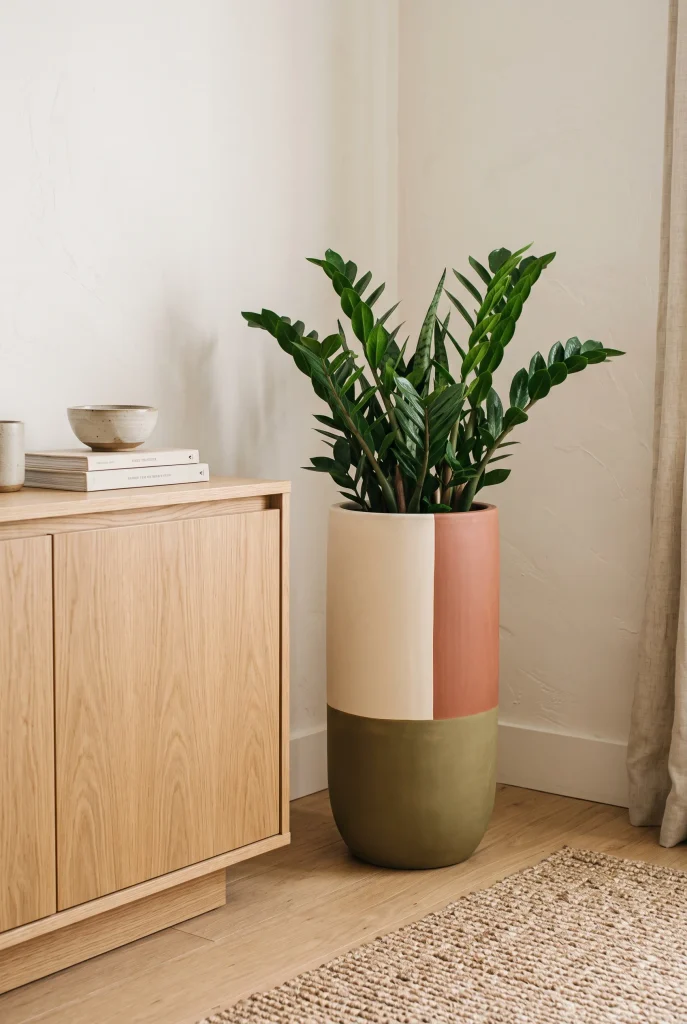
- Color blocking makes a planter look bold without complicated artwork.
- Three coordinated shades can create a strong visual statement.
- Uneven sections can feel more artistic than perfectly equal blocks.
- Earthy colors blend naturally with wood and woven home accessories.
- Keep the plant and surrounding decor simple to highlight the painted design.
Color blocking gives a plain planter a strong decorative presence using only a few simple sections. Divide the surface into large areas and fill each one with a different coordinating shade. You could combine warm white, muted rust, and olive for an earthy look, or use navy, cream, and soft gray for something more contemporary. The key is choosing colors that work together rather than trying to include too many shades. Even a small planter can handle bold blocks because the large areas make the pattern easy to understand from across the room.
You can keep the sections symmetrical for a clean modern appearance or create an offset design for something more artistic. Painter’s tape is useful when you want sharp lines, especially around the base and rim. Let each color dry completely before removing tape or adding the next section. This technique is particularly effective when the surrounding room uses mostly neutral colors because the planter becomes a controlled pop of color. Simple color-blocked pieces work beautifully on shelves, plant stands, entry consoles, and desks where a small decorative accent can make the space feel more finished.
10. Terracotta Dip
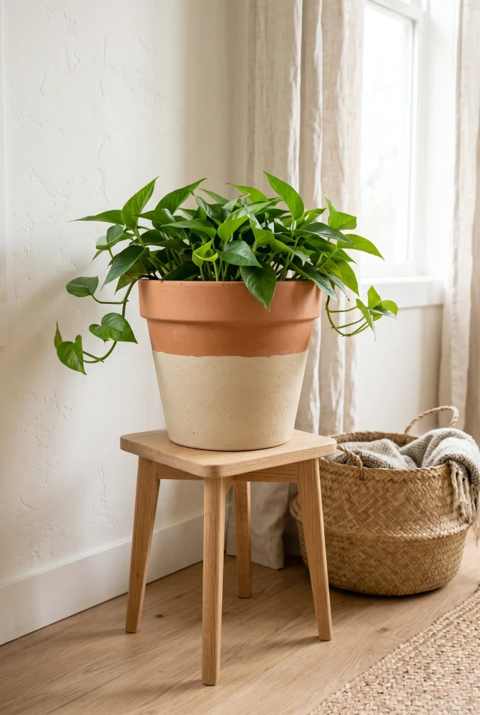
- A painted lower section gives a basic terracotta pot a fresh update.
- The contrast between natural clay and paint creates visual interest.
- Cream, beige, sage, or soft gray work beautifully with terracotta.
- A straight paint line keeps the design clean and modern.
- Leaving part of the original clay visible adds warmth and texture.
Give a traditional terracotta pot a simple makeover by painting only the lower section in a contrasting color. The combination of natural clay and a soft painted finish creates an easy two-tone effect that feels modern without losing the pot’s earthy character. Cream, warm beige, muted sage, and dusty blue are especially easy to pair with green plants. Mark the desired height with painter’s tape, then apply thin coats of paint for an even finish. This technique is ideal when you want a noticeable update but do not want to cover the natural texture that makes terracotta so appealing.
The painted section can cover the bottom third, half, or even a narrow band near the base depending on the look you want. A lower half in cream feels bright and simple, while muted olive creates a stronger organic statement. For a more relaxed result, leave the paint line slightly imperfect instead of aiming for complete precision. This approach works particularly well with rustic, farmhouse, bohemian, and organic-modern interiors. Place the pot on a wooden stool or woven stand where both the painted surface and natural clay remain visible. The result feels decorative but still wonderfully practical.
11. Abstract Brushstrokes
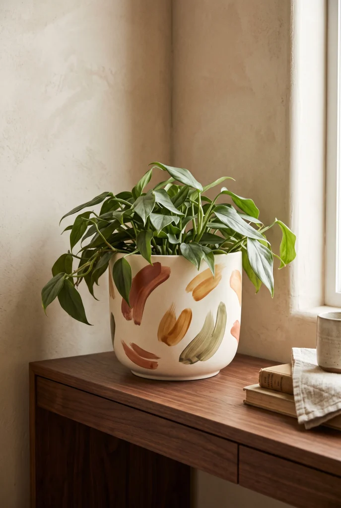
- Loose brushstrokes create an artistic look without requiring drawing skills.
- A neutral base lets expressive colors stand out beautifully.
- Short overlapping strokes can hide small painting imperfections.
- Earthy tones make abstract artwork feel warm and approachable.
- Every planter can have a slightly different pattern for a handmade collection.
Abstract brushstrokes are perfect when you want a planter that feels artistic but does not require precise painting skills. Start with a neutral base such as cream, beige, or soft gray, then add loose strokes in two or three complementary colors. Try short vertical marks, curved strokes, or overlapping patches instead of recognizable shapes. The beauty of this technique is that there is no single correct pattern. You can stop whenever the surface feels balanced. That makes it one of the most forgiving pot painting ideas for beginners who want something creative without spending hours perfecting details.
Choose colors that already feel comfortable in your room so the finished planter becomes part of the decor rather than an isolated accent. Terracotta, ochre, olive, charcoal, and dusty blue are excellent choices for an earthy palette. Use a dry brush for softer, textured strokes or a slightly wetter brush for smoother marks. Leaving some of the base color visible helps abstract designs feel lighter and more intentional. Display the planter against a simple background where the brushwork remains easy to see, and pair it with foliage that has an uncomplicated shape.
12. Speckled Stone Effect

- A speckled finish can make an inexpensive planter resemble natural stone.
- Neutral colors keep the effect sophisticated and easy to decorate around.
- Fine speckles create subtle texture without adding a complicated pattern.
- A toothbrush or stiff brush can create natural-looking scattered marks.
- This finish pairs especially well with minimalist and organic interiors.
A speckled stone effect can make a simple planter look like a textured ceramic or natural stone piece. Begin with a matte beige, cream, or soft gray base, then add tiny scattered marks using a darker neutral shade. A stiff brush or old toothbrush can create irregular speckles with very little effort. Keep the marks varied in size and spacing so the surface looks naturally textured instead of patterned. This finish is especially useful when you love expensive-looking neutral decor but want an affordable way to recreate that calm, collected appearance.
For a realistic stone-inspired result, avoid using too many colors. Cream with charcoal speckles creates a crisp modern look, while beige with brown or taupe marks feels warmer and more organic. You can also add a very subtle second layer of smaller speckles for additional depth. The finished planter works beautifully with greenery, dried branches, or sculptural plants because the neutral surface does not compete with the foliage. Place it on light wood, stone, or a woven surface to reinforce the natural feeling. Simple texture often makes a small decorative piece feel much more substantial.
13. Rainbow Bands
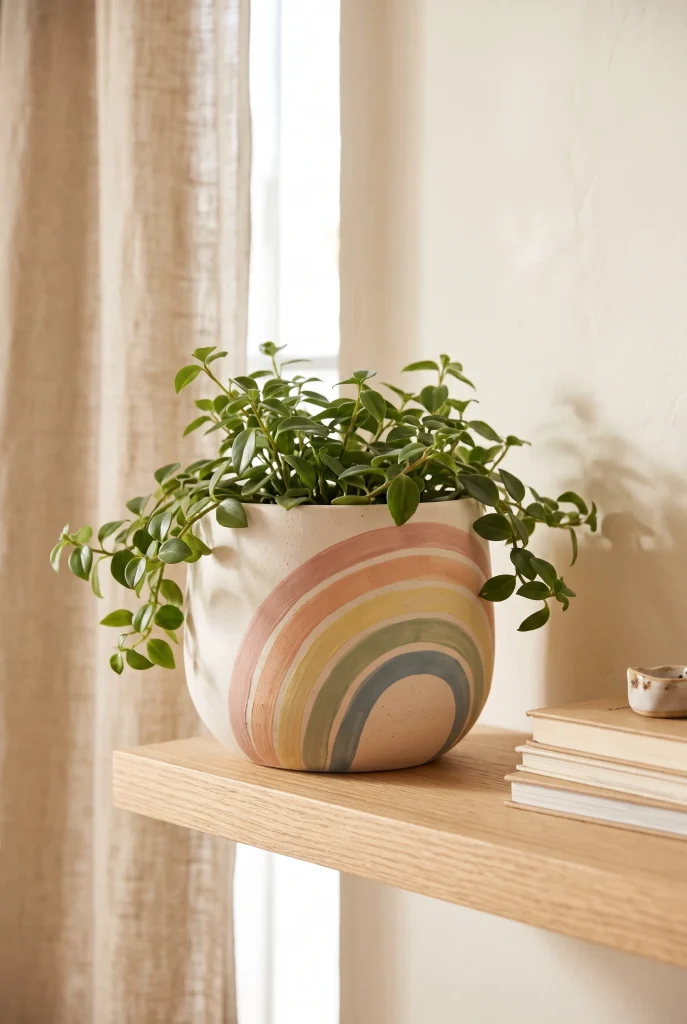
- Soft rainbow colors can brighten a room without feeling overly colorful.
- Muted shades create a more sophisticated version of the playful pattern.
- Curved bands work especially well on rounded planters.
- Keep the plant simple so the painted colors remain visible.
- Repeating the palette elsewhere can make the display feel intentional.
Soft rainbow bands can bring cheerful color to a planter while still keeping the overall look calm and stylish. Instead of using bright primary colors, choose muted shades such as blush, peach, butter yellow, sage, and dusty blue. Paint the colors as curved bands around the front of the pot, allowing each shade to flow naturally into the next. This approach works especially well on rounded containers because the curved surface enhances the movement of the pattern. It is a fun choice for bedrooms, creative spaces, children’s rooms, or any corner that could use a little extra personality.
You can make the design more subtle by using only three colors or painting thin bands instead of wide ones. A cream base can also soften the overall effect and give the colors more breathing room. For a handmade appearance, do not worry if every curve is perfectly identical. Slight variations can make the finished piece feel more personal. Place the planter somewhere with plenty of natural light so the colors remain clear throughout the day. If your room already contains colorful artwork or textiles, repeat one or two of the planter shades nearby to create a cohesive and playful display.
14. Checkered Neutrals
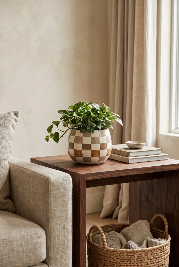
- Neutral checks create pattern without overwhelming a calm interior.
- Ivory, taupe, and brown feel warmer than stark black and white.
- Small squares work well on compact decorative planters.
- A simple leafy plant balances the stronger graphic pattern.
- This design fits modern, transitional, and organic interiors.
A neutral checkerboard pattern gives a planter plenty of personality while keeping the color palette sophisticated. Instead of the traditional black-and-white combination, try ivory with taupe, warm brown, or muted clay. These shades feel softer and pair naturally with wood furniture, linen textiles, woven baskets, and other earthy materials. Divide the pot into simple squares and alternate the colors around the surface. If you are painting by hand, lightly mark your grid first so the pattern stays reasonably consistent. Small imperfections are fine and can actually make the finished piece feel more handcrafted.
The scale of the checks should match the size of the pot. Larger squares create a bold graphic statement, while smaller squares produce a more detailed look. Keep the plant relatively simple so the leaves do not hide too much of the pattern. A trailing plant can also soften the strong lines by allowing foliage to spill gently over the sides. Neutral patterned planters are particularly useful when a room needs visual interest but already has several textures. Place yours on a console, bedside table, bookshelf, or kitchen shelf for an easy decorative update.
15. Half Painted Pot

- Painting only half the pot creates an easy modern contrast.
- The exposed surface keeps natural texture visible.
- Warm white gives terracotta a brighter, cleaner appearance.
- A horizontal paint line makes the transformation quick and simple.
- This style works well when you want minimal decor with character.
A half-painted planter proves that you do not need to decorate every inch to create a strong visual update. Paint roughly half of the pot in a contrasting color while leaving the remaining surface natural. Warm white against terracotta creates a particularly timeless combination, but you can also try beige, sage, charcoal, or dusty blue. The exposed portion keeps the original texture visible, giving the planter a warm handmade quality. Use painter’s tape to establish the dividing line, then apply two thin coats for a smoother finish and allow everything to dry before removing the tape.
You can paint the upper or lower half depending on the effect you want. A painted upper section feels lighter and more decorative, while a painted base gives the planter more visual weight. This simple approach works with modern farmhouse, Scandinavian, rustic, and organic-modern spaces because the materials remain uncomplicated. Place the finished pot near natural wood or woven accessories to emphasize the contrast between painted and unpainted surfaces. If you want an even softer transition, choose a paint color close to the natural terracotta rather than a dramatic contrast. The result is simple, useful, and easy to recreate.
16. Scalloped Edges
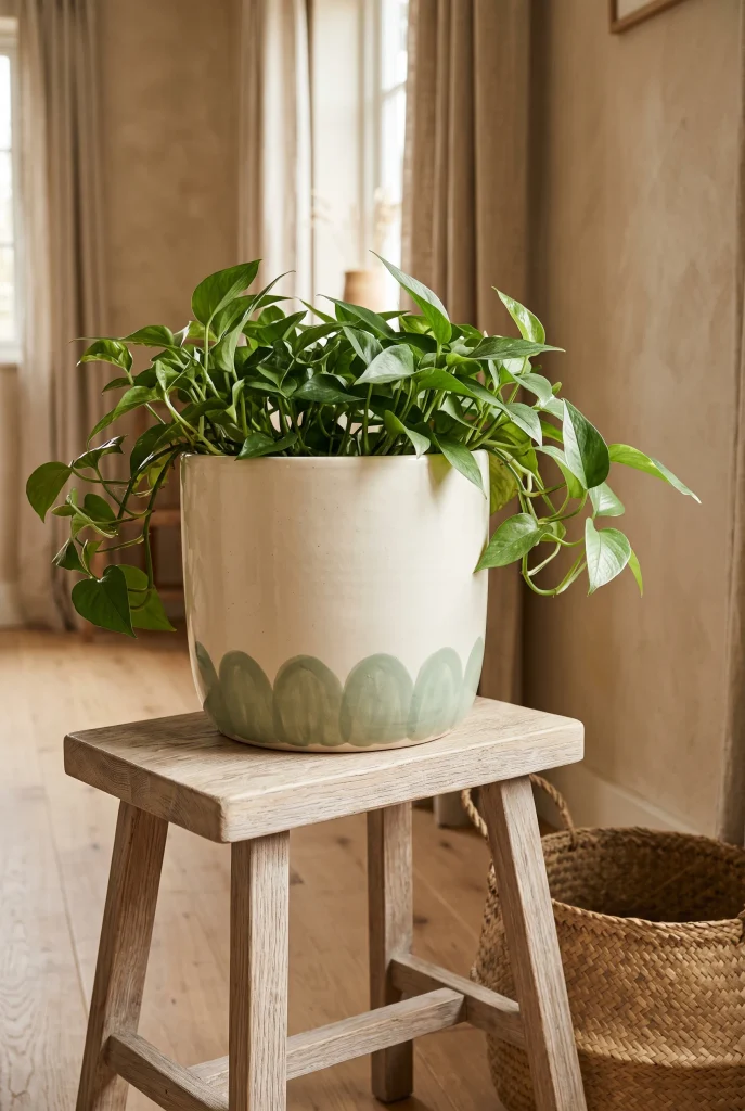
- Scalloped shapes add softness and charm to a simple planter.
- A narrow decorative border keeps the design delicate and manageable.
- Sage, dusty blue, blush, and cream create a gentle palette.
- Small repeated curves are easier to paint than detailed illustrations.
- This style works beautifully with cottage and romantic interiors.
Soft scalloped edges can give a basic planter a charming decorative detail without making the entire surface feel busy. Paint a repeating row of rounded curves around the rim, middle, or bottom of the pot, then leave the remaining surface in a simple neutral shade. Cream with sage green feels fresh and natural, while blush or dusty blue creates a softer romantic appearance. Lightly sketch the curves first if you want consistent spacing. A small rounded brush can help you fill each section neatly once the outline is ready.
The size of the scallops can change the personality of the planter. Tiny curves feel delicate and detailed, while larger scallops create a stronger graphic effect. Keep the rest of the design simple so the decorative border remains the main feature. This technique works especially well with cottage, vintage, farmhouse, and romantic interiors where gentle shapes already appear in textiles and accessories. Place the finished pot on a shelf, dresser, bedside table, or plant stand where the rim can be seen clearly. Pairing it with soft foliage helps balance the structured curves and creates a relaxed, welcoming display.
17. Monochrome Lines

- One color can create a surprisingly sophisticated painted finish.
- Thin lines add detail while keeping the overall design minimal.
- Black, charcoal, navy, or deep green work well on light bases.
- Simple curves and leaves are easier than complex illustrations.
- Leaving plenty of blank space keeps the design visually calm.
A monochrome line design can make a simple planter feel sophisticated without relying on multiple colors. Start with a light base such as white, cream, or pale beige, then use one darker shade to draw simple curves, leaves, waves, or abstract shapes. The contrast makes even very thin lines visible while keeping the overall design clean. This approach is ideal for minimalist rooms because it adds personality without introducing another strong color. Use a fine detail brush or paint marker designed for the surface, and lightly sketch your design first if you want greater control.
The secret to making this style look polished is allowing plenty of empty space. You do not need to cover the entire planter with drawings. A few thoughtfully placed lines can create more impact than a crowded illustration. Charcoal gives a softer appearance than pure black, while deep green can connect the design with the plant itself. Simple linework looks especially elegant when paired with sculptural foliage and uncluttered furniture. Display the planter on a console, bookshelf, desk, or side table where its small details can be appreciated up close.
18. Fruit Motifs
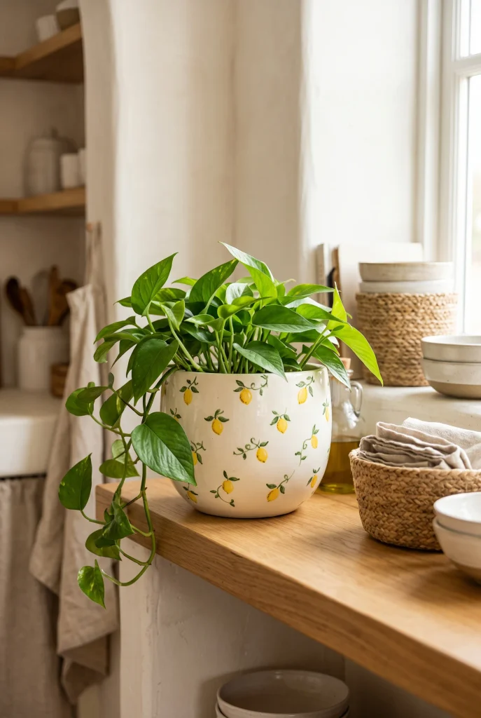
- Fruit motifs bring cheerful personality to kitchens and sunny spaces.
- Lemons, oranges, cherries, and small berries are beginner-friendly choices.
- A neutral base keeps colorful fruit details from becoming overwhelming.
- Repeating one simple motif creates a cohesive handmade pattern.
- Small painted details can make an ordinary planter feel custom.
Fruit motifs can turn a simple planter into a cheerful accent, especially in kitchens, breakfast areas, sunrooms, or colorful corners. Lemons, cherries, oranges, strawberries, and tiny berries are easy shapes to simplify into small painted illustrations. Start with a neutral base and choose one fruit as the main motif rather than trying to paint an entire market basket. Add a few simple leaves between the shapes to create visual connection. You do not need detailed shading; clear silhouettes and a small number of colors can make the design recognizable and attractive.
A lemon pattern in yellow and green feels especially fresh against cream or white, while cherries in red and green create a more playful vintage-inspired look. Keep the fruit relatively small if the planter itself is compact, and leave enough background visible to prevent the surface from feeling crowded. These designs work beautifully with cottage, farmhouse, Mediterranean, and eclectic decor. Place the planter near natural wood, woven accessories, or ceramic kitchen pieces to reinforce the handmade feeling. If painting multiple containers, use the same fruit colors across each one to create a coordinated collection without making every pot identical.
19. Coastal Waves

- Flowing wave lines give a planter a relaxed coastal feeling.
- Blue and sandy neutrals create an easy beach-inspired palette.
- Curved lines are forgiving and beginner-friendly to paint.
- A cream base keeps the design bright and airy.
- This style works beautifully with woven and natural wood accessories.
Flowing wave lines can give a plain planter an effortless coastal update without relying on obvious beach decorations. Start with a cream or sandy beige base, then paint several loose curved lines in muted blue, soft teal, or warm brown. Keep the waves irregular so they feel relaxed rather than perfectly measured. This design works particularly well on rounded pots because the curves naturally follow the shape of the container. You can use a fine brush for narrow lines or a wider brush for broader bands. Allow each color to dry before adding another layer.
For a softer coastal look, combine dusty blue with cream and a small amount of sandy beige. Avoid using too many bright shades because muted colors usually create a more sophisticated result. The finished planter looks especially natural beside rattan, linen, pale wood, and woven textures. Curved patterns also work well in rooms that already have many straight furniture lines because they introduce a gentle visual contrast. Place the pot near a bright window, entryway, bathroom shelf, or living room console where the light can emphasize the soft colors and flowing painted details.
20. Vintage Floral Border
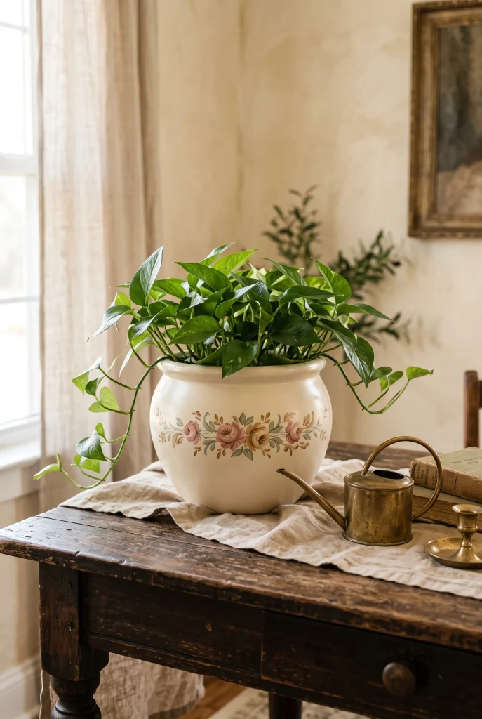
- A floral border adds vintage charm without covering the entire pot.
- Muted colors create a softer and more timeless appearance.
- Small repeated flowers are easier than large detailed botanical paintings.
- Keep the border narrow for a refined decorative finish.
- Pairing the planter with aged wood or brass enhances its vintage character.
A narrow floral border can make an ordinary planter feel like a charming vintage find. Instead of covering the entire surface, paint a repeating line of small flowers and leaves around the rim or lower section. Dusty rose, muted green, ochre, cream, and soft blue create a naturally aged-looking palette. Keep the flowers simple with a few petals and small leaves rather than trying to create detailed botanical artwork. Lightly sketch the border first, then build the design gradually so the spacing remains comfortable. The finished result feels decorative while still leaving plenty of the base visible.
This style works especially well with cottage, vintage, romantic, and traditional interiors where small decorative details already have a place. A warm ivory base can make the colors feel softer, while a terracotta base creates a more rustic appearance. You can also slightly distress selected areas after the paint dries if you want a gently aged effect, but this is completely optional. Place the finished planter on an antique-style table, bookshelf, dresser, or kitchen shelf. Add simple greenery rather than an overly colorful plant so the delicate floral border remains easy to notice.
21. Textured Earth Tones
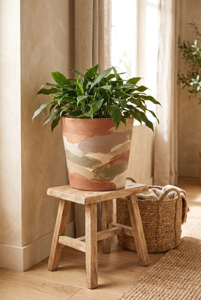
- Layered earth tones make a planter feel warm, substantial, and natural.
- Combining matte shades adds visual depth without complicated patterns.
- Clay, taupe, cream, and olive work beautifully with green foliage.
- Brush texture can hide small imperfections while adding character.
- This finish suits rustic, organic, and modern earthy interiors.
Layered earth tones can make a basic planter feel warm, textured, and thoughtfully designed. Start with a clay, taupe, or cream base, then add loose patches or brushed sections in two or three related shades. You can overlap muted olive, warm beige, soft brown, or terracotta without creating a strict pattern. The goal is to build subtle variation rather than perfect shapes. This technique is especially useful for older pots that have minor marks or uneven surfaces because the layered finish can disguise imperfections while giving the container a more intentional handmade appearance.
Keep the colors close in tone if you want a sophisticated organic look. Matte finishes are particularly effective because they emphasize the earthy quality and reduce distracting shine. Pair the planter with natural materials such as light wood, linen, jute, stone, or woven baskets to reinforce the palette. Earth-tone planters are easy to move between different rooms because they rarely clash with existing decor. Place one beside a sofa, on a plant stand, near an entryway, or on a bedroom dresser, then add lush green foliage for a simple finished display.
Conclusion
Painting your own planters is a simple way to refresh your space while adding something personal and creative. These pot painting ideas range from easy stripes and dots to botanical artwork, abstract finishes, and earthy textured designs, so you can choose a style that fits your home. Start with one plain pot, pick a few colors you love, and let yourself experiment. Save this article on Pinterest so you can come back when you are ready for your next project. Share it with someone who enjoys DIY decor, then turn an ordinary planter into something worth displaying and enjoying every day.